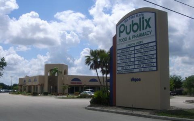
Sunday, August 25, 2024

Publix #498 - Del Tura Plaza - North Fort Myers, FL


Publix #498
18900 North Tamiami Trail, North Fort Myers, FL - Del Tura Plaza

***The photos in today's post are courtesy of new MFR contributor Horizontal Horizons***

Today's post is a presentation of Lee County retail

     While I mentioned some Publix closures made the news this summer in my most recent AFB post, the Publix we'll be touring today was not one of them - this Publix actually closed quite a while ago! While we'll be getting back to current events before long, we'll take a little bit of time today to look at this interesting relic of Publix's past, courtesy of new MFR contributor Horizontal Horizons. A Floridian retail fan hailing from Southwest Florida, Horizontal Horizons was kind enough to send over these photos taken in 2022 and 2024 of former Publix #498 for all of you to see. Publix #498 presents a lot of intrigue, as this store has been sitting empty since 2012. Having closed so long ago now, your interest has probably been piqued as to what relics of Publix's past may be preserved inside, as decor packages like Wavy Pastel and Classy Market 1.0 were still alive back then. I'll let everyone ponder those thoughts for a moment to build up the suspense, as we take a little time to talk more about how Publix #498 came to be, and why it's been sitting empty for 12 years now:

Photo courtesy of Foursquare

     Publix #498 opened on December 1, 1994 to serve the northern fringes of Cape Coral and North Fort Myers. Located across the street from the Del Tura Golf & Country Club community, the shopping center housing Publix #498 was named "Del Tura Plaza", seemingly positioned to to be a convenient grocery stop for people in the few residential developments along this stretch of Tamiami Trail. Looking forward, Publix may have seen this site's potential to grow as time went on, as the nearby (then-lightly) developed portions of Cape Coral built out heading into the new millennium. While the growth Publix probably expected did come as we entered the 2000's, I don't think store #498 ever did particularly well, as the location of this store is a bid odd - see for yourself here. Store #498 was built on the very edge of the population area, in a tiny shopping center facing a dead end stub to nowhere (which made the store difficult to see from Tamiami Trail), located on a non-signalized intersection off a pretty busy road. I feel pretty confident in saying store #498 was a bit of a real estate mistake for Publix, and probably a large contributing factor as to why Publix became pretty eager to move out of this building. The fact that no one ever seemed interested in developing one of the many empty outparcel spaces during Publix's time at this location seems a bit telling of this location's poor placement too.


     Even with a number of strikes against it, Publix #498 managed to survive for 18 years at Del Tura Plaza. During those 18 years, this store received one remodel in the early 2000's where its original Wavy Pastel decor was swapped out for Classy Market 1.0. Interestingly, it also received an early Publix Liquors location in the late 2000's as well. However, in 2012, Publix managed to secure a fantastic site for a new North Fort Myers store about a mile south of here at the busy intersection of Tamiami Trail and Del Prado Boulevard (Del Prado being one of the main North-South roads in Cape Coral), a site that had been expected to become home to a newbuild Sweetbay Supermarket around 2009. 

Site Plan for proposed Sweetbay Supermarket #1962 at Shoppes at Del Prado - Lee County Records

     I found an old lease agreement in the Lee County records showing Sweetbay's intent to build at the Tamiami and Del Prado site, the site plan from which you can see above. I couldn't find any more detail though about why the talks with Sweetbay fell apart, however, Sweetbay was running into financial difficulties come the 2011-2012 timeframe when this store would have began construction. While Sweetbay did open a handful of new stores in 2011, this one may have been cut as Delhaize began to realize that Sweetbay's future wasn't looking very promising, and that the end of Sweetbay was nearing. Anyway, Sweetbay's troubles in the early 2010's worked to Publix's advantage, as Publix was approached to be the new grocery anchor for the Shoppes at Del Prado project, a deal which Publix gladly accepted.


     Publix #498 closed for good on the evening of October 24, 2012, with its replacement, Publix #1407, opening the next day on October 25th. Ever since October 2012 this building has been sitting empty, somewhat forgotten in the back of this little shopping center. In its 12 years of vacancy, the only action this building has seen was a brief stint as an emergency shelter for Lee County residents displaced by Hurricane Ian in late 2022. Other than that this former supermarket has just sat here anchoring a fairly dead shopping center on the edge of town since 2012.


     Publix #498 (and the small attached shopping center) used a Spanish/Southwestern style architectural design, an interesting take on what would otherwise be a typical early 1990's Publix build. Above, Horizontal Horizons is approaching the store from the left side, looking toward the old left side entryway into the building. As Horizontal Horizons put it, "Upon walking up the the old entry doors of the left vestibule, I was greeted warmly by a busted out whatever-you-call-those-pole-things."


     Arriving at the front walkway, here's a quick look at the store's left side vestibule, which we'll come back to in just a little bit.


     Early-mid 1990's Publix stores didn't have a standard "default" facade, particularly the 40N and its larger sibling, the 49N (like this store was). As such, stores from this era had a pretty wide array of exterior designs, from some fairly plain ones to some more elaborate designs. Store #498 certainly fell on the more elaborate end of the exterior design spectrum from that era, with its custom Spanish architectural style, fancy patterned tile walkway, and custom wall tile design as well.


     I'll let our contributor's captions take over for this next image, as Horizontal Horizons summed this scene up well: "Taking a glance out from this old archway you can see off in the distance what looks to be an undeveloped pad of land, a field likely cleared out for a planned expansion this plaza never received. Why else would there be an arch to nowhere? Apart from receiving no outparcels, this plaza also lacked any sort of extension outward past the Publix space. Not a good look for business performance having all those empty fields!"


     I mentioned before we were going to take a closer look at the left vestibule, and that time has now come. Just glancing through the doors, hopefully there's one obvious Publix relic inside jumping out at you...


     …the Wavy Pastel wall tile stripes! As Horizontal Horizons put it: "Looking inside, I was met with a bright clash of old 1994 colored tiles from the Wavy Pastels era. These all somehow survived the store’s first and only remodel, being to CM 1.0, likely taking place in the early 2000s when the package debuted." Horizontal, I was just as excited as you were seeing this photo for the first time! This vestibule is a perfect vestige of 1990's Publix, from the wall tiles to the original flooring and even the original older-style ceiling tiles as well. (I always associate that ceiling tile pattern with supermarkets from the 1980's and 1990's, as that seems to be when that pattern was most popular - as you'd probably imagine, Publix has swapped out those ceiling tiles in most stores of this design that still survive for a modern alternative). From this angle, you'd never even realize this store closed with Classy Market 1.0.


     Turning the corner from the vestibule and peeking into the main salesfloor from the front windows, we can start to see more of this store's final years with some remnants of CM 1.0 still on the walls. As Horizontal Horizons described this scene: "And would you look at that! Past the sand-covered tiles we have some old CM 1.0 remnants, most notably being the fake wall windows. You just can’t miss those, as they are very obviously visible to anyone who looks in. I guess Publix simply had no desire to remove all of the decor fixtures after moving out in 2012."


     Pulling back a bit, we can see more of the old faux skylight that used to shine down upon the front end until Publix said goodbye to this store, that light eagerly awaiting its second chance to light up again.

Photo courtesy of Foursquare

     Poking around the internet, Horizontal Horizons managed to find one interior photo from Publix #498 before it closed. 49N Publix stores have a mezzanine level for offices and the employee breakroom, which look down over the front end. From the looks of it, this photo was taken from one of the windows on the mezzanine level, looking down on the left-most side of the front end, closest to the bakery and pharmacy counter. As Horizontal Horizons described this interior photo: "Hanging proudly from the ceiling in the left of the frame was a lovely poster view of good ol’ Mr. George bagging up some groceries. Aside from that banner, you can also noticeably see the check lanes, and back behind those, vaguely make out some of the old CM 1.0 aisle markers. (all of which are now long gone, as depicted through the modern photos)"


     Back to the present, Publix #498 looks a bit darker and grayer in appearance, and not because it has Evergreen decor inside! The interior photo we just saw from when the store was open was looking roughly at this same portion of the building, just angled downward from the mezzanine. The left half of the store once contained produce in the back left corner, followed by the bakery in the front left corner, and the pharmacy immediately to our left between the bakery and the entryway. The half-height wall you've been seeing off to the left in these interior photos separated the salesfloor from the pharmacy waiting area. Since this store closed in 2012 with Classy Market 1.0, it didn't survive long enough to have its pharmacy relocated to the multi-purpose nook at the front right corner of the building like most 49Ns received during their remodels to Classy Market 2.5 and/or Sienna/Classy Market 3.0.


     As we move away from the left-side vestibule, here's a little more from Horizontal Horizons about what we're seeing: "Heading over now to the right side vestibule, you can enjoy these funky old tile patterns while walking down the seemingly endless empty front awning of this building. The address in the corner adds a nice touch too. Despite lacking a tile mural, I was overall very impressed with the look and theming of this store. While it’s a shame a store this nice had to be replaced so early on, at the same time it is great thing the place gets to live on as a well preserved relic to Publix’s past. We all know dang well those CM 1.0 windows would be long gone by now, had the building still been operational today!"

     It's interesting Horizontal Horizons brought up the tile murals, as this store's number neighbor, store #499 in Melbourne Beach, was the very last Publix to receive tile murals made by Pati Mills'. While not a mural, like Horizontal Horizons, I do appreciate some of the tile patterns select early 1990's stores received as decorative trim like this!


     Now at the building's right side vestibule, let's take a peek through the glass and see what we may discover on the right side of the building:


     The right side of the store was home to the distinctive 49N dairy arch, visible to the right in the photo above. On the back wall we can see the remains of the former deli counter, that department's alcove visible in the background of the left side of the image.


     The scars from the grocery aisles can be seen here, under the raised ceiling that once housed those aisles.


     Much like its left side counterpart, the right-side vestibule is just as much of a relic from 1994.


     Between Horizontal Horizon's two visits to this store, the pile of pipe near the window disappeared, but other than that nothing about this vestibule changed.


     Back to the front walkway, here's another look at the decorative tile work as we look back toward the doors.


     To the side of the right entryway is the former location of the Presto! ATM, boarded over where the actual ATM unit used to be housed (as keeping an ATM at a closed store wouldn't make any cents).


     Off to the right side of the former Publix space is the small strip of stores that comprises the remainder of Del Tura Plaza. Of the 12 or so units that comprise the strip of stores, if Google Maps is accurate, only 4 of these units are currently occupied - those businesses including a rental ballroom, a brunch café, and two doctor's offices. While those businesses are still hanging on in this desolate little strip, of particular attention to us in relation to our post is this very first unit next door to the former Publix. For a short period from the late 2000's until Publix closed in 2012, this unit housed the Publix Liquor store. A 1994-built Publix would not have had a liquor store from the beginning, as Publix only revived the liquor store concept in the early 2000's (following a brief experiment running liquor stores that failed rather fast in the late 1980's). At some point Publix managed to secure the space immediately adjacent to this store for the new liquor store, and considering this store ended up closing only a few years after it was added, I'm surprised Publix even bothered to add a liquor store to this location.


     Looking through the front doors of the former liquor store, there really isn't much to see in here. The former liquor store has been pretty well stripped out, the flooring included.


     When Publix moved, the new store down the road also had a liquor store added, so that feature wasn't lost in the transition. Anyway, with the photo above, we're back in the parking lot now, with a final overview of the former Publix as seen from the right side of the building.


     The final photo Horizontal Horizons shared with us was this one, with "the front facade stretching across the vast, empty parking lot. This really creates a good illusion that makes the store appear much larger than it actually is." I see that too - an abandoned supermarket does look larger and more intimidating staring right at you across its large, empty parking lot.

Photo courtesy of The Real Yellow Pages

     Our last photo for today will be this one I found online, the only other photo of Publix #498 I could find besides the ones already shared by Horizontal Horizons. Technically this isn't even a photo of the store itself, but its road sign facing Tamiami Trail. This small sign was all there was to tell people going by there was a Publix hidden back here. I really think turning this shopping center 90 degrees to face Tamiami Trail instead of the little dead end road to nowhere could have helped this store's prospects quite a bit!

     Anyway, that's the story of Publix #498. Sitting empty since 2012, I believe there are only two other Publix stores out there that have been sitting empty for longer than this one, those being store #187 in Jacksonville (empty since 2007), and the infamous crash-and-burn store #460 in Statesboro, GA (empty since 1998!). A big thanks to Horizontal Horizons for photographing this store and sharing these photos with the blog, and hopefully we'll get to see more from Horizontal Horizons in the future!

So until the next post,

AFB

Sunday, August 18, 2024

Publix #680 - Gainesville, FL

 Publix #680

Esplanade at Butler Plaza

3100 SW 35th Boulevard

Gainesville, FL 32608

Click Here for the companion post on Publix #1312 with joint coverage from yours truly and The Albertsons Florida Blogger

Welcome back to My Florida Retail Blog!  After an exciting summer of covering AL-Dixie news (beginning with my post on former Winn-Dixie #579 in Auburn), I figured it was time for me to transition focus back to our old friend Publix.  Surprisingly, I've had the bulk of this post written since July 29, 2022, which happened to mark the final hours of my previous job.  It's shocking to think it has been that long, but alas, time marches on.  I'm in a much better place now than I was two years ago, and I no longer run into the issue of drowning in boredom at work.  That change may have resulted in less time for blogging; however, I can't say that is a bad thing.


One of the reasons for sitting on this post for all that time was because I knew The Albertsons Florida Blogger intended to write his own post on former Albertsons #4389 / Publix #1312 located a staggering 400 yards from the store I will be showing off today.  I can think of plenty of stores which have relocated a farther distance than what separates these two!

I've often heard others mention Publix's tactic of operating a store across the street from another store; although I had never experienced this phenomenon (so long as you don't count Publix #33 and GreenWise #1689):  that changed when I visited the Gainesville "twins" several years back. 

Store #680 has coexisted with store #1312 for the past 15 years, in addition to the two being surrounded by a Whole Foods, Aldi, Target, Walmart, & Sam's Club.  The Butler Plaza area seems to be a popular retail hub for The Swamp and obviously has plenty of traffic from Archer Road and nearby I-75.  It still says something if the development can support two Publix stores in addition to the other aforementioned businesses!

For those who haven't realized this by now, #1312 (along with all other locations in the #1300-#1348 range) was an Albertsons acquisition.  That former Albertsons is still the only one of this prototype I've made it to, so I couldn't resist taking a few pictures while inside – which AFB was kind enough to include in his post!

Publix #680 opened on August 19, 1999, and replaced the circa 1975 store #189 next door.  Had I known this when I visited, I probably would have popped my head into the Joann Fabric store to see if anything remained from #189, but pictures from Google Maps lead me to believe the building has been thoroughly remodeled. (Woops, that previous claim didn't age well:  I've since returned to #680 yet still didn't bother to stop in Joann!)

The Gainesville Sun (Google News) - June 10, 1999

The current store is a warehouse-ceiling 37N akin to what we toured in Columbus a while back.  Both stores originally opened with a variant of Publix's Wavy Pastels interior, which would explain the bright tile patterns we saw at #650 and my use of the colorful section headers in this post.  (Isn't it crazy how that works?  If you haven't yet realized it, the orange header below was modeled off the bakery signage, while the red one is based on meats and the teal one on produce.)  


My main purpose for visiting back in 2022 was due to this store being a fun and rare example of a "Classy Conglomeration"; however, the space has since been decked out in 50 shades of Evergrey.  At least I took plenty of pictures of the store while it had its primitive version of Bamboo (Classy Market 2.5)!

Classy Conglomerations seem to have been rolled out before the more stringent practices of later Bamboo / Sienna remodels were adopted, meaning many have a variety of quirks on display. (Who doesn't love visiting a quirky Publix – whoever said they all look the same is just wrong!)  Sienna remodels tended to be uniform, but I have yet to find two Classy Conglomerations that look alike.  Let's see what surprises we have in store.

The first oddities I noticed were the inner tubes protecting the bollards in front of the store; I've seen these at plenty of other Publix stores, but never at one located an hour from the coast!  Are they for floating down one of the local rivers?  Do the UF students like to use them for swimming pool parties?  Is Publix afraid that the infamous Florida retirees will walk square into one of the posts? 

My best guess is that the tubes provide transportation in the event of a famous Floridian flash flood – it even seemed to be the preferred method during my 2022 visit based on how many of those puppies were parked outside!

Wet 🌂 bag?  Why would I need one!

Yeah, the rain just rolls right off my back, and I don't get caught in those same old traps!

What I do get caught up in is the fact that the vestibules for this store look like most every other 37m Publix we have toured (#582, #599 & #650).  The entrance sign above the door is probably original yet doesn't feature the iconic Gill Sans font.

Hopefully you have realized it by now, but this grey checkered tile pattern is still extremely common to spot in Publixes from the 1990's and 2000's.  I've confirmed that it was used with Wavy Pastels, Metallic Marketplace, and early Classy Market 1.0 stores; therefore, it provides little insight into #680's history.  

Despite this, we still see a rare spectacle for 2022:  the rectangular Publix logo.  The marbled-green background features the same texture used for the lettering in Kiwi/CM 1.0, meaning this sign likely dates back to that package.  Did it remain in place to cover up a Wavy Pastels tile mosaic?

Stepping inside, we see a conventional setup for most 'modern' Publix stores:  a selection of seasonal items joined by the bakery and deli rounding out the front right corner.  

I would like to point out how the nonstandard "Restrooms" and "Deli" signs are two hallmark features of a "Classy Conglomeration" Bamboo installation, and the aisle markers date back to at least Classy Market 1.0.

What is unconventional about this, though, is the store's "multipurpose nook" hosting a variety of international foods.  (Greeting cards or a pharmacy are the traditional choices for the space, while an in-store bank was the former favorite.

May 2024

As I alluded to earlier, I made a return visit to #680 earlier this year to shore up any coverage gaps I had and pick up a carrot cake.  It was on this trip when I stumbled upon the fact that the store had remodeled to Evergreen in late-2022 or early-2023:  what a shame!

May 2024

I'm not surprised in the least, I just wish I had the opportunity to take one last look at this unique space.  Oh well, I suppose the fact that the international foods section now has its own department signs makes it special in a different way.

Turning toward the registers, we find the customer service desk in its typical configuration accompanied by an odd surprise.  Read on if you haven't noticed it.

May 2024

It's worth noting that Publix installed new light fixtures during the Evergreen remodel, which seem to do a fantastic job of confusing my camera's auto exposure; the bright bakery table makes the rest of the store look extremely dark!

Our next notable feature, or lack thereof, is how the bakery soffit lands in a 90 degree angle rather than a much more graceful corner.  Publix only seemed to discover the far superior sign placement into the 2010's and only bothered to retrofit the stores if they were deemed "worth it".  The fact that this store stands in the shadow of #1312 likely has something to do with that.

Another reason why this soffit is so inconsistent between stores is because all of them originally lacked a wall and just had the space above the dropped ceiling exposed for everybody to see.   That look didn't age well, and Publix likewise decided to enclose it in some form or fashion.

Based on my notes, it seems that I took this picture to highlight the wood-grain background on the small bakery sign in the distance.  I believe most stores' signage instead have a solid brown background.

One of the highlights of a Classy Conglomeration is the unique curved orange deli sign which was only used in 2010-2012ish installs.  It seems to be an updated adaptation of the one used with Invigorate but was shortly replaced by the rectangular one still commonly found today.

May 2024

Unfortunately, this store went from a rare and unique Bamboo deli sign to a run-of-the-mill Evergreen implementation featuring vinyl wallpaper and grey foam letters.

Our next surprise can be found behind the deli.   The tile in this store may look like two grey stripes on a white background, but it is much more than that.  You can't tell it from this picture, but there was a section of the top stripe which seemed to be chipped away, revealing some bright pink tile.  The top stripe is actually paint covering the original 3-row pink checkered design this store opened with, while the bottom stripe is the original grey tile.  Now I at least found one way Publix hid its old tile!  (I'm glad I wrote that caption two years ago because I otherwise never would have remembered that detail!)

Anyway, this is the only time I remember seeing Publix resort to the Winn-Dixie method of painting tile.  I have seen the company try everything else including installing vinyl on top, installing tile on top, or even chiseling out and replacing the old tile.

Taking one last look at the bakery, I'd like to note how it never received the trademark blue tile scullery wall which accompanied most remodels from 2007 on.  Instead, this store only had a cinder block wall painted blue.  Are you starting to notice the trend of Publix cutting corners (or not cutting corners, in the bakery's case) with the remodels here?


To help matters, I feel confident that the open deli cases on the left are original to this store's 1999 opening.  At least Publix got around to replacing all of the refrigeration units during the Evergreen remodel.

In the back right corner of the store, we find produce (and a sign which seemed much too large for this space in person).

Publix must've really liked this layout for the produce department, because they seemed to use it for almost two decades in a variety of prototypes.

Why did the buggies in this store have cupholders??

May 2024

Jumping forward a couple of years, we find the same corner of the store with new signage, lighting, paint, and fixtures.  I have to say that this is one part of the store which looks much nicer in its new digs.  As much as I like Bamboo, the variety of paint colors really made this space feel chaotic whereas the muted colors of Evergreen allow the colorful produce to pop.

May 2024

Something that was left behind was this sign highlighting how produce is coated in food grade wax.  It's colors fall much more in line with Bamboo than they do with Evergreen!

Leaving produce, we find where the cut fruit station also received paint over its celadon (that's a fancy word for teal) tile, but otherwise looks to be in the same location as it was in 1999.

The floral case in this store looks like it was added as an afterthought but seems to still serve the purpose.

I'd like to point out how the wood molding above the coolers was painted to match the secondary color in each department (what a nice touch).  That would be "Something Blue" in the case of the dairy department.

I've seen Publix also follow this practice in some of the early Sienna stores, but it largely seemed to have died off by 2014 or so.

May 2024

Once again, Evergreen robbed us of all color in this part of the store making it feel like a dim winter evening.  Publix even neglected to paint the signature green band around the perimeter of this store! (Ditto for #1312.  Why did both of these stores receive abnormally drab Evergreen implementations?)

At least fruit snacks aren't drab!

We'll take a look at aisle 3, and Publix' current "Steamy", "Dreamy", and "Creamy" product posters.  I remember when those were all the rage back in 2022 – the Sing Oil Sidekick kept making fun of them.

"Steamy", "Dreamy", and "Creamy" may have been products of the Evergreen era, but Bamboo wasn't immune of flaunting random adjectives on signage:  just take a look at the "CREAMY COOL FRESH SMOOTH GRADE A" sign up above.

The next oddities about this store were the stainless steel panels above the dairy and produce cases.  I presume these were the outside walls of some walk-in coolers; however, I still think it is strange that Publix decided to leave them exposed to the sales floor.

Aisle 6 sported bread, jelly, and candy . . .

. . . while a nearby endcap offered customers a variety of cream cheese (yay, no shortage!).  This cooler also showed a version of the "cool it, chill out, take it easy" text with a thin font, while other such coolers in the store hosted a heavier font with darker green lettering.  All of these were later removed with the Evergreen reno.


Aisle 7 offered HBC products, complimented by some hanging signage I had not seen before.  (This was despite me posting about a store which has them a month before I wrote that caption.)

These signs likely date back to CM 2.0 or this store's early CM 2.5 installation, if I were to guess.  The three stock photos are significant because they previously matched the backlit aisle toppers used over the H&BA section.  The newer yellow and blue star patterns roughly coincide with where the popcorn and water graphics used to be.

It may be a bit difficult to see, but the category marker for "bar soap" needed to be cleaned up.

If you didn't pick up on my hint before, I wanted to highlight how this was one of the few stores to retain its dropped ceiling over the checkout lines into the 2020's.  This was a common feature in Publix stores during the 1990's and early 2000's, but most of these were removed during Bamboo or Sienna remodels.  They are certainly a rare sight to see today (as I can only think of one other store I've seen one in), so I was excited to finally witness one.  Hopefully it can survive into this store's inevitable Evergreen days!  (Huh, the joke's on me!)

Lining the face of the customer service desk was Publix' historic photo collage.  By this point, you have seen plenty of other stores where I have photographed this set of pictures.  I now even have a few of those in my collection (thanks Ian).

May 2024

Again, to little surprise, neither the suspended ceiling nor the historic photo collage survived the Evergreen remodel.  Welcome to Blandtown!

The balance of the rear actionway is laid out the same as any other 37D/N or 44T store, with seafood and meat off in the distance.  These are some of the only Publix prototypes where you will find the meat department in the back right corner!

May 2024

It's worth noting that Publix built out the bulkhead over the seafood counter during the last remodel.  At least one department received some nicer treatment!

Also, a friend mentioned how Publix recently started displaying signs stating that it cannot sell partial packages of eggs.  I think this is the first store where I noticed such a thing.

I only recently recalled (as recent as two years ago, I suppose) the portrait function of my phone's camera and decided to use it to highlight a CM 2.5 category sign.  The lucky one indicated the location of margarine.  Notice how the Bamboo category signs lack the abstract graphic found on the old Invigorate ones and use a different typeface.


Two years later, and I can only guess as to why I took this photo.

One of my biggest hesitations in stating which décor the 37N stores opened with is their lack of Metallic Marketplace awnings of any sort.  Many CM 2.5 remodels kept these structures in-place; therefore, I would have expected to find some kind of remnant from them.  I haven't even found pictures on the internet to indicate which package these stores received; my only clues are the pink and blue checkered tile patterns.

Update:  I've since found pictures of these stores with Wavy Pastel adornments.  Metallic Marketplace was almost exclusively used in 44T and 54T stores.

Aisle 12 offers prepackaged lunch meats, some frozen products, and a variety of chips.

The seafood counter's teal tile was also obscured.  Luckily, I have other sources for identifying the vintage tile pattern hiding beneath the paint. 

Wow, I was alluding to my post on Publix #650 as if it were a surprise.  That's what happens when you write a post two years before it goes live!

The same goes for the meat department.

This newfound omnipotence is strange.

May 2024

Flashing back to the present, we find the meat department in an almost dystopian state.  I'm typically one to defend Evergrey; however, this store just seems to lack any sort of soul.  At least everything is cohesive!

Now I wish I had a photo taken from the back right corner looking back into the store because the layout with the lonely coffin cooler is really throwing me off!

Not my best picture, but aisle 13 was home to frozen products and cold beer.  Note how the signage for the cold beer lacks the blue background found in later iterations of the package yet uses updated silver lettering compared to what we saw at #599.

This shot does a great job showing the structure supporting the dropped ceiling encompassing the front of the store, while also highlighting the crooked #13 on the aisle maker.  Did I mention how that style of tri-sider hasn't been installed in a Publix since 2007?

I like how this shot showcases those CM 1.0 aisle markers and the CM 2.x frozen foods banners.  Those dang things still remind me of a beach chair hanging from the ceiling!

Cards separate the wine department from the checkout lines, forming a sympathetic buffer for when things unwined.

Frozen foods occupy the majority of aisle 14, with the ends donating space to the meat department in the back and wine in the front.

Similar to my tour from Publix #599 I decided to take a wide angle shot to showcase the entirety of the dropped ceiling structure.  I believe the acoustic tiles were installed in favor of the old grate diffusers Publix loved to use during the 1990's.  Boy did those go out of style!

This store retained the old-style checkout cubes up until its Evergreen remodel.

The unsigned wine department could still be found in the front left corner.  Why did Publix even bother with the lonely vineyard photo hanging on the right?

If I didn't know better, you could've easily convinced me that this picture was taken all the way back in 2010!  The only thing I see which disproves that theory is the "curbside pickup" sign in the wine section featuring Publix's new product design.

I'm typically not a fan of computer-generated bokeh (known as Portrait Mode on most phones) because it often trips up when identifying the edges of objects to put in focus.  You can see an example of this around the edges of the pork sign, which makes me wish I could bring my DSLR along for a full store tour.  How do newspaper photographers get away with it!

May 2024

Jumping forward, we see how much more open the front speedway feels without the old suspended ceiling looming above.  It looks like the remodel allowed for the wine corner to get its own sign while also adding a few new self-checkout terminals.

Knowing what I do now, it is crazy to see a Redbox still sitting in the front of a Publix.  The grocer quietly removed all remaining machines in either the latter half of 2022 or 2023.  I have to say that they must have seen the writing on the wall considering how the fledgling company filed for bankruptcy protection earlier this year and has since left outstanding machines in varying states of disrepair.  I've personally seen some sitting idle and unplugged outside of businesses while others are ready and willing to rent or sell any of the titles which remain.  In any regard, I know there is about to be a flood of used Barbie Movie DVDs hitting the market and a surplus of red scrap metal.

To close out our tour, we'll see the opposite side of the dropped ceiling section and how it "floats" over the front of the store.  Now that's what I call chicken soup for the soul.

Courtesy Publix

While I'm sad that I don't remember all of the details from my original visit to Publix #680, I'm glad that I at least built out the bones of this post immediately following the trip.  It's crazy for me to see how things can change in a store over the course of two years while also realizing how many things I have learned and forgotten. 

Speaking of lessons learned, one of the biggest things that stood out to me as I was editing the draft is how I still thought "Classy Market 2.5" was called Invigorate back in 2022.  I'd hope that I learned something after embarrassing number of hours I've spent scouring building plans to get where I am today.  All of that research is well and good, but the best thing I've done to learn more about the past is visit these "historical" places for myself.  No matter what topic you are passionate about, there is no substitute for seeing something with your own eyes – you can never get a true grasp of scale or detail by just looking through somebody else's lens.  A snapshot is indeed just a snapshot.

I'll close out this post with my interpretation of the bumper sticker "GO SEE KEN."  I've seen the phrase emblazoned on a neighbor's car and thought that it was designed to inspire people to go and seek (go seekin') new wonders and adventures, but on the contrary, it appears to be a notorious Houstonian advertisement for a local bike shop.  I have no idea how that wound up on a car in Georgia or why I thought it had a deeper meaning than just visiting a guy named Ken; however, I still think my original interpretation has a worthwhile message:  that is to find a new passion of yours and pursue it.  Never did I think that a random internet query would lead to a passion for researching supermarket history; alas, here we are!

So, with that, I plea for you to go into the world and seek something out because you never know when it will be gone.  Additionally, if you haven't done it already, make sure to seek out this week's tag-team companion post where AFB and I collaborate on giving y'all a tour of nearby Publix #1312 – you won't want to miss it.

Happy exploring,

- The Sing Oil Blogger