Sunday, March 24, 2019

Sears #2245 - Melbourne, FL - The Closing Begins


Sears #2245
1050 S. Babcock St., Melbourne, FL

     This Sears store opened in 1968, coinciding with the opening of the neighboring (now dead) Brevard Mall, which featured Montgomery Ward and JCPenney as its anchors (more on that here, though). In 2015, this store was sold to Seritage Properties as part of SHC's controversial REIT deal, which is typically not a good sign for the long-term future of a Sears or Kmart store. Even with that being the case, this Sears location was supposedly a "Top 200" store from what a few employees told me, citing this Sears location had particularly strong sales in clothing. As usual, Eddie doesn't care about any of that, and this Sears store was marked for closure during SHC's initial bankruptcy filing in October 2018. Liquidation sales had begun here in late October 2018, with the store closing for good on January 6, 2019 at 1:45pm.

     Tuesday, November 13, 2018, approximately 11:00am: With the liquidation sale at the Melbourne Sears in full swing, AFB sets out to see just what has changed since his last visit, which took place prior to the sale beginning. Let's jump into this post and see what has changed, as we begin part two in AFB's four part series on the Melbourne Sears store: The Closing Begins.

     When we last left off with our coverage of the now-former Melbourne Sears store, we toured it in its pre-liquidation form. Jumping ahead nearly a month from when I took that last batch of photos, we find the Melbourne Sears store in the dreaded liquidation mode. The red and yellow liquidation signs of doom are now up, and a large "Store Closing" banner had been hung above the Sears logo on the front of the store. However, as you can see in the above photo, a nice wind gust had gotten the best of said "Store Closing" banner, but I won't complain about that. With the banner now mostly hidden from sight flipped up on the roof, we don't have that distraction to take away from the great mid-century architecture that graced this Sears store into its final days.


     In the previous post we took an extensive look at this store's exterior, admiring the unique architecture of this very 60's Sears store. With that extensive exterior tour out of the way, we'll just skip along to the front entrance as we begin to head inside, where we will see just what has changed since the liquidation began three weeks prior. Approaching the front door, there was no shortage of store closing signs plastered to the front windows...


     I believe this was my best attempt at capturing the "Sears, Roebuck, and Co. Satisfaction Guaranteed or your money back" lettering above the doors. That lettering, in addition to the architecture, just made this a great example of a 60's Sears store - a Sears opened at a time when this company was seemingly indestructible.


     Stepping inside, yet more store closing signs can be seen lining the main aisles as far as the eye can see. The liquidation discounts began at 10%-40% off (a fact that was reinforced quite a bit here!), and most of the departments were still mostly stocked even three weeks into the liquidation process. However, the folks of Melbourne had gotten word of this closing, as a decent crowd of people showed up on this day to pick over the remains of this once proud department store.


     Here's a look across the front of the store and the women's clothing department, as seen from standing in front of the jewelry counter. The front register can be seen in the distance here, a line beginning to form with shoppers wanting to pay for their discounted goods.


     Moving deeper into the right side of the store, here's a look across the men's clothing department. Like I said, there was still quite a bit of merchandise to be found here, as the clothing departments still appeared fully stocked three weeks into the liquidation sale.


     Here's yet another look at the men's clothing department, this time looking back down the main aisle toward women's clothing.


     To the left of the men's clothing department was children's clothing, pictured here. Things were beginning to thin out just a little bit here, but again, still plenty of merchandise to be picked through.


     Stepping out of the children's clothing department, here's a look back toward the front of the store and its main entrance. Women's clothing and the main register lie just ahead in the distance.


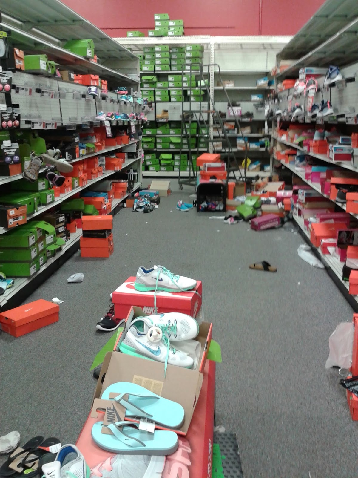
     This store's new toy department was never really given much of a chance to get off the ground. Almost as soon as it was set, the announcement of this store's closure came out. In typical store closing fashion, the toys in this area were now thrown around and shoved wherever there was room. However, this was really the worst destruction I saw at the closing of the Melbourne Sears store. Overall, the employees were able to keep things neat and orderly here, or at least as neat and orderly as you can get at a store closing. Thankfully, I saw nothing like this scene here!


     Moving along to the left side of the building, here's a scene from the housewares department, looking toward mattresses in the distance.


     Plenty of furniture and mattress displays were up for grabs this day, all marked down and ready to go. All of these displays needed to be sold in order to convert this part of the store into the main fixture sales department in the coming weeks.


     Leaving furniture behind us, we now enter the hardware department in the back of the store. Straight ahead (where the plastic shed and Craftsman banner are along the back wall) were two small alcoves. The alcove on the left was formerly an H&R Block office, while the alcove on the right was a hearing aid center. I touched on that a bit in my last post, however this photo gives us a better, straight-on look at the placement of those two alcoves. At this point in the closing, the first few fixtures up for sale were placed in these two alcoves. As time progressed, the fixtures sale would gradually grow out of those alcoves and take up most of the salesfloor space you see in the above photo, with the main fixtures staging area overflowing into the former furniture and mattress department behind me.


     Here's a quick look at the scene from within the old H&R Block alcove. Not too much for sale here just yet in terms of fixtures. Most of the fixtures up for sale at this point were some random furniture odds and ends that appeared to come from some of the offices in the back.


     Here's another look at the hardware department, as seen looking from the right side of the department toward the left side.


     Much like the situation in the toy department, the Christmas merchandise had also just been put out as the announcement of this store's closure made the rounds. With that being the case, much of the Christmas merchandise hadn't been put out, or at least put out in ins properly planogrammed home. All the excess small Christmas merchandise was placed in this aisle and along the side wall in front of me, with Christmas trees on the other side of the shelf to my right.


     Ah, "improving", so that's what they're calling all that strewn about stuff these days 😀


     Emerging from the Christmas department, here's a look toward sporting goods and the corridor that leads into the appliance department.


      Speaking of appliances, here they are! The appliance department was unusually quiet this day, even though the clothing and hardware departments were hopping. During my visits to this store during normal operations, the appliance department always seemed like one of the busiest parts of the store, with plenty of salesfolks wandering around in this area too. However, at discounted prices, it wouldn't be long before the selection of appliances here would begin to dwindle.


     Along the right side wall in the appliance department, slightly hidden behind these shelves, is the old exterior entrance into the appliance department. This entrance hadn't been used in years, and is covered by a roll-down hurricane shutter from the outside.


     It doesn't look like this register would be ringing any sales anymore...


     Since not a whole lot has changed here at the Melbourne Sears store three weeks into the liquidation, we'll keep today's update brief. Here's one last look toward the front of this store and the main front register.


     Only three weeks into the liquidation, and already one of the store closing signs hanging from the window had fallen down!


     As the sign on the door states: This Isn't Goodbye from the Melbourne Sears just yet. For the next installment in my series on the closing of the Melbourne Sears store (Part 3 of 4), we'll jump ahead a few more weeks. In the next post we'll begin to see some pictures that will really make this liquidation sale feel like a real liquidation sale, emptiness and sadness and all. Stay tuned!

So until the next post,

AFB

Sunday, March 17, 2019

That Old Wal-Mart Feel - Appliance Stockade, former Big Lots, nee-Wal-Mart - Merritt Island, FL

You ever walk into a store, and you can just..... feel it? In the air, in your nose, on your skin. Not a smell of rot or decay, not a feeling of spiderwebs or built up dust. Not even really humidity, though that probably plays a part. But it's there, and it's so very noticeable. A pervasive feeling of age, of, I hesitate to say "antiquity" since we're dealing with something from the 80s at earliest, but that word feels right. It's a feeling of a quickly rehabilitated store, of slightly shoddy paintwork, of faded and cracking plastic, of uncleand and unshined floors wearing every scratch, whether it be from unruly customers or from construction crews.

This is the feeling that I felt in unmistakable spades when I opened the no longer automatic doors to Appliance Stockade in Merritt Island, FL. It's a smaller store, fashioned out of the awkward, left-over middle bit of a long former Wal-Mart (that is exactly how it is spelled, corporate restyling be damned) after Big Lots left and it was carved up between Appliance Direct on one end and Harbor Freight on the other. When I first visited this spot, it was on one of my very first "retail expeditions" where nearly an entire day was dedicated to running my dad around an area so I could feed my new hobby. At that time, I was hunting for a highly visible vintage logo Big Lots label scar. 


 One could of course, imagine my dismay when I found it in the middle of construction work, completely stripped to the bare metal skeleton. While it does look, pretty ahem metal, (yes, booo), at the time I assumed it meant the facade was about to be ripped out entirely, which in the end thankfully turned out untrue.

While an unhelpful orange cone has eaten my camera flash, we can still see a proto-interior of what would soon become Appliance Stockade. When I photographed this back in July 2018, I thought it was just overflow storage for Appliance Direct, but as we'll see later, minus the cone and stray Publix shopping cart, this was likely just setup for Appliance Stockade's opening day.

But enough waffling about with photos of a dim, dark, unopened store from a dreary July afternoon, let's move to the much newer photos of Appliance Stockade in operation.


Sorry for the tilt, but this is the best shot I ended up with of the overall exterior. Much to my joyful surprise, Appliance Stockade did not rip down the old Wal-Mart facade for a flat faced new one, but instead quite lovingly rebuilt it. While this of course did obliterate the existing Big Lots label scar, I think it's a fair price to pay to see this old Wal-Mart "staggered rectangles" style facade preserved. For a store located in Florida, Appliance Stockade follows a very western theme, for what little branding it has.

These paper fliers taped to the glass brand Appliance Stockade as "Where low prices make their final stand". Slogans like this, as well as the ever-present skull motiff, gave the building a slightly Ollies-like feel, that is, a feel of a store that doesn't take itself so seriously, unlike the modern incarnation of Big Lots.
Pointless Button. Warning: Pointless.
 Getting closer to the doors, we find the very much non-functional handicap automatic-door button. Having this sitting here, non-operating, probably breaks some sort of law or regulation on disabled accessibility, but who cares, not like this place doesn't have automat-.... oh. I didn't get a photograph of it, but the doors at Appliance Stockade are all manual, presumably any automatic functionally was either never there or was just dummied out by age. Anyways, let's step inside.
To the right
To the left
Remember that smell, that feeling I spent an entire paragraph rambling about at the top of the post? That wasn't just my inevitable mental breakdown (that, my friend comes later) but my attempt to put into words what hit me like a freight train once I entered this store. A unique blend of mustiness and humidity, with a bit of dust and aging HVAC thrown in for flavor, it's really not able to be put into words. This vestibule feels old, that square tile is likely Wal-Mart original, and sadly is also the best looking flooring in this structure. The brick too, is undoubtly a remnant of the long gone, halcyon days of Wal-Mart ownership, before this storefront began getting tossed between discount tenants. Even Appliance Stockade's bright red, colorful paint does little to conceal the fact that these door and window frames somehow exude their age, the faded black paint that lay just beneath blasted to a chalky finish by decades of unforgiving sunshine. Prose aside, this vestibule felt a bit odd as well, not in the "feeling of age" way I just described, but in the fact that, it, well. You ever seen that Tumblr post, floating around the internet, about places where reality is a little bit altered?

This is relevant I swear.
Imagine any one of those for me, the rest stops and McDonalds on long road trips are particulary potent, as well as the weird little beaches like the ones next to docks, at least for me. Just picture it. Got it? That's the feeling I had in this vestibule. It's a place designed to funnel large amounts of people and hold shopping carts, in a store that is now both very low traffic and entirely devoid of shopping carts. (Though it would be a great place to store some dollies or something to help people move appliances. Just a thought)


 You know how I mentioned this tile being the best flooring in the store? Yeah, that doesn't necessarily mean it's in good shape. These gouges are likely the result of clumsy movement of appliances or other equipment, which I know was stored in the vestibule before opening.

I know, because I photographed it back in July! While the majority of the vesitbule was covered in boards and paper, age and clumsiness had allowed me peaks inside, include this shot from the far left side. All this stuff being crammed in here, and then the requisite "creative" movements to get it back out without breaking windows is probably what put the gouges in the floor. General cheapness, plus the fact that "Wal-Mart 1987"isn't an available tile choice at Home Depot likely influenced the fact that the damaged tile was left in place.


I was initially going to comment about the fact that Appliance Stockade cheaped out so much that they decided not to put bulbs back in every light fixture, before realizing that despite leaving the original light fixtures in place, they've crammed newer (presumably LED) fixtures into the old ones. Bizarre.


Our last photo of this wonderfully vintage vestibule is a shot of the cheap little "OPEN" sign, which you'd think would be mounted on the glass but what do I know? It's quite elegantly mounted too, premium dangling cable there. The hilter-skilter paperwork at the bottom of the shot is permit paperworkleft in place from when they were renovating the place for re-use. I'm not sure why it's been left here, but it sure adds to the feeling of quick-and-dirty that this place exudes.

And you thought walls of text only existed online...
But before we enter, traveller, herald this warning. This very large banner whose word count outdoes some of my smaller school essays outlines Appliance Stockade's 24 hour return policy and 1 year functional parts/labor warranty, and the many things it does not cover as well! I guess it needs to be well communicated, and this is better than an employee taking 10 minutes to rattle it out after purchase, but it's a little bit imposing. Also, "but not limit of items not included" is an interesting word salad of a sentence fragment.


There's been a bit of appliance shuffling, fridges have been moved from the front of the building to a bit farther back, but the basic 2 appliances wide lines style has been preserved. However, let's address the elephant in the room, at least to me. Can you spell "Shelving Scars"?
You can dub whatever montage music you prefer over these next few photos.

At least this one lines up, unlike captioned photos, BLOGGER!

I don't believe I've ever seen shelf scarring as severe as this. Seriously, you could map out the entire floorplan of a Big Lots of yore with minimal effort. I don't think this floor has ever been properly, heavily deep cleaned (though with all the scratches across almost every square inch of floor, you might as well replace it). I kept expecting to find a price tag or receipt or flyer from the Big Lots days, forever stuck in place by decades of under shelf grime.


Here we are transferring to  some general photos I took of the store's interior. Appliance Stockade sets itself aside from Appliance Direct next door by being a "manufacturer's returns" store, or the appliance store equivalent of a bent-and-dent store. It's stuff that's been returned to the manufacturer under warranty or through some service program, and then bought by the pallet load by Appliance Stockade. They then fix them up (at least internally, not necessarily cosmetically) and sell them on at reduced prices.


For a store of exclusively returned items, everything here seemed in pretty good shape, all things considered. There were maybe, 2 or 3 appliances I passed by in walking through this entire store, that one could consider "grotty", most of them seemed in pretty good shape and not even really outdated.


Maybe I'm just behind the times (don't answer that), but look, they even got stainless steel fridges! These are all nicer than what I have at home, at least. Admitably, none of these have Samsung's overstock smartphones jammed in the water and ice machine slot, which seems the newest trend, but all of these look completely serviceable.


These very industrial looking metal shelves line the back of the store, seperating the "showroom" from the backroom storage. This is the right set of them, which as far as I can tell is mostly parts? That's what it looks like at least. The left set of shelves (they're seperated by a gap that leads to the backroom) holds mostly microwaves.
 

To wrap up our post, we have another picture of that classic staggered rectangles facade on the outside. By the way, Appliance Stockade definitely does not have carts, the one in the photo has just wandered over from Harbor Freight next door. I have to say however, despite the fact that it's been cut up and remodeled, this old store still has....

that old Wal-Mart feel.

This has been Cape Kennedy Retail, signing off until next time in 3.... 2.... 1...


The Pastel-less Wonderland - Winn-Dixie #2355 - Fort Pierce, FL


Winn-Dixie #2355
4967 South US Highway 1, Fort Pierce (White City), FL - Towne South Plaza

     Oh yes, this store again, the Winn-Dixie I gave the name "The Pastel Wonderland" when we saw it last time on my flickr photostream, where that album of photos still resides. This store contained many interesting and funky examples of the classic rose and teal Marketplace decor package, which gave it a classic charm. While I quite enjoyed the funky interior this store had, that's not the reason we're revisiting this store today. If you haven't already been able to figure it out from the title, we're revisiting this store because...


     ...yes, because of its recent remodel to the Down Down/Red Interior. While there are still plenty of untouched 90's Marketplace Winn-Dixies out there, SEG was able to do a surprising amount of remodels over the course of 2017 and 2018, when they really cranked up their remodeling initiative. This particular Winn-Dixie was included as part of a remodeling sweep done back in the Spring of 2018. Unlike many Winn-Dixie remodels of late, which have been nothing more than new paint on the walls and rearranged aisles, I was actually a bit surprised to see how much work Winn-Dixie put into this remodel. The remodel here actually included new floors, freezers, and the addition of a second entryway, as well as some ceiling work and relocation of some departments. While this was more work than many other Winn-Dixie stores have been able to get in the latest remodel sweep, this was by no means a super fancy remodel like we saw back in the days of the Transformational stores. However, this store cleaned up nicely, and I have to give Winn-Dixie the credit for putting in the effort where it was needed.


     A very large, updated logo graces the repainted exterior. The word "Marketplace" took center stage on the exterior prior to the remodel (as we saw in the first photo of this post). With the Marketplace era gone, Winn-Dixie gets their name up in lights now (about 20 years after the Marketplace era officially ended, but hey, Winn-Dixie is at least trying!).


     Something this store got as part of its remodel that I haven't seen in most other basic remodels are new doors. Previously there were two swinging doors here, like you'd see at most 80's built Winn-Dixies, replaced now by this single set of sliding doors. With the addition of the new second entrance (visible on the other side of the vestibule through these doors), Winn-Dixie probably felt it was in their best interest to replace the doors over here too. However, adding a new entrance is also something I've only seen in this remodel too, but more on that in a bit...


     Walking in through the original left side entrance, we find this photo collage greeting us as we enter the White City Winn-Dixie. While technically falling in the southern fringes of Fort Pierce, Winn-Dixie chose to honor this small community for its official designation. While not officially a city of its own anymore, White City is a small community located behind this Winn-Dixie, settled in the late 1800's and known locally for is large remaining cluster of old-Florida architecture. This website has some more details about the history of White City if you're interested in learning more.

     Another nice touch here is the addition of classic Winn-Dixie photos as part of the collage. None of these photos are specific to this particular location, but it's still a nice touch (especially as a certain other grocery chain in these parts is working to remove their classic photo collages as part of their recent remodeling sweep).


     Anyway, stepping through the front doors, here's our first look into the store itself. The produce department lies in the distance ahead where we see that pop of red (previously a pop of pastel). Also, at the right edge of this photo we can see the new right side entryway door. I'm a bit surprised Winn-Dixie went through the effort to add another door here, but clearly they see something in this store to give it a bit more love than some of the others! Here's a look toward the new entryway prior to the remodel.


     Here's a look across the vestibule, as seen from the special deals section. Prior to the remodel, most of the windows you see here were blacked out so the vestibule could be used to store promotional merchandise. With the promotional merchandise moved elsewhere now, the light was allowed to shine back it. All the windows make it nice and bright up here, which I like. One thing about this store prior to the remodel was that it always felt dark to me. The newly remodeled store felt much brighter, partially due to the uncovered windows, and probably from some upgraded lighting as well.


     Promotional merchandise has been moved to the small area to my left, displaying this week's deals. Previously most of this merchandise was located along the wall to my right (in addition to seasonal merchandise), as well as in the unused portion of the vestibule.


     However, the front wall between the entrance and produce had to be cleared out to make way for the relocated Floral department. Floral was previously located in an island between the deli and produce, pictured here, typical of a 90's Marketplace store. Floral was moved to the front wall to make way for an expanded Wine and Beer department in its former location.


     Moving into the produce department, everything looks much different (and much more red) than the last time we saw this part of the store.


     Gone are the pastels, the angled lighting, and the decorative beams going across the ceiling. In its place we find a whitewashed ceiling with a red perimeter, with new tube lights replacing the angled lighting that was removed. As funky as it looked prior, this part of the store had much more character with the old decor and design.


     While the Down Down decor isn't this most visually exciting decor package out there, there are some situations were it doesn't look all too bad, even in these remodeled older stores. For some reason this decor just looks odd in this part of the store, probably due to the contrast from the stark white color of the vaulted ceiling.


     Turning the other way, we find the new wine and beer department located between produce and the deli counter. The current wine and beer department is located in what was once the space that housed floral, as well as excess space for overflow promotional merchandise. What's really bad is I can't remember where the beer and wine department was located in this store prior to the remodel. I think the beer was somewhere on the opposite side of the store near dairy and the bakery, but I can't picture the wine anywhere!


     The wine and beer department is the only department to get black paint on the walls instead of the usual red for the rest of the departments, at least in these cheaper remodels. In some of the deluxe Down Down remodels, the black (or even wood grain) accenting is used in other departments (such as the bakery, deli, and meat departments). My one main complaint about this decor is that there isn't much variety in the colors used. For the most part, the walls are either bright red or stark white, with not much else to take away from how powerful those two colors are. However, the color situation could be worse...


     Aisle 1 bumps up to the produce and wine department, containing mostly packages of water.


     New spotlights were installed over the wine department to shine off the bottles, a common sight in most Winn-Dixie stores remodeled since the company's first bankruptcy in 2005.


     Here we have a look back at what we just covered. From this angle, the decor actually goes together nicely, however the previous look really went above and beyond with the details.


     In the back right corner of the store is the deli. During the remodel, the deli cases were replaced and the prepared foods selection was expanded. While the prepared foods selection at this store is nothing compared to what you'd find at a deluxe Down Down or a Transformational store, Winn-Dixie did add a sandwich counter and a new grab and go case here. It's still more than what was here prior. And speaking of deluxe offerings, a recently remodeled Winn-Dixie in Neptune Beach (which is near Jacksonville) even got itself a taproom! Publix doesn't even offer one of those yet!


     Here's a closeup of some of the new prepared foods cases this store has added. Pretty much every Winn-Dixie, be it a fancy Down Down store or a store still stuck in 1994, got the new chicken wing bar in some form. Winn-Dixie has really been pushing the selection of Lip Lickin' Chicken (as they call it), which includes the wing bar, the fried chicken selection, and the rotisserie chickens, running various promotions during the week with their chicken selection. Next to the wing bar is another case of deli prepared foods and the sandwich station, followed by the grab and go case. 


     Here we have a look across the back of the store, as seen from the edge of the deli department. The majority of the back wall comprises the meat department, with a small meat and seafood counter located in the distance.


     Another new addition from Winn-Dixie's recent remodeling spree is the Dollar Shop. Originally intended to be used for the Harvey's and Fresco y Mas stores (which place a heavier emphasis on promoting lower prices), the Dollar Shop has begun appearing at Winn-Dixie as well. This is probably my favorite part of these recent Winn-Dixie remodels, as the dollar shop includes a little bit of everything in it - food, health and beauty, office supplies, party supplies, cleaning products, etc. There are a lot of bargains to be found in this section, and I usually end up finding an impulse buy myself every time I walk through one of these Dollar Shops at Winn-Dixie (curse those bargains!). For the most part, the Winn-Dixie Dollar Shop takes up two aisles (like we see here). Some smaller stores only have one aisle dedicated to the dollar shop, focusing more on food than some of the general merchandise extras.


     Peeking out from the Dollar Shop toward floral.


     Here's a look across the front of the store, as seen from the Dollar shop.


     Here's a closer view of the Dollar Shop sign. Each end of this aisle has one of these large signs hanging over it.


     BACON. I find it funny how bacon gets its own billing in giant letters as part of the Down Down decor.


     Here's another look down the store's back wall, this time taken closer to the butcher counter.


     The grocery aisles are looking nice and neat here.


     Here's the butcher counter up close. It's quite the dramatic change back here from the last time we saw the butcher counter.


     That black backsplash is another distinctive feature of these Down Down remodels, that backsplash added to the butcher, deli, and bakery departments in all of these remodeled stores. I just don't know if that's real tiling, or some kind of paneling made to imitate tiles.


     Only three panels on the aisle signs seems like not many to me, but maybe I've just gotten used to the typical 5-6 panels typically used at other stores (and in past Winn-Dixie remodels). 


     Here we enter the health and beauty aisles, which are located toward the left side of the store in aisles 13 and 14. The two outer rows of shelving in the health and beauty aisles have lighted toppers, which add a little bit of brightness to this section of the store.


      A closeup of the beauty department hanging sign can be seen here.


     This new setup is certainly much more modern than the old setup!


     More from the back wall...


     We are the Beef People. While this sign was added as part of the remodel, most older Winn-Dixie stores are also getting this signage in their meat departments. Winn-Dixie has been doing a good job in recent years of putting their longtime tagline back into the spotlight, after "The Beef People" disappeared for a while during the years following the 2005 bankruptcy.


     Beach supplies take up the space that would have once been home to an in-store pharmacy, this little indented spot between the service desk and the bakery. If this store ever had a pharmacy, it's been gone for a long time. Prior to the remodel, this was used as more excess space for promotional items.


     Moving on from the beach stuff, we find the bakery department in the front left corner of the store. Again, a big difference from what was here prior.


     The department name itself was a bit difficult to photograph, given how it was crammed into a small space where the ceiling height changes, with frozen food cases sticking out behind me.


     With the angled light panels removed, yet another new bump in the ceiling has been created. Since the walls over the frozen food department were painted red, this inner wall was painted white. With the way the ceilings transition in this part of the store, the wall above the bakery counter itself just looks really...blank. I really feel there should be a sign or picture or something in that giant expanse of white above the counter!


     Turning away from the bakery counter, here's what we see looking in the opposite direction. Frozen foods take up the last three aisles in this store, just like before. However, all the old coffin coolers that comprised most of the frozen department were replaced with new freezers with doors, and the lighting and wall colored changed accordingly from before.


     These freezers are brand new, so Winn-Dixie clearly splurged here!


     Here's a very pastel look at the scene in the above photo from prior to the remodel.


     I guess I shouldn't have complained about the Bakery sign being hard to photograph, as no matter what I did, the Milk sign was always blocked by the aisle 18 sign!


     Lastly, aisle 19 is home to the remainder of the dairy department and more frozen foods. From the looks of it, the coolers against the wall (containing the dairy products) look to be the same ones here prior to the remodel, just repainted to match the modern decor in the rest of the store.


     Now that we've covered pretty much everything we needed to here, let's had back toward the front end...


     The front registers now appear to my right, with the service desk hidden behind those Christmas bread/cake/whatever they are boxes.


     The lights glared it, but on the wall above the checkouts it says "Thank you for shopping your White City Winn-Dixie".


     Here's another look at the service desk, obstructed once again by more cake!


     And at last, a cake-free view of the service desk!


     These two express lanes were added as part of the remodel, as this store had eight regular checklanes prior. Strangely enough, prior to the remodel, checklane 8 was closest to the service desk. Usually Winn-Dixie numbers the registers with 1 being closest to the service desk, like they now have the checklanes set up post-remodel. Another thing to point out is that the early Down Down remodels did not include checklane lights. Since then, these rectangular red ones have been used in the more recent remodels.


     So now that we've completed our tour of this store, we'll exit through the new right side entryway pictured above...


     While it's nice to see Winn-Dixie remodeling their stores to keep them looking fresh, it's kind of sad seeing that funky old Marketplace decor get wiped away at this store. While there are some Marketplace stores out there that look quite rough around the edges, this one was always kept neat and looking good. With the nearest Publix store being about three miles away, this Winn-Dixie has a nice little buffer for it to get a following from the people living nearby in White City and Indian River Estates, both of which are neighborhoods more conveniently located to this Winn-Dixie than any of the nearby Publix stores. And if Winn-Dixie was able to justify a remodel to this store, it must be doing well, as Winn-Dixie isn't in the best financial place to be dumping a lot of money into stores that are doing poorly.


     So even though the Pastel Wonderland has been painted over in red, we'll conclude this post with one final look at that sea of pastels that graced this store for a good 25 years. While those pastels were outdated for much of the last 20 of those 25 years, it was still a fun sight to see, and a fun glimpse at the store that was once "America's Supermarket".

So until the next post,

AFB