Saturday, December 24, 2022

Winn-Dixie #179 - Jacksonville, FL (Old St. Augustine Road)


A Companion to this week's Sing Oil Blog Post

Winn-Dixie #179
11101 Old St. Augustine Road, Jacksonville, FL

     Merry Christmas everyone! If you haven't seen it already, this post ties in to this week's Sing Oil Saturday on the Sing Oil Blog, profiling the former Sing Oil station located right in front of this Winn-Dixie store. Since we're in the neighborhood, we'll continue with our Christmas Eve retail adventures by taking a quick look at this Winn-Dixie. As you probably know, Jacksonville is Winn-Dixie's home town, with the company's headquarters located only 5 miles away from this very store. With that being the case, Winn-Dixie's Jacksonville stores are some of the best cared for in the chain, and it's always been like that through the years. All of the Jacksonville area stores received remodels of some kind during the 2000's, so Jacksonville was one of the chain's only markets that have had all the tired untouched Marketplace stores wiped away for years now. Even in the present, the majority of Winn-Dixie's Jacksonville area stores received early Down Down remodels, with that decor making its grand debut only a few miles away from here at the Baymeadows Road store. A few Jacksonville-area holdouts have gotten the Winn Win decor more recently, however, this store on Old St. Augustine Road still sports its mid-2000's Post-Bankruptcy decor as 2022 comes to a close. Winn-Dixie #179 is one of the last in Jacksonville to still retain this decor, and one of a constantly dwindling number of stores in the chain to still have this decor overall as Winn-Dixie progresses on their goal of remodeling all stores by the end of 2023.


     Interestingly enough, my photos of this Winn-Dixie were taking almost two years to the day apart from my set of photos of the former Sing Oil station. When I originally visited this Winn-Dixie I didn't realize the historical lineage of the gas station out front, as the Sing Oil Blog had not yet been founded, and I had never even heard of Sing Oil to begin with at that time. Thankfully I ended up in the area again two years later, and we now have the complete tale to tell of this Winn-Dixie and its longtime gas station partner.


     While Sing Oil had been on this corner since 1984, the Winn-Dixie you see here didn't come along until 10 years later in 1994. Originally (as I touched on in the Sing Oil post), the land which this Winn-Dixie sits on was part of the original parcel Sing Oil bought for the construction of their gas station. With Sing only interested in the very corner of the parcel at the intersection of Old St. Augustine and Losco for the construction of their new station, the remainder of the property was sold off in chunks. The chunk of property immediately behind the Sing station was sold to a developer who would later bring Winn-Dixie to this intersection, bringing us what we see here today. 


     If you thought the exterior of this Winn-Dixie was a little funky looking, well, you'd be correct. Originally, this store would have had the early 1990's "inverted check" exterior design (a better example of which you can examine here), common with early 1990's Marketplace builds. While that was a common exterior design, what was unusual about this store was it received the mid-1990's Winn-Dixie Marketplace layout inside - the layout that usually goes along with stores that looked like this. A true "inverted check" store looked like this inside (or better yet, this), so the store we'll be seeing here today is unusual in that respect. This store must have been a prototype straddling the transition between the early-1990's Neon Marketplace decor of the "inverted check" stores with the upcoming mid-1990's pastel Marketplace design, creating the unusual exterior and interior mashup we'll be seeing today. Adding to the oddities of this store, when it remodeled to the Post-Bankruptcy interior in the late 2000's, Winn-Dixie modified the exterior by squaring it off into what we see today, and moving the entryway into the fancy central atrium we see here:


     The grand atrium we see here is the product of Winn-Dixie's Post-Bankruptcy remodel, quite the fancy towering entryway to add during a remodel! The new Post-Bankruptcy entryway resembles a standard mid-1990's Marketplace entrance, which made me think it was original during my initial visit. However, a small ramp still exists on the left side of the store designating where the original entrance was located.


     While the exterior received a lot of work during the Post-Bankruptcy remodel, the interior was given a fairly standard (but quite thorough) refresh with updated decor, flooring, and fixtures. The floorplan we'll be seeing in here matches the mid-1990's Marketplace design, and besides that floorplan being used in combination with the older facade, the interior isn't anything super unusual for Winn-Dixie. The use of this floorplan makes me think this store received pastel Marketplace when it first opened, probably one of the first Winn-Dixie stores to prototype that decor (and this store being in Winn-Dixie's hometown not far from the corporate headquarters, I wouldn't be surprised if this was the very first store in the chain to get the Marketplace decor we all know and love).


     I've always thought the Post-Bankruptcy interior was a nice look for Winn-Dixie, but I can see how this decor can come off as a bit dated now. However, this store has kept the decor looking quite pristine, as I've seen some Post-Bankruptcy stores in recent years with broken wall signs and rigged together check lane lights as elements of the decor began to fall apart. I have some tours of stores like that in my archives, although I know a good number of those stores have since remodeled to either Down Down or Winn Win. Probably by this time next year, this very store will have a much "fresher" looking produce department as Winn-Dixie works to remodel their remaining older stores.


     Winn-Dixie's current revitalization campaign has been their largest push to remodel since the Post-Bankruptcy years of 2007-2011. It's quite amazing at how many stores Winn-Dixie got remodeled during that time, as the Post-Bankruptcy decor was quite widespread compared to some of the remodeling campaigns that came after it. I'm pretty convinced that by the end of next year, finding a Winn-Dixie with any decor besides Down Down or Winn Win will be difficult, as all signs are pointing to Winn-Dixie meeting their remodeling goal. Winn-Dixie's current TV and radio ads keep reinforcing that goal to remodel all stores by the end of 2023, and as of the end of 2021, 70% of the company stores have seen a remodel since 2016, and 2022 brought about 50 more remodels on top of that too. As sad as it is to see a lot of the decor variety die off, it will be nice to see Winn-Dixie have a cohesive brand image across all their stores for the first time in 30 or so years. (And don't worry, I've visited plenty of older Winn-Dixie stores to keep the memory of all those older decor packages alive, however, I don't think Marketplace will ever truly die!).


     The store's floral counter was located in an island adjacent to aisle 1, behind most of the produce displays.


     Beyond produce we find the organic section, followed by beer and wine.


     The organic department had its own custom-made hanging sign, but no additional signage on the wall (like Wine & Beer has). Like many other supermarkets these days, Winn-Dixie has been eliminating the dedicated organic food sections when stores remodel in favor of merchandising these products alongside their mainstream counterparts.


     Beer occupies the right side wall following the produce coolers, with wine in the few aisles in front of that.


     The potent potables behind us, we now find ourselves at the deli counter in the back right corner of the building.


     For a store that isn't super fancy or recently remodeled, Winn-Dixie had a fairly robust deli here with a sub station and a large hot case. I visited this store fairly early in the morning shortly after it opened for the day, which is why some of the cases look really empty over here.


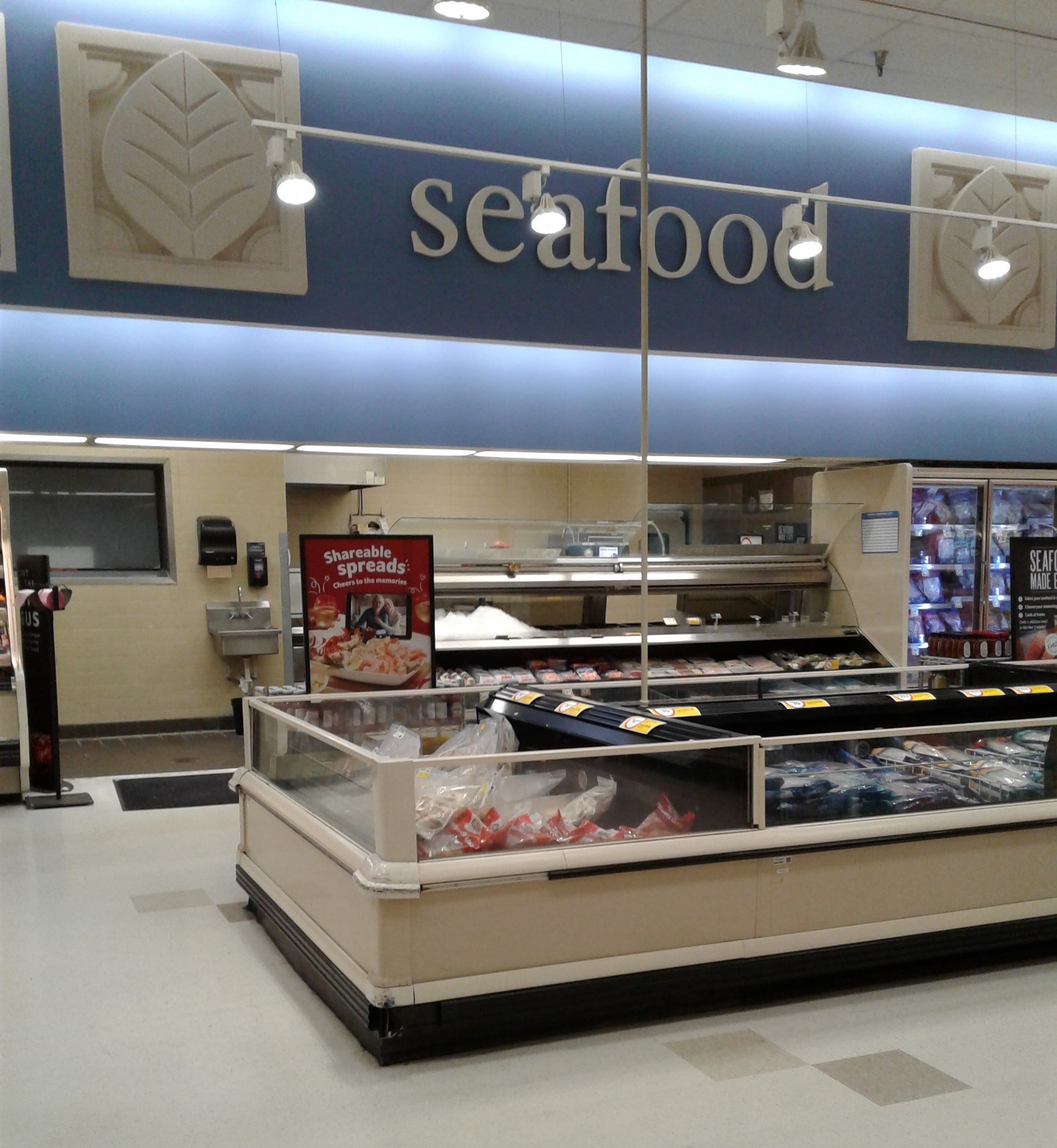
    The service seafood counter follows the deli to the left, although the decorative spotlights always find a way to get the best of me and obstruct my photos somehow!


     Leaving the seafood counter, we find ourselves in aisle 3, home to candy and a variety of non-food products (greeting cards, stationary, etc.). The side of the aisle with the candy and stationary was lit from above, which is a bit unusual (as Winn-Dixie typically reserves these top-lit aisles for beauty/cosmetics).


     Following that aisle, we now meander over to the soda aisle, home to both the national brands (on the left) and Winn-Dixie's famous line of Chek products (the large selection of which is to the right). Winn-Dixie has one of the most elaborate store brand soda selections out there, and Chek has always seemed to be a very strong brand for them with a large following. 


     Returning to the front of the store, here's a quick look across the front end. The check lane lights in this store used the recolored version of the Purple/Maroon style lights, leading me to believe this store had an earlier Post-Bankruptcy remodel (2007/2008-ish). Later Post-Bankruptcy stores used a different style of lane lights, which looked like this.


     Cutting down another grocery aisle, we move from the front of the store to the back again:


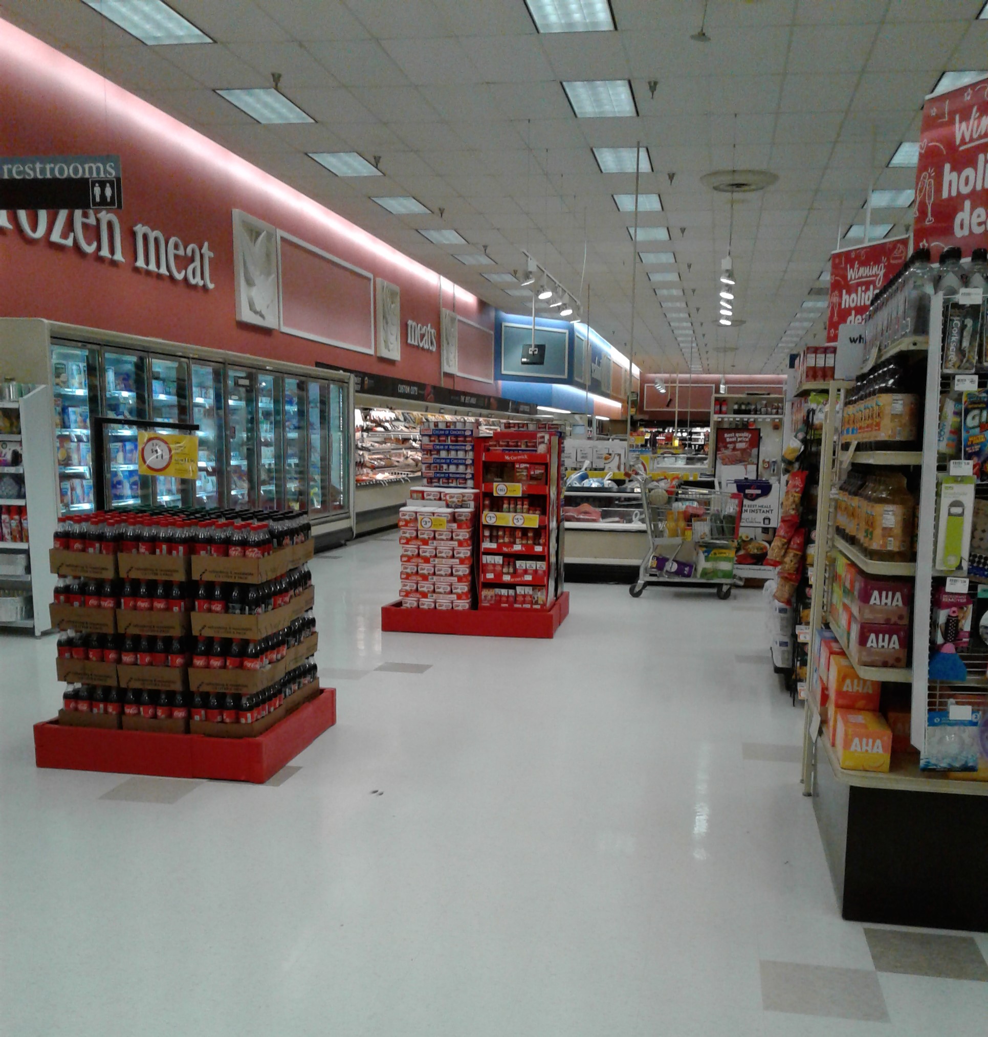
     Following the seafood counter, we find the meat coolers. Beyond the regular meats are the frozen meats, followed by lunch meats, meaning we have all of our meats well represented here!


     Frozen foods are located in the center of the store, still featuring the original Marketplace-era setup of two rows of upright freezers with a row of coffin coolers down the middle. Some Winn-Dixie stores replaced the coffin cooler in the middle with more upright freezers in later remodels, but that was not the case here.


     Both frozen food aisles are officially unnumbered. The aisle count goes from 5, skips frozen foods, and jumps to 6 after these two aisles (which is something I've seen Winn-Dixie do a number of times before).


     Moving past frozen foods, we now find ourselves in the pet aisle.


     At the end of the pet aisle was a small clearance rack with a few odds and ends on it. One item on the rack that jumped out at me was this Christmas advent calendar for dogs. It's not the product itself that caught my attention (dogs have every right to an advent calendar as humans do!), but it was where this product was intended to go that stood out to me - there were 4 or 5 of these advent calendars on the clearance rack, and there were all labeled with price tags for Ross Dress for Less! While it's not uncommon for supermarkets to get cases of store brand products intended for other stores (like these Whole Foods branded soap bars I spotted at a Winn-Dixie in The Villages), getting product intended for sale at Ross confused with product intended for sale at Winn-Dixie is an odd one!


     From pet products, we now move along to health and beauty in aisle 7. In this aisle, we can see another row of top-lit shelving over the cosmetics, the more common place to see this setup.


     Food items reappear here in aisle 9, as we get closer to the left side of the store.


     Chips and snacks find their home in aisle 10, the store's second to last numbered aisle.


     Dairy occupies the store's last aisle, also unnumbered, which is a double-wide aisle with a few open coolers of product lining the center.


     From the back left corner, here's a look at everything we've seen so far along the store's back wall.


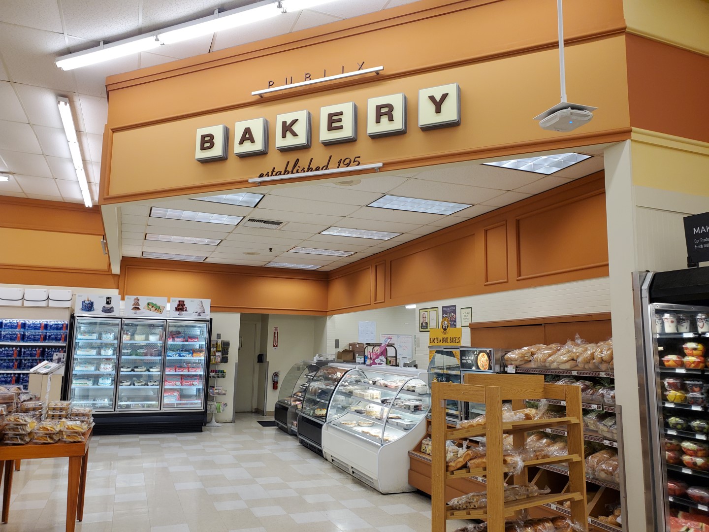
     The coolers in the middle of the dairy aisle look to be original to the store's 1994 construction, just repainted to match the newer decor (as I can clearly picture what those would have looked like originally). In the background of this image we see the store's bakery department poking out, which we will take a closer look at now:


     As usual for a mid-1990's Marketplace build, the bakery is located in the store's front left corner. Also as usual, the spotlights have to find a way to obscure the wall sign on me!


     The spotlights aren't doing me any favors from this angle either, but we do get a closer look at the bakery counter in this image.


     Stepping further out, here's a nice overview of the store's front left corner.


     Next to the bakery is the store's former pharmacy counter, blocked off by some shelving and a good number of folding chairs. Even with all that, it's still pretty obvious what used to be here, as Winn-Dixie never bothered to repaint the walls or remove the decorative panels to either side of the old pharmacy sign.


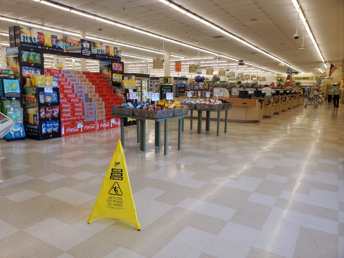
     Returning to the front end, here's a nice overview of the store's 7 check lanes.


     I got some pretty nice shots of the store's front end, as well as the "Thank you for shopping your neighborhood Winn-Dixie" sign over top. I guess visiting a store first thing in the morning when hardly anyone is around has its perks for getting some good, unobstructed sightlines (and having no decorative spotlights around helps with that too!).


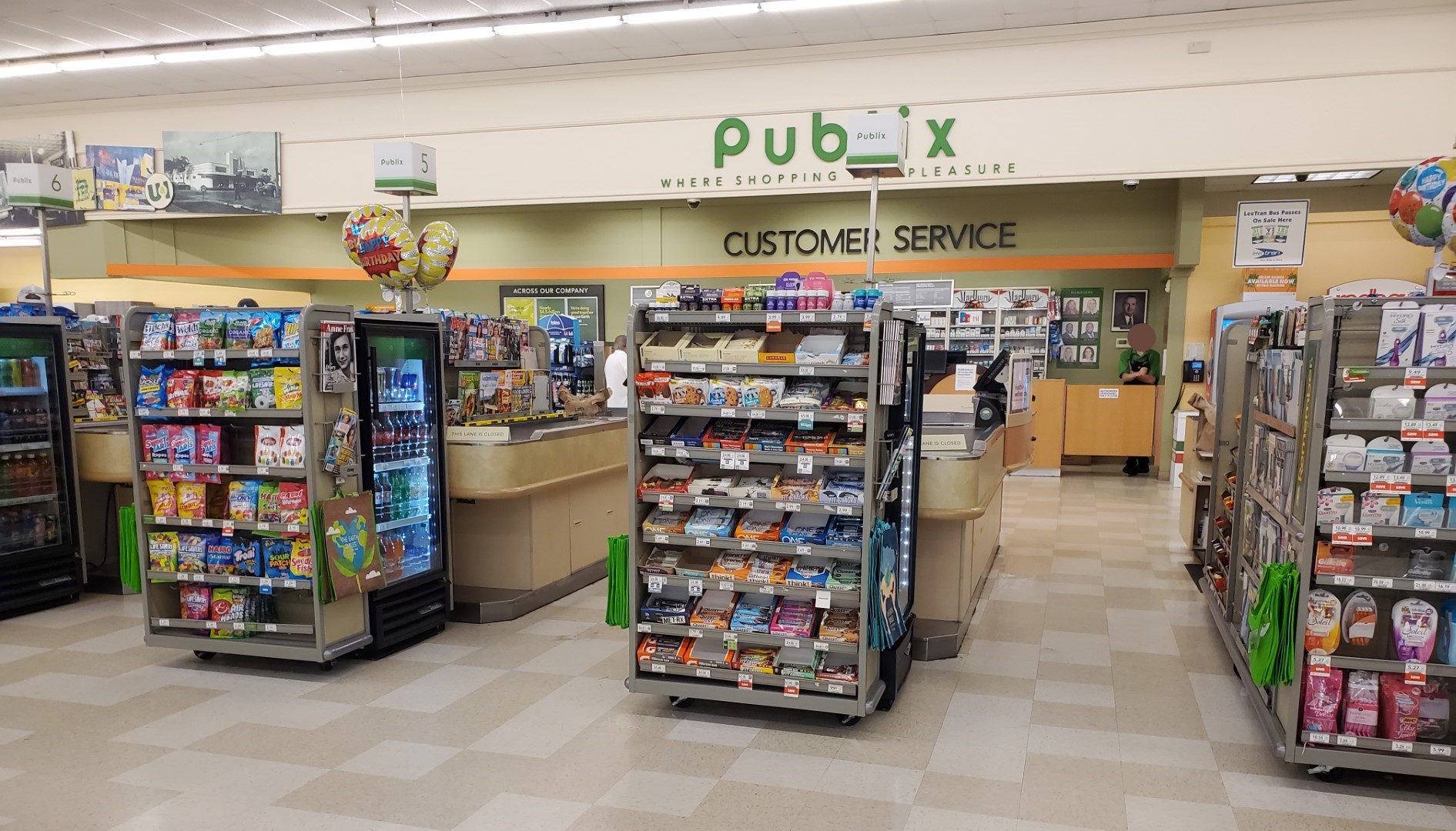
     The store's service desk is located on the wall between the check lanes and the former pharmacy counter, the usual placement in these 1990's-built Winn-Dixie stores. The original entrance would have been in the corner just behind the service desk, where the 5 gallon water jugs and the vacuum rental kiosk are now.


     Back outside, here's a look through the small breezeway on the front of the building. This breezeway looks behind the original slanted (but now straight) wall that gave the "inverted check" stores their distinctive look. Looking through the breezeway, we see the small strip of stores attached to the building's left side.


     And with that, here's one final exterior photo of Winn-Dixie #179 and its unique (now modified) facade to wrap up this post with. If you haven't seen it yet, be sure to check out my accompanying debut post on the Sing Oil Blog here, profiling the former Sing Oil station located in front of this Winn-Dixie store.

     So that's all I have for today. I hope everyone has a happy and joyful Christmas, and I'll be returning to AFB with new posts beginning on January 15th!

I'll see everyone again in the new year, so until the next post,

AFB

Tuesday, December 6, 2022

Publix #1331 - Fort Myers, FL


Publix #1331 | Former Albertsons #4413

San Carlos

16950 San Carlos Boulevard

Fort Myers, FL 33908-1224

A Classy Collaboration: A Companion to This Week's Albertsons Florida Blog Post & This Saturday's Sing Oil Blog Post


Some of you may have seen it coming, but today marks another special day for the retail blogging community.  As one of my friends described it, this is quite possibly "the hottest crossover event since 'That's So Suite Life of Hannah Montana'".  That's right, folks, today marks the second ever post collaboration featuring The Sing Oil Blogger and The Albertsons Florida Blogger as we celebrate the life and legacy of the former Publix #1331 / Albertsons #4413.  This post also marks a new milestone for my When Publix Waves Goodbye series as it is the first postmortem tour I have given depicting the store as it was during its operation; furthermore, we may get to sneak a peek at its afterlife (I'll save that surprise for Saturday the 10th).  This post also adds an entirely new level of irony to When Publix Waves Goodbye, but I'll address that point later on.  First, I want to debut the new graphics I made especially for this store:

I didn't think it was fitting to use my Wavy Pastel-style image because Publix #1331 opened on February 5, 2009 and never would have boasted those designs.  Instead, I opted to recreate the flavor of Classy Market 2.0 department signage for Meats, Seafood, Dairy, and Produce to serve as this post's branding.  I was never familiar with Classy Market 2.0 during its prime, but I've come to appreciate the influence it left behind for only being an active package from 2007-2010.  Let's dive in to see how this 52,799 sq. ft. store wound up being so notorious.


Albertsons #4413 began construction in 1994 to serve South Fort Myers and the surrounding beach communities.  It is located at the busy intersection of San Carlos Boulevard, which carries traffic south to Fort Myers Beach from Fort Myers proper, and Summerlin Road, which serves as one of the primary routes to the beautiful Sanibel Island.

Courtesy Newspapers.com - News-Press - August 30, 1994

Fort Myers is home to a rich history and hosted the likes of Thomas Edison and Henry Ford as they escaped cold winters up North.  Little did Albertsons know that they would continue the rich history of this region when they opened store #4413 on February 1, 1995.  This store was the second location for the Idaho chain in Fort Myers, with the first being #4313 which AFB covered a few months ago.

Courtesy Newspapers.com - News-Press - February 3, 1995

The crowds at the new store only seemed to exasperate existing traffic problems at the popular intersection, leading to a bridge being built across San Carlos Boulevard to allow traffic on Summerlin Road to have faster access to the beaches (and $6+ toll) at Sanibel.  The new bridge opened in 2007 which in turn obscured the store from traffic heading toward the popular destination.  This must not have bothered Publix too much considering they occupied this building for 13-years after the bridge was completed.

Courtesy the Lee County Property Appraiser - Albertsons #4413 - January 1998

I may not be as much of an expert on Albertsons' stores as AFB is, but I have gotten a feel for this prototype from the two other Publixsons of this design I have visited (here is a similar store AFB covered a few years ago).  From what I understand, Albertsons used this prototype during the mid-1990's, and Publix happily converted several of these stores to their brand following the 49-store acquisition in 2008.  Publix wanted to turn the newer stores around as quickly as they could, and it took the chain seven months to reopen this location after the deal was closed in June.  In all honesty, I'm surprised it took Publix that long to reopen this store based on what I saw on my visit; I suppose a 49-store acquisition can be overwhelming for design, permitting, and construction crews to tackle.

Courtesy the Lee County Property Appraiser - Albertsons #4413 - February 2007

Many in the area were glad to hear that the store would finally reopen on February 5, 2009, but were let down several days later when the News-Press corrected their statement claiming the store would feature a liquor store and a pharmacy.  Albertsons #4413 did operate a pharmacy, but Publix was seemingly blocked from opening one of their own due to a pharmacy located in the adjacent shopping center.  Interestingly, the current neighboring pharmacy, At Cost Rx, was only registered in the Florida pharmacy database in 2010 which could have been a result of a legal dispute with Publix over who would be granted a license.  This pharmacy proved to be a thorn in Publix's side as it is believed to be the primary reason the company delayed this store's demolition until 2022.  Allegedly, Publix wasn't going to build a new store on this site until they were granted approval to obtain a pharmacy license, yet they didn't want to remodel this store since they intended to tear it down.  These odd circumstances led to a store in-limbo with a décor package that was the last of its kind – for years.

Courtesy the Lee County Property Appraiser - Publix #1331 - October 2009

I found evidence where Publix spent an estimated $70,000 to remodel this store again in 2013, which surprised me given what we will see below.  What is even more strange is how the page lists the money as being used for an "interior remodel".  As to what this was used for, your guess is as good as mine.  It's quite possible that this went toward a back store room (since the listing mentions the space being 2,760 sq. ft.), but I have no idea what specifically it would have been for.  Regardless, I'm sure AFB will fill you in on some other details about this store that I neglected to mention; I've got to write two posts about this store after all!  Let's get this party started.


This tour was a special one for me, as it marked my documenting of six of the last seven major décor packages Publix has used: Wavy Pastels, Classy Market 1.0, Classy Market 2.0, Invigorate, Sienna, and Evergreen.  I doubt I'll ever make it to a Metallic Marketplace store (considering I don't know any to remain), but I'd say I did pretty good for only beginning my journey just over a year ago!

Since this store was pivotal to my goal, and this was the last of Publix's 1,300+ stores to ever use this décor, I took extensive notes following my trip.  We'll see some specific details pop up from me and the person who I managed to drag along with me (I'll just call them my "shopping companion" since I've already used "Sing Oil Sidekick" for a different friend).

My first impression when driving up to Publix #1331 was that it seemed to have a poor location:  I had to take an “exit” off Summerlin Road, turn right, then cross traffic to turn left to get in the parking lot. The store also seemed to be in a not-so-nice area based on the surroundings, but I suppose this could've happened after the new interchange was built in 2007. 

As I was walking up, I was greeted by a black Infiniti SUV driving around the parking lot with all of its windows down, blaring rap music.  Based on the looks of confusion from other patrons leaving the store, this seemed to be out of character for the location! 

This store still had the original Albertsons swinging doors, which looked pretty worn out at this point.  To make matters worse, it appears that one of the entrance doors wasn't even working!  I'm still shocked that these guys have hung around this long, as Publix generally installed their standard sliding doors years ago (I think former #4446 in Jupiter was the second-to-last store to keep its old doors, and it had them swapped a few years ago).

Stepping inside, I realized that this store was built using the same prototype as Former Albertsons #4441 in Pensacola, former Albertsons #4418 in Sebring, this former Albertsons in Ridgeland, MS (Thanks Retail Retell), and this former Albertsons in Houston (Thanks Anonymous in Houston).  I've only been to two of those four stores, but I wanted to include that Krogersons in my list for all of its quirks and the Food Town since it provides a rose (or maroon) tinted version of this store's original décor!

It may not be as apparent in these pictures (but maybe I'm just an optimist in that regard, I'm sure Anonymous in Houston will pick up on it), but this store felt tired in person.  It's not often that I come across a Publix in need of some TLC either, but I'm sure a large portion of that was due to Albertsons' old strip florescent lights and dropped ceiling remaining in place (14-years longer than they should have).

Although Publix may have not quite known what to do with all of the excess space in this store, we can see two small Mother's Day displays protruding from the floral department to my left.  I also happened to buy a Mother's Day card while in this store, so what a fitting coincidence (or maybe it was just because I stopped by this store in May).

Turning to the right, we see the store's checkout lanes and customer service counter.  According to Anonymous in Houston, Albertsons also had their photo counter located at the customer service desk, and formerly had their video rental department in the alcove under the American flag, while often using the space where the Redbox machine and scale are for an in-store bank.  I'm not sure what they had in this particular store, but the soffit above the customer service counter is 100% a relic left by Albertsons and seems to imply there were rooms of some sort adjacent to either side.

Next up, we'll grab a sip of water (it was a long drive from Naples) while checking out this vintage sign for Publix's carryout service (complete with Classy Market 2.0's signature orange).  We also see some of Albertsons' old paneling that has been covered up by white paint.

Just outside of the water fountain hallway, which is just to our right, was the last Classy Market 2.0-style restroom sign to remain in a Publix.  Oddly enough, this sign sold at auction for $60, which is $5 more than both water fountains sold for!  The hallway we see under the sign leads to the men's and women's restrooms off to the right, in addition to the door we see below opening to the employee breakroom.  NEXT up, beer is (obviously) located just to the left.

Turning back around, we see this store's large and eclectic isle of beach gear.  The palm trees may be a bit cheesy, but only now did I notice that there is an entire picnic table with a bottle of wine on top of the display!

Instead of having a pharmacy like I've seen elsewhere, the store just had a “Cold Beer Shrine” in the front right corner of the store.  This layout is absolutely original to Albertsons, as entailed by the trim work dating back to the chain's Blue and Grey Market interior.

Do these coolers on top of the fridge remind anyone of Winn-Dixie?

If this was indeed the store's Beer Shrine, then all of this water must be the altar for drinkers to repent at.  We can really tell that Publix didn't know what to do with this space if they had to fill it with a mountain of water like this!  That has to be at least three pallets worth!

Next, we'll turn to our left and look down aisle 16, home to magazines, baby supplies, and a greeting card alcove.  You might ask yourself why this store has such an odd configuration over here, especially since the Nine Mile Publixsons didn’t have this (don't worry, you'll get a tour of that store from me soon enough).  Well, it turns out that the magazine racks are actually standing in front of Albertsons' old pharmacy window!  Since Publix wasn't able to acquire a license for this store, they instead decided to wall off the old box and use it for additional offices (auction lots #408-#419 show the inside of this space).

Wow, this store had so many historic photo collages; if only could get a piece of one of them . . .  Specifically, this store had this cluster of old photos hanging above the greeting card section, another cluster above the old pharmacy, another cluster by the meat and seafood counter, and a final few sets in the front of the store (on either side of customer service and next to the bakery).  With all of these collages, some of the photos ended up repeating themselves.

I believe that Albertsons used the greeting card alcove to house pharmaceutical products, which makes sense considering the close proximity to the pharmacy.  Just off to my right was a door that led to the old pharmacy space.

Walking toward the back right corner of the store, we find some more Classy Market 2.0 signage! The seafood and meat departments in this store are also original to Albertsons (shocker) as Publix would have split these spaces into two with a more thorough remodel.  Seafood and meats also got their own historic pictures, similar to the ones we saw before; they had a lot of wall space to fill!

We'll take one last look down aisle 16 and see the old pharmacy box off to the left.  You can also see the top of the door to the old pharmacy just over the greeting card display.

Taking a closer look at the aisle signs, the originally white plastic seems to have yellowed over the last 14 years.  Interestingly, this hasn't been the case in other Publixes using the same vintage of signs.

Turning the corner toward the rear actionway, we find another surprise: Albertsons' circa 1994 refrigeration units.  Had Publix not installed their signs on the wall, painted the molding, or installed their Tetris-themed vinyl flooring, I'd be hard pressed to tell you this wasn't an Albertsons!

Next up, we'll take a look at the meat and seafood counter, along with their corresponding Classy Market 2.0 Signage.

Instead of wood crates, CM 2.0 signs have backings which match the department’s theme colors.  I do like this cohesive element of the package!  

Oddly enough, this store received an Evergreen-era GreenWise sign in the meat department.

It did, however, still have all of the original CM 2.0 category markers.  These are different from the CM 2.5 versions because they feature a pattern on the edge facing the wall / freezer.

To add to the oddities of this store, Publix managed to keep part of Albertsons' store layout featuring an awkward wine aisle between the meat aisle and the normal grocery aisles on the right side of the store. My “Shopping companion” said “I don’t like stores with these weird layouts, they remind me of Harveys and are confusing.”  Y'all have seen a few of my Harveys posts by now, but they often retained odd split-aisle setups which were leftovers from the previous owner.  I guess that's what you get when you inherit stores from FoodMax, Winn-Dixie, Piggly Wiggly, and Food Lion (all of which have used split aisle setups of one form or another).

I do think Publix moved their wine department from where Albertsons used to keep it next to the "Beer Shrine".  

Even better than that, I believe the endcap toppers we see here date back to the early days of Sienna from sometime around 2011; meanwhile, the wine and pet department secondary signage all hails from the mainstream flavor of Sienna.

Our next peculiarity can be easily noted while looking down aisle 8:  the lights.  It is possible that Publix rearranged aisles 9-16 but didn't want to spend the money to move the cheese refrigerator.  Regardless, the strip lights over this section of the store are turned perpendicular to the ones in the rest of the store.

We'll pop out of aisle 8 to take a quick look at the front end of the store . . .

and a glance at the customer service counter . . .

before we head back to Iceland.  Aisle 7 had a freezer door which was out of order, but otherwise looked very neat with its banners!  It also seemed to be missing a number of category signs, but I have a feeling that we will solve that mystery a bit later . . .  Didn't this picture turn out nice, if I say so myself?  Select CM 2.0 stores also received a dedicated "Frozen" department sign, but most locations just received banners similar to the ones here.

Poor freezer door!  It looks to me like Publix never bothered to fix it in the 5 months following my tour either.  I neglected to notice if there was any product on display behind the cardboard.

Let's take one last look at the Frozen banners (do they remind anybody else of a beach chair?) before we continue on with our journey.

The (liquid) dairy department, which lies between the deli and the meat department, is up next and features a calming color palette of baby blue and soft yellow.

The dairy sign has some corrugated metal plastic which hearkens back to Metallic Marketplace.  Just a PSA: that sign is much larger than it appears, ringing in at roughly 12-feet wide!  Ceiling tile math to the rescue!

So many pieces of this store may have been vintage, but I do see an Evergreen-era endcap topper next to aisle 2 which also features the most recent Sienna styling on the sides.  I also see a "Cool It. Chill Out. Take it Easy." cooler which Publix must have pulled from one of their other stores since it dates back to 2000.

Turing 180°, we'll take one last look at the rear actionway and Fort Myer's own "Mt. Coors" – the fifth tallest peak in the state of Florida! Sadly, based on its un-refrigerated state, this Mt. Coors is neither blue nor "as cold as the Rockies." Little Big Town would be so disappointed!

As usual, I remember there were several people loitering around the deli, but I still managed to get this profile angle of the space.  As should be no surprise, the lower section of ceiling dates back to Albertsons.

The Grand Aisle of this store was very large yet felt very empty (even thought it was fully stocked).   I'm still shocked at how Publix can manage the space in a 65,000 sq. ft. store that they built, yet they can't wrap their heads around stocking a 53,000 sq. ft. Albertsons.  

In other news, you might've noticed that there aren't many people in my pictures.  I generally try to avoid photographing other customers, but I didn't really have to worry about that issue in here.  My “shopping companion” said “I would love to shop at this store if I lived near here, because nobody is in here. It is not crowded at all!”  Well, there you have it – a tired old Publixsons doesn't draw the same crowds as a reconstructed 61M standing on the ashes of a Kmartsons.

Standing behind a cooler provides a good place for me to take a picture of the deli!  Despite their differences, Classy Market 1.0 and Classy Market 2.0 shared an awfully similar deli sign.

Dang, I took a lot of pictures in this store; it's almost like I knew it was endangered or something.  While we waft in the smells of Pub Subs and rotisserie chicken, now would be the perfect time for me to give a shameless plug to my upcoming surprise post!  Keep on reading this to get a good understanding of how this Publix looked in its final days but be sure to check out The Sing Oil Blog this Saturday for some exclusive coverage you won't want to miss.  Some of you may have guessed what I will cover, but I'll just say that you won't want to miss it if you haven't.

We'll head over to produce next and scope out the space along the left side of the store.  I do like how Publix embraced Albertsons' molding throughout the store and painted the insides of the boxes different colors to compliment the décor.

The store may not have been crowded, but the produce was still well-stocked.  I'd also like to note that these produce displays only date back to 2014 and must have been installed during Publix's "interior remodel" that I mentioned earlier.  Just to note, every other fixture or sign in this shot is no newer than 2009.

I just love the look of the Classy Market 2.0 produce sign and all of the dimension it has!  If only it wasn't 12-feet wide too!

It looks like Publix spent the time to remove Albertsons' old checkered accenting before hanging this sign, which adds to my theory that this remodel wasn't as cheap as it could have been.

Those leaves are pretty cool too.  At least they aren't quite as large.

Next up, we'll glance over at the bakery which is still in the original position, bearing the original trim work, from Albertsons.  Did anybody else notice that the "established" sign below "Bakery" is missing a 7?  Or has Publix been baking bread panem since Roman times?

Turning around, we get a nice overview of the left side of the store with the deli and dairy department off in the distance.

Our Classy Market 2.0 tour wouldn't be complete without a photo of Mr. George, or another display of beer (how many places can they stock it in this one building?).

We'll also get a nice overview of the front end of the store and see where the sign for aisle 1 is missing one of its category markers.  I wish Publix had advertised "Fresh Subs" on these signs in packages besides Classy Market 2.0!

I'd also like to see if you can zoom in and notice the difference between these two bakery signs:  I assure you they are different, but I didn't realize this until weeks after the store had closed.  If you really want to find out, be sure to check out my upcoming post this Saturday.

Now we'll get a better look at the floral department and its corresponding signage.

Here we can see more of the collages I mentioned earlier!  I believe the one on the right is hung over the former bank space.

We noticed where the aisle 1 sign was missing a category marker on the other side, but this side oddly enough had a Sienna-era water sign on it.  And would you look at that:  another beer display!

We'll take one last look at the former bank space to see what Publix has done with it.  It appears that they built an office here (psst. the store's safe is inside there) and found a bit more room to tack up some collage photos.  We also see something I don't recall seeing anywhere else:  a Presto! ATM inside the store.  Now you know Publix was being stingy for that to happen!

With that, we'll exit this store for what I thought would be my last time seeing Classy Market 2.0 (spoiler, it wasn't).  I'd like for you to note the tinted window located on the other side of the alcove, which happens to lead to a manager's office that overlooks the store.

I didn't manage to stop by the liquor store during this trip, but it was located at the end of this covered walkway just to the right of the store.

I'm not sure why, but the road sign seems to imply that this is "Publix Plaza" (or just "Plaza") rather than "Publix at San Carlos" as the company listed the store on their website.  Regardless, this sign dates back to Albertsons' construction of the complex and faces San Carlos Boulevard.

In actuality, Hurricane Ian's trajectory likely prolonged the existence of Classy Market 2.0 by a week or two since Publix initially planned to shutter and demolish this location in September 2022.  When I visited #1331 back in May, I asked the cashier when the demolition was planned to take place, and she said September was the intended target.  I later found more construction documents supporting this statement and was surprised when September rolled around, and Publix never published a "closing soon" notice on this store's location page.  Little did I know, a category 4 Hurricane Ian would set its sights for a landfall only a few miles to the north and devastate the surrounding area.  Maybe this was a total matter of coincidence, maybe Publix can mysteriously control the weather, or maybe an employee at Corporate had the idea to postpone this store's closure for a matter of a few days in hopes of collecting an insurance payout for the damages to this 1994 supermarket. The world may never know the true answer, but I'm inclined to think the latter based on the circumstances.  This store served its last customers on September 28, 2022, and had an official closure date of September 30, 2022.  Publix #1853 is scheduled to replace this store next year.

Here you are, next to me
So much beauty at my feet
All I wanna do is swim
But the waves keep crashing in
No, I'm not afraid to drown
Take me out, take me down
I'm so tired of the shore
Let me in, baby
You're an ocean beautiful and blue
I wanna swim in you

The waves, the waves, the waves, the waves
The waves, the waves, the waves, the waves 
- Ocean, by Lady Antebellum 

After the thought came around of a hurricane wiping out the last traces of Classy Market 2.0, all I could think of were the lyrics to Lady Antebellum's "Ocean" as sung from the perspective of a seaside Publix department sign.  Isn't it just the perfect fit!?  When Publix waves goodbye!?  AFB tried to one-up me in our last dual-post with his Avril Lavigne spinoff, but I think I have him beat this time around since I didn't even have to warp the lyrics!

I typically would be upset that a storm wiped away the last existence of a supermarket décor, but I find this case amusing (note: I in no way find the devastation and loss of life caused by this storm amusing) because Publix wound up on the right side of luck at San Carlos since they will possibly be paid to tear down the old Albertsons.  Hurricane Ian also killed off the last 1980's Winn-Dixie Marketplace, but that store also seemed like it was living on borrowed time and had seen much better days


I'll leave y'all with this photo, which happens to be one of the last pictures I took inside Publix #1331.  Some of you may be able to spot the subtle significance of this shot, but it otherwise serves as a fitting closure for Mr. George Jenkins to have kept watch over the grand aisle of this store for its entire life as a Publix.  I'm sure that can't be said about many of the company's stores!  Anyway, this is also a sneak preview of my supplementary post scheduled to go live this Saturday over on my blog, so make sure to check it out!

That will wrap up today's coverage of former Albertsons #4413 / Publix #1331, but make sure to check out AFB's post on this store if you haven't done so already, and check back on the 10th for my special surprise post.  Happy 9th anniversary to The Albertsons Florida Blog!

Until then,

- The Sing Oil Blogger