Wednesday, April 27, 2022

A Classy Conglomeration - Publix #1054 - McDonough, GA


Publix #1054

The Shops at Westridge

2158 Highway 20 W

McDonough, GA 30253

Welcome back to The Peach State!  While today we are only looking at a "modern Publix", I feel like this store serves as an example that newer Publixes can still be interesting if you know what to look for.  However, if you want to see a former Publix that is really interesting, be sure to check out my post which showcases surprisingly in-tact Wavy Pastels in 2022 if you haven't already.

This store helped me realize that Publix wasn't perfect with their Classy Market 1.0 eradication.  Even though it predominately features Classy Market 2.5 (Invigorate Bamboo), it portrays some of the strongest CM 1.0 roots I have seen in a modern Publix (barring #172, which still has Classy Market 1.0).  Something I did not realize until recently, is that Classy Market 2.5 and Sienna both made their debut in 2010, which is why both have shocking resemblances.  Initially, it seems like Sienna was designed to be the more premium package while Bamboo was designed to be a cheaper way to "re-invigorate" older stores.  That being said, I have certainly seen newly-built stores receive Classy Market 2.5 (think #1427 that I wrote about a few weeks ago).

Update: thanks to a comment below, we now have proof that this store retained Classy Market 1.0 through 2011.  We can see the edge of a CM 1.0 deli sign in this picture and the bakery here.

This particular store opened on April 13, 2006 and uses Publix's 39M prototype.  I've yet to find any distinctive differences between the 39M and the 45M, other than a few more aisles in the stores.  Maybe somebody else will notice something that I didn't!

Courtesy of Mike Kalasnik - Flickr - September 1, 2012

I didn't manage to take a picture of the cart storage area in the vestibule, but I managed to find where Mike Kalasnik did back in 2012!  I have so many memories of those old Publix buggies with the white handles; it is a shame that they are so scarce now!  I'm going to assume that this picture was taken after the store's CM 2.5 remodel but I don't know for sure.

As I have mentioned previously, I am confused as to why Publix spent the time, money, and effort to update the customer service island and pharmacy signage in Classy Market 2.5 stores while not bothering to swap out the décor.  This specific store had the late-Sienna style CS stand, which is over a decade newer than some of the other interior fixtures in this store.  I'm not sure where customer service would have been when #1054 opened, but I found pictures indicating the store previously had a round island here which was replaced around 2018.

Turning toward the right, we see the floral department and the bakery.  This store oddly received the same floral sign as a Sienna store (I guess the two packages do share a number of things in common) instead of the traditional Classy Market 2.5 sign.  Publix also managed to leave behind all of Classy Market 1.0's crown molding in the store (as was typically removed as part of the Sienna renovation).

I found a picture online which indicates this section of the store used to house the greeting cards before 2018, which explains why we see a Classy Market 3.0 floral sign!

Here we have a wider view of the front right of this store, and the small balloon display for the Super Bowl.

Turning around, we see the front end of the store, looking toward the pharmacy.

It has been a very long time since I have been to a store built during the Classy Market 1.0 era, so I forgot what sort of tile pattern Publix used at the time.  As we can see in the picture above, it looks to be a checkered beige-and-brown design (the solid blue section in the corner was added with Classy Market 2.5).

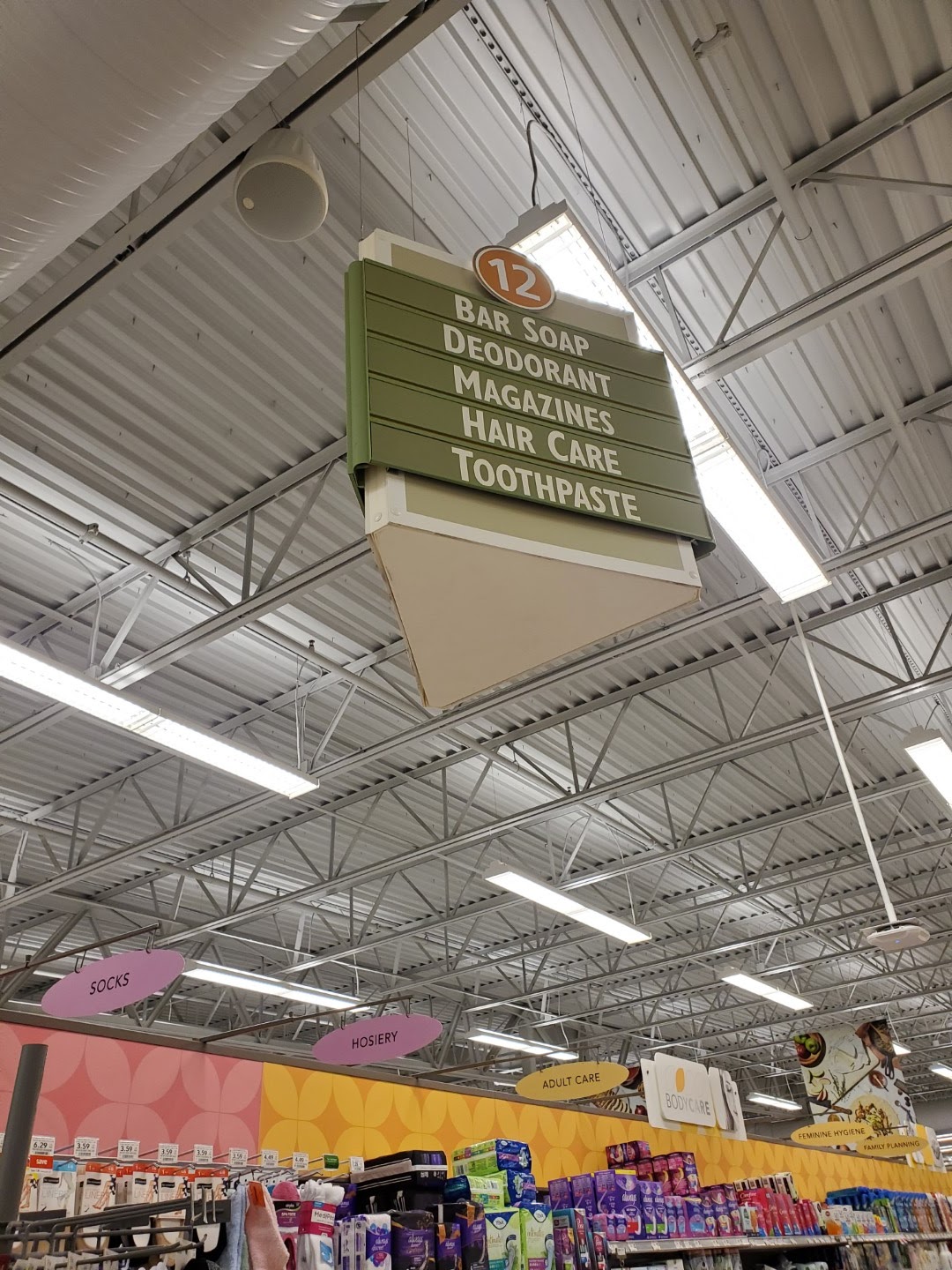
One of the first pieces of this store that I was thrilled to photograph was this deli sign.  Every other CM 2.5 store I have been to received one that matched Sienna's; meanwhile, the one in this store is a relic from one of the earlier Classy Market packages.  Just for reference, this is the only time I have been able to photograph one of this vintage and probably one of only a handful of stores to still have one on display.  The presence of this style of sign makes me believe this was a very early, or very cheap, Bamboo installation.

The other components of this store's décor that I was thrilled to see were these Classy Market 1.0 aisle markers!  I thought these were long gone from any store (except #172 that I mentioned above), but was pleasantly surprised to come across them in 2022.

Just like the 45M prototype, the 39M has the produce department located in the back right corner of the store.  All of the crown molding shows how cheaply Publix remodeled this store from CM 1.0, yet the décor still feels cohesive.

We'll take one last look down the grand aisle before we head on to the rest of the store.

But first, I wanted to mention this sign I noticed.  I love how Publix highlighted the colloquial "buggy" in their Instacart advertising.  While I grew up calling a shopping cart a buggy, I find it interesting how other regions also use this term, while others still have never heard of it.  I recently met somebody from Pennsylvania who was shocked that anybody else used the term, too.

We can't have a Classy Market 2.5 produce department without the leaf motifs!  I also noticed how Publix's "Southern Grown" branding only highlights the states which they serve.  I guess they will have to change out these signs once the first Kentucky stores open!

Publix loves to hold on to these old tertiary signs, even in newly built stores.  While the sign shown here was last revised in 2004 and this store was built in 2005, you can often find signs of a similar vintage in stores built in the last 5 years!

Looking down the rear aisle of the store, we see the meat department, followed by dairy in the distance.

Oh no, I almost forgot to mention seafood.

Aisle 2 was home to cereals and other breakfast staples.  It was also home to another cool Classy Market 1.0 sign!  If you don't know the difference between these and later aisle signs, the CM 1.0 ones have the distinct 3D section where the category markers are placed that sticks out further than the rest of the sign.  These are basically a re-colored relic of the Metallic Marketplace days.

Next up is Meats.  Nothing too crazy to see here.

We'll take a quick look at the remaining section of the rear aisle before we move on.  I'd also like to point out how this store still has the CM 2.0 era restrooms sign rather than the blue one most CM 2.5 stores got.

Here's another look at the CM 1.0 sign for aisle 6.  We also can see some of the banners which hang over the freezer section.

I also noticed that a number of stores still have this GreenWise placard over part of the meat section.  I'm pretty sure the modern GreenWise branding looks a bit different and that this sign is fairly old.

Aisle 9 is home to snacks and wine; although, I feel like most people associate eating salty snacks with beer.

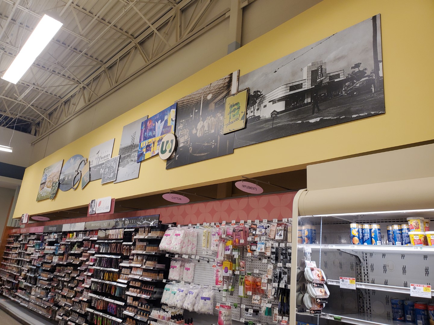
I couldn't visit a CM 2.5 store without taking a picture of the photo collage!  This store also managed to get some late-Sienna checkout cubes and pharmacy signs.  It isn't often when you can see elements from the entire Classy Market era (2004-2019) in one Publix!

The one unique thing I noticed about this store vs its 45M siblings is the absence of a few short HBA aisles between the checkout lanes and the pharmacy.  The pharmacy box shape also reminds me of what I have seen in some of the Metallic Marketplace stores, but I guess this store wasn't far removed from that era.

As we take a view back toward the portion of the store we have covered, our view is slightly obstructed by the rack of random clothing articles.  At least I got a clear view of a few aisle signs!

The only interesting thing I notice about the last aisle in the store (aisle 13) is how well stocked the bread looks.

Good thing I didn't need any cream cheese on this trip!  As a fun fact, the branding on the boxes of Publix regular cream cheese dates back to 2005 (how poetic, just like this store) and has only since been phased out over the last year-or-so.  The new branding  is very similar (and can be seen on the French Onion dip on the top shelf), but uses the "P" logo instead of "Publix" being fully spelled out in the black circle.

I just love the shade of blue Publix used on this sign, and it think it may be my favorite department sign from this package.  I also find it interesting how these early CM 1.0 stores feature the arc on the wall behind the department signs because I believe that element was borrowed from Metallic Marketplace.

What a contrast: a CM 1.0 aisle sign blocking a late-Sienna pharmacy sign!

I must've forgotten something because I ended up working my way back to the middle of the store before I visited the checkout.  At least I got one more picture of the CM 2.0 restroom sign.

I really enjoyed seeing these CM 1.0 aisle signs!

I mean I really did!  Both aisles 10 and 11 just happen to be missing a category marker; at least all of the remaining ones match.

Aisles 7 & 8 happen to look the same as almost any other Publix in recent memory.

Just some freezers, CM 3.0 category signs, and CM 2.5 freezer banners.

So curvy!

Well that wraps up our tour of this Publix with a conglomeration of interiors.  As a parting picture, we can see the the front-end of the store which features the restrooms, vending, and a few offices.

Thank you for shopping your Westridge Publix - Where Shopping is a Pleasure!  Make sure to check back soon for Whatever Daring adventure I decide to write about next (I'm all about subtle hints, and I just left you one).  Until next time!

- The Sing Oil Blogger

Tuesday, April 19, 2022

54M: The First Generation - Publix #1228 - Prattville, AL


Publix #1228

High Point Town Center

2451 Cobbs Ford Rd

Prattville, AL 36066

When I was scoping out this store, I was primarily interested in the fact that it still had Classy Market 2.5 (Invigorate Bamboo) in full display. You're probably tired of me mentioning my enjoyment of this décor, but I feel like I am drawn to these stores because they offer something (slightly) different from Sienna and are becoming more-and-more sparse. Although Publix still has 5 décors in the wild, two of those are only in one store each at the time of this writing (Classy Market 1.0 & 2.0), one is dwindling by the day (Bamboo), one is seemingly everywhere (Sienna), and one is on the rise (Evergreen). Other than it still having the 12-year-old interior, I thought this store would just be a standard 45M that didn't look different from practically any other Publix built since 2004. It was only after I was doing some research that I realized this store was closer to 54,000 sq. ft. – not 45,000. I was very confused because I had only known about the current 54M prototype, introduced in 2010, which was not what I saw in this store. After discussing it with AFB, we realized that Publix actually had a first-generation 54M prototype that was used in a few other markets besides Prattville. Now that you know there are two-generations of the 54M (with second-gen stores being much more common), let's take a look at one of the experimental first-gen stores of this prototype. Moreover, if you need a refresher on all of Publix's prototypes, here is a list I have recently compiled.

Publix at High Point Town Center was announced in August 2007, and opened for business on October 22, 2008. Many residents were excited to "not have to cross the river" to get to their favorite grocery store, which was part of a larger development including Bass Pro, Belk, Best Buy, and J.C. Penny, among others. The Prattville Publix is also located only several-hundred yards from the Autauga County line in Elmore County, Alabama. Being the only Publix in either county, this store serves most of Montgomery's northern suburbs facing competition from Aldi, Target, Walmart, and Winn-Dixie (expect a post about this store soon).

Although this Publix has stuck around, the Best Buy next door closed, and the adjacent shopping center largely feels like a ghost town. Other than the major anchors and a handful of other stores, many of the spaces look like they have been vacant since construction was completed over a decade ago. I guess that shows what impact the recession had on brick-and-mortar retail!

We'll begin our tour by looking one of my favorite aspects of Classy Market 2.5: the historic collage! Even better for me, this store had three collages. While I'm not certain whether this store opened with Classy Market 2.0 or 2.5, having opened in 2008, I feel like it originally had CM 2.0 and was remodeled to CM 2.5 around 2012.

Welcome to Publix!

Something I noticed in the vestibule that I thought was odd was a small section of the floral department's tile pattern surrounded by the typical green vestibule tiles.  It looked a little haphazard to me.

Now that we are inside, welcome to the Valentine's Forest!  If anybody forgot when the holiday was, Publix says there is "Always Something There to Remind Me."

Fast forward several months, and we see a much less love[ly] grocery store. Only a few graduation balloons and a birthday inflatable.

Going back to February, we get a slightly obstructed view of the customer service desk.  Although Sienna and Bamboo were introduced in the same year, I find it interesting that only the latter used the rectangular Publix logo in the décor.

Spinning around, we see that the floral department was ready for its time to shine during its busiest season of the year. I have always thought the signage was interesting, but two aspects throw me off: why is the floral sign a different shape than every other department, and why is the green background so bright? It looks almost neon! Even when looking up the aisle from the rear of the store toward the department the sign is very noticeable; I guess there is "always something there to remind me" that this section exists!

Bullseye! I typically avoid taking pictures in the restrooms (for obvious reasons), but I find the tile in here interesting since they alternated the yellow tiles with white tiles inlaid with olive green squares. I do wonder how they cut square openings into these ceramic tiles without breaking them.

Classy Market 2.0 and 2.5 were full of fun tile patterns, and I wanted to highlight this one which is found to the right of the bakery counter.  I feel like this particular one will mesh well with Evergreen, but only time will tell!

While speaking to a bakery employee, I learned something about the cake cooler on the right. I was looking for a small Chantilly cake I had seen in another store and asked if there were any in stock; the employee informed me that each Publix store gets to select one "premium" cake offering to be sold in small quantities, and this store's chosen cake is chocolate ganache. Although a store may not offer a small portion of a specific cake, a larger portion can still be ordered.  "How Bizarre!"

Zooming out a bit, we catch a glimpse of the bakery's third tile pattern (the cream and brown one).  We also see a giant inflatable bear — I love it!

We'll take one last look at Balloon Land before we venture over to the Vault of Sliced Meats.

As typical with the 45M stores of this era, this 54M got an arched ceiling over the deli counter.

The Valentine's Forest even managed to encroach on the specialty cheeses near the deli (what an invasive species). The cubic balloons are quite interesting.

Looking back down the grand aisle, we can really see how this first-gen 54M differs from the second-gen prototype.  Currently, we would be overlooking the produce department as we glance at the bakery off in the distance, but instead we just see a few tables of sale items and a shelf of water and drinks.  If you need a refresher on a second-gen 54M, check out this post.

And now we exit the deli and pop (corn) into the produce department. The produce in this store was well stocked, and the lighting and layout of the department make it a very inviting space for customers. I am not a fan of the bright orange, green, and yellow tile in the Service area; this is definitely one section they could have toned down a bit.

If you didn't recognize it already, the produce department is laid out almost identically to Publix's 45M prototype.  The CM 2.0 designers also decided to give us a reminder of their long-gone Metallic Marketplace package with the corrugated metal panel above the lettuce.

Leaving produce, we see my favorite category marker for aisle 1: "Fresh Subs," (AKA the world-famous Pub Subs!)

Next, we'll take a look at seafood. I love the curved bamboo behind the department sign because I feel that it continues the wood-grain signage trend from the produce department while changing it up to fit the theme. It also resembles a bamboo sushi mat. One other detail in the seafood department is the tiles which resemble fish scales or bubbles. Once again, the tiles have square holes inlaid with a different color tile.

The bamboo wood texture is even continued from the seafood department sign to the restroom sign.

In addition to Valentine's Day, the meat department also decided to market to football fans; although, Rams and Bengals fans are probably few and far between in Central Alabama.

The first grocery aisle we will take a look at is aisle 5: home to pastas and sauces.

What the aisle was not supposed to be home to was grapes.  A decision was made here — it looks like someone would rather have rice with their dinner than grapes!

While aisle 6 was home to pet supplies and batteries, we will take a look at aisle 7, home to paper products and plastic bags.  The shortage of the week at this store seemed to be disposable cups and plates.

We'll take one last look at the right side of the store before we venture back to the left.

Aisle 9 is where you can find soft drinks and charcoal.

Since I have tried to target my modern Publix visits to focus on anything which doesn't have Sienna, I've photographed a number of Classy Market 2.5 stores over the last few months.  Surprisingly, Publix has spent a lot of effort to standardize all of the aisle markers in Sienna stores (even the early prototypes from 2010 or 2011), but they have not bothered to do the same with Bamboo stores.  I have seen at least seven different styles of aisle markers in 2022's selection of Classy Market 2.5 stores.  Those include one store still using the Classy Market 1.0 signs (which I thought were long gone), several stores using a variation of the Classy Market 2.0 signs we see here (this store getting the lightest green version, while some got a darker green, and others got the dark green Sienna inserts), one store featuring a Classy Market 2.5 design (similar to the one above, but the number is on a wood-grain sign rather than the 3D circle), one featuring a Sienna-era sign with a lighter wood grain number panel, and a final one featuring a flat, bilingual Sienna sign.

With all of that being said, this confusion has led to many of these signs having some degree of mismatched category markers.  If you look at the sign above, the Soft Drinks and Charcoal labels use a small-caps font while Specialty Drinks uses all-caps and has a slightly different shade of green.  This is at least one of the more subtle mismatches I have seen.

Gear for fans that are common in Central Alabama can be found on aisle 10.  Another unique find in this store is the large section of merchandise for both University of Alabama and Auburn University.  This was one of my first clues that this store was larger than a typical 45M.

Even with all of the collegiate clothes on this aisle, the sign only indicates the presence of water and powdered drinks.

The next interesting thing about these original 54M stores is the large coffin cooler in the frozen section.  Most newer 54M stores have a coffin cooler here, but it only takes up about 1/4 to 1/3 of the aisle.  Meanwhile, this one took up half the length of the aisle and had an opening where customers could move freely between the aisle of snacks and the first freezer aisle.

Our fun featured frozen product this week is a box of SeaPak battered clam strips, yum!

The actual fun frozen product I purchased on this trip was a frozen cheesecake.  Although it looks like the cream cheese shortage of a few months ago had finally caught up to cheesecake production, I was still able to continue my tradition of late-night frozen cheesecake trips to Publix.

Popping out from the end of the frozen dessert aisle, we see this store's second Classy Market 2.5 photo collage.  It seems to me like this is the version of the collage I have seen most often in stores.  We also see a few of the short first aid and OTC medication aisles in front of the pharmacy.

Looking back over the front end, we see the checkout lines and the customer service island off in the distance. 

In the front left corner of the store, we see the pharmacy (which had already closed for the night).  I find it interesting how several of the other CM 2.5 stores I have toured also received signage with the new pharmacy logo.

Another unusual aspect of this store is the entire aisle 16 is devoted to greeting cards and gift wrap.  People in Prattville must love sending cards for any occasion!  Modern 54M stores typically place the cards near the entrance to the store, not on an entire aisle dedicated exclusively to them.

Next, we'll look at aisle 18, which has a number of health and beauty products.

One thing that does resemble modern 54M stores is the presence of milk in the back left corner.

Finally, aisle 19 (a rare sight for a Publix to have that many aisles), has the remainder of the dairy department, bread, jelly, and a few more cosmetics.  Mind you, most 54M stores top out at 13 or 14 aisles.

Over the short section of cosmetics, we see the third-and-final vintage photo collage featured in this store.

I managed to get a better view of it from aisle 18, and I would also like to point out that it has a few elements we have already seen in this store.

Another featured shortage for this particular day was Little Debbie snack cakes.  How sad.

We'll take one last look at the Revlon display on aisle 19 before we head back up front.

For some reason, I think the state-themed reusable bags Publix has released over the last year look really good.  If you haven't seen them, Publix made one for each state they serve and only sell a design in the state it represents.  The side of the bag also features a motif of a state symbol (Alabama has pink camellias).  So far, I have managed to collect bags for 5/7 states, and hope to get the last two at some point.

In case you wanted to buy a balloon featuring anything except Valentine's and Super Bowl themes, you can snag a cool Paw Patrol PJ Masks balloon at the checkout!

If you are lucky, you can also snag one of Publix's older-style checkout cubes.  This store never received newer ones from the late-Sienna years or the newest ones from Evergreen.

One last look at the customer service island (and a clear view of the old "P" logo) before we purchase our cheesecake and strawberry shortcake ice cream.

I wanted to take this opportunity to mention how well the branding on Publix Premium ice cream blends together.  It is also fun to try the different seasonal flavors!

What is that I see? A 25 lb. bag of carrots? And a carrot cake!?!  I'm in no place to judge (I am taking pictures of a supermarket, after all) but I had seen this bag of carrots in a different store and wondered who would need that many?  Today I got my answer.

The customer in front of me: "I got like 20 pounds of carrots, so you want to hand me the scanner so I can leave them in the cart?"

Cashier: "No I can take them" *lifts up 25-pound bag of Publix GreenWise organic juicing carrots*

The cashier seemed about as confused about the bag as I was.  Above, we can see him struggling to scan the barcode on this apocalyptic supply of the vegetable.  I do have a theory as to why this lady needed so many orange vegetables: she had a lot white hair on her jacket which made me think she had a family of rabbits back home.  Either that, or she wants to improve her eyesight!

Regardless, she was able to appease her carrot-themed shopping desires and head back out to the parking lot.  Meanwhile, I wanted to snag one last picture of the front of store #1228.

Thank you for shopping Publix, thank you Prattville for providing an interesting shopping experience, and thank you patrons for reading my blog post!  That will wrap up this shopping adventure but check back soon for my next Alabamian adventure.  Also, make sure to check out my blog this Saturday for Part III of When Publix Waves Goodbye. If you like Publix, and want to see some Wavy Pastels, then you will certainly appreciate the post!

- The Sing Oil Blogger