


Publix #1054
The Shops at Westridge
McDonough, GA 30253
Welcome back to The Peach State! While today we are only looking at a "modern Publix", I feel like this store serves as an example that newer Publixes can still be interesting if you know what to look for. However, if you want to see a former Publix that is really interesting, be sure to check out my post which showcases surprisingly in-tact Wavy Pastels in 2022 if you haven't already.
This store helped me realize that Publix wasn't perfect with their Classy Market 1.0 eradication. Even though it predominately features Classy Market 2.5 (Invigorate Bamboo), it portrays some of the strongest CM 1.0 roots I have seen in a modern Publix (barring #172, which still has Classy Market 1.0). Something I did not realize until recently, is that Classy Market 2.5 and Sienna both made their debut in 2010, which is why both have shocking resemblances. Initially, it seems like Sienna was designed to be the more premium package while Bamboo was designed to be a cheaper way to "re-invigorate" older stores. That being said, I have certainly seen newly-built stores receive Classy Market 2.5 (think #1427 that I wrote about a few weeks ago).
Update: thanks to a comment below, we now have proof that this store retained Classy Market 1.0 through 2011. We can see the edge of a CM 1.0 deli sign in this picture and the bakery here.
This particular store opened on April 13, 2006 and uses Publix's 39M prototype. I've yet to find any distinctive differences between the 39M and the 45M, other than a few more aisles in the stores. Maybe somebody else will notice something that I didn't!
 |
| Courtesy of Mike Kalasnik - Flickr - September 1, 2012 |
I didn't manage to take a picture of the cart storage area in the vestibule, but I managed to find where Mike Kalasnik did back in 2012! I have so many memories of those old Publix buggies with the white handles; it is a shame that they are so scarce now! I'm going to assume that this picture was taken after the store's CM 2.5 remodel but I don't know for sure.

As I have mentioned previously, I am confused as to why Publix spent the time, money, and effort to update the customer service island and pharmacy signage in Classy Market 2.5 stores while not bothering to swap out the décor. This specific store had the late-Sienna style CS stand, which is over a decade newer than some of the other interior fixtures in this store. I'm not sure where customer service would have been when #1054 opened, but I found pictures indicating the store previously had a round island here which was replaced around 2018.

Turning toward the right, we see the floral department and the bakery. This store oddly received the same floral sign as a Sienna store (I guess the two packages do share a number of things in common) instead of the traditional Classy Market 2.5 sign. Publix also managed to leave behind all of Classy Market 1.0's crown molding in the store (as was typically removed as part of the Sienna renovation).
I found a picture online which indicates this section of the store used to house the greeting cards before 2018, which explains why we see a Classy Market 3.0 floral sign!

Here we have a wider view of the front right of this store, and the small balloon display for the Super Bowl.

Turning around, we see the front end of the store, looking toward the pharmacy.

It has been a very long time since I have been to a store built during the Classy Market 1.0 era, so I forgot what sort of tile pattern Publix used at the time. As we can see in the picture above, it looks to be a checkered beige-and-brown design (the solid blue section in the corner was added with Classy Market 2.5).

One of the first pieces of this store that I was thrilled to photograph was this deli sign. Every other CM 2.5 store I have been to received one that matched Sienna's; meanwhile, the one in this store is a relic from one of the earlier Classy Market packages. Just for reference, this is the only time I have been able to photograph one of this vintage and probably one of only a handful of stores to still have one on display. The presence of this style of sign makes me believe this was a very early, or very cheap, Bamboo installation.

The other components of this store's décor that I was thrilled to see were these Classy Market 1.0 aisle markers! I thought these were long gone from any store (except #172 that I mentioned above), but was pleasantly surprised to come across them in 2022.

Just like the 45M prototype, the 39M has the produce department located in the back right corner of the store. All of the crown molding shows how cheaply Publix remodeled this store from CM 1.0, yet the décor still feels cohesive.

We'll take one last look down the grand aisle before we head on to the rest of the store.

But first, I wanted to mention this sign I noticed. I love how Publix highlighted the colloquial "buggy" in their Instacart advertising. While I grew up calling a shopping cart a buggy, I find it interesting how other regions also use this term, while others still have never heard of it. I recently met somebody from Pennsylvania who was shocked that anybody else used the term, too.

We can't have a Classy Market 2.5 produce department without the leaf motifs! I also noticed how Publix's "Southern Grown" branding only highlights the states which they serve. I guess they will have to change out these signs once the first Kentucky stores open!

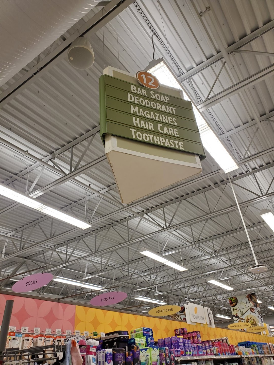
Publix loves to hold on to these old tertiary signs, even in newly built stores. While the sign shown here was last revised in 2004 and this store was built in 2005, you can often find signs of a similar vintage in stores built in the last 5 years!

Looking down the rear aisle of the store, we see the meat department, followed by dairy in the distance.

Oh no, I almost forgot to mention seafood.

Aisle 2 was home to cereals and other breakfast staples. It was also home to another cool Classy Market 1.0 sign! If you don't know the difference between these and later aisle signs, the CM 1.0 ones have the distinct 3D section where the category markers are placed that sticks out further than the rest of the sign. These are basically a re-colored relic of the Metallic Marketplace days.

Next up is Meats. Nothing too crazy to see here.

We'll take a quick look at the remaining section of the rear aisle before we move on. I'd also like to point out how this store still has the CM 2.0 era restrooms sign rather than the blue one most CM 2.5 stores got.

Here's another look at the CM 1.0 sign for aisle 6. We also can see some of the banners which hang over the freezer section.

I also noticed that a number of stores still have this GreenWise placard over part of the meat section. I'm pretty sure the modern GreenWise branding looks a bit different and that this sign is fairly old.

Aisle 9 is home to snacks and wine; although, I feel like most people associate eating salty snacks with beer.

I couldn't visit a CM 2.5 store without taking a picture of the photo collage! This store also managed to get some late-Sienna checkout cubes and pharmacy signs. It isn't often when you can see elements from the entire Classy Market era (2004-2019) in one Publix!

The one unique thing I noticed about this store vs its 45M siblings is the absence of a few short HBA aisles between the checkout lanes and the pharmacy. The pharmacy box shape also reminds me of what I have seen in some of the Metallic Marketplace stores, but I guess this store wasn't far removed from that era.

As we take a view back toward the portion of the store we have covered, our view is slightly obstructed by the rack of random clothing articles. At least I got a clear view of a few aisle signs!

The only interesting thing I notice about the last aisle in the store (aisle 13) is how well stocked the bread looks.

Good thing I didn't need any cream cheese on this trip! As a fun fact, the branding on the boxes of Publix regular cream cheese dates back to 2005 (how poetic, just like this store) and has only since been phased out over the last year-or-so. The new branding is very similar (and can be seen on the French Onion dip on the top shelf), but uses the "P" logo instead of "Publix" being fully spelled out in the black circle.

I just love the shade of blue Publix used on this sign, and it think it may be my favorite department sign from this package. I also find it interesting how these early CM 1.0 stores feature the arc on the wall behind the department signs because I believe that element was borrowed from Metallic Marketplace.

What a contrast: a CM 1.0 aisle sign blocking a late-Sienna pharmacy sign!

I must've forgotten something because I ended up working my way back to the middle of the store before I visited the checkout. At least I got one more picture of the CM 2.0 restroom sign.
I really enjoyed seeing these CM 1.0 aisle signs!

I mean I really did! Both aisles 10 and 11 just happen to be missing a category marker; at least all of the remaining ones match.

Aisles 7 & 8 happen to look the same as almost any other Publix in recent memory.

Just some freezers, CM 3.0 category signs, and CM 2.5 freezer banners.

So curvy!

Well that wraps up our tour of this Publix with a conglomeration of interiors. As a parting picture, we can see the the front-end of the store which features the restrooms, vending, and a few offices.

Thank you for shopping your Westridge Publix - Where Shopping is a Pleasure! Make sure to check back soon for Whatever Daring adventure I decide to write about next (I'm all about subtle hints, and I just left you one). Until next time!
- The Sing Oil Blogger
Hi Sling, this is a cool post and it's interesting that this store has 2.5 (#599 also still has 2.5 btw). 1. I have post ideas for you on your own blog. A new Publix series about Closed GA stores (#460 (definitely check out that one), #558, #661, #476 and maybe a few others), and a page of a list of Publix Closed GA stores and a page on Publix interior models. Also, Westridge did have 1.0 according to here
ReplyDeletehttps://flickr.com/photos/pepsicopublixteam/5376568206/in/photolist-9c7zSC-9c4vo6-9c7zWo-9c7A3q-9c4v72-9c4v4p-9c4vgz-9c7jpQ-9c7jqN-9c4eDx-9c7jr5
*Sing, I didn't mean to say Sling, I'm confusing Sing with Sling, my bad
DeleteThank you, I'm glad you enjoyed the post! (and I guess you have been watching too much Sling TV, lol). I came across #599 a bit ago and wondered whether it still had CM 2.5 or rather I would be tricked out by a last-minute 2019 Sienna install like what happened with #720. I'll certainly have to add that to my list of stores to visit because it looks like it has an old edition of CM 2.5 similar to #1054. I really wish I could be around when one of these stores gets a remodel because I would love to see one of those CM 1.0 aisle signs up close!
DeleteThat is a neat idea to consider! I still have a backlog of stores that I would like to work through, but I can keep those former stores in mind during my travels. I wanted to cover #477, #520, and #535 (you can find them here: https://singoil.blogspot.com/p/more-than-convenience.html ) first since those were still supermarkets and had a number of Wavy Pastels pieces remaining; now that I have finished that series, I can move on to other stores. I am currently compiling a list of current and past Publix stores, so expect that to be released sometime in the near future. I currently have 29 closed Georgia Publixes on my list, and I have photographed a couple of them in addition to the three I mentioned above. #460 would be a really cool store to see; I just have no idea when I would be able to make it to Statesboro to visit. Additionally, I would hate to make that drive only to realize the inside had been gutted or I couldn't see past the trapezoidal vestibule through the second set of windows. I feel like somebody needs to go on a real estate tour to really get some documentation on that store! I believe #558, #661, and #476 have all been stripped of most of their interiors, but you never know what you might see.
Thanks for the link to the Pepsi page! I had seen that a while ago but forgot how much good stuff they have posted.
I actually don't have Sling TV XD but that is a funny coincidence, I possibly thought there was an invisible L. Also, about the interior page, I was talking about a page on your blog for Publix interiors overall (Like Wavy Pastel and the Classy Markets) as a similar page to the store models.
DeleteAh, yes. I read that the first time I looked over your comment but forgot to mention it in my reply. I've thought about making an interiors page, but don't want to duplicate work that others, such as AFB, have already done. I may ask him if we can work together to add some information to his page. The reason I went ahead and created a store models page is because I wanted to go into much more detail than anybody else.
DeleteAlso, hopefully I can make it to #599 before it remodels because it looks really neat. If you find out when it will remodel or see that it is in progress, please let me know! I'd definitely try to change my plans for a chance to get some old signs.
I do like this Publix store better than I liked the previous one you showed from Alabama. The meat department looks a little more finished without those exposed ducts. The ducts in the ceiling of the frozen foods department does look quite industrial looking. It really does make the place look like a factory rather than a store, but in general I prefer drop ceilings anyway. But, yeah, this store generally has a pretty cheerful feel to it. It's a bit more Albertsons-like in some ways than a more modern Publix.
ReplyDeleteHere in Houston, people refer to carts as, well, carts. I do think 'buggy' is not unusual in Louisiana though and so it's not a completely unheard of term here as there are a lot of people from Louisiana here, but cart is certainly the term that people use here.
These CM 1.0-built stores do look nice where they cover up the refrigeration ducts along the walls. I'd also imagine that flat sheetrock is much easier to remodel without all sorts of ducts and pipes in the way! Dropped ceilings can look nice (in smaller stores like #476), but can also make a store feel claustrophobic like with Publix's 56D prototype stores. At this point, I am so used to seeing warehouse ceilings that I barely notice them.
DeleteI guess that makes sense for "buggy" to be more of a Southeastern term and not stretch into Texas. Louisiana still seems to share a number of characteristics with the rest of the Southeast but I feel like Texas tends to have its own identity. It is crazy how colloquialisms vary by region!
Publix makes it so convenient for me when buying supplies for my afternoon wine and potato chips snack! I need something now that Winn-Dixie decided to put the champagne and orange juice on opposite sides of the store! :)
ReplyDeleteThis store had to get one of the earliest CM 2.5 remodels from 2010 or so, as the deli sign and the banners over frozen foods were carryovers from CM 2.0. CM 2.5 (and to an extent, CM 2.0) remodels certainly weren't as extensive as the later CM 3.0/Sienna ones were, so it makes sense that CM 2.5 was intended to be the "cheap" decor package with Sienna reserved for the fancier stores, especially since both debuted the same year. Just seeing the remnants of the CM 1.0 decor on the walls is pretty rare, especially since CM 3.0 remodels wiped all of that away. For a newer store, this is certainly on of the more interesting examples with all the random eras of Classy Market decor strewn about in here!
I know, how dare Winn-Dixie ruin your mimosa plans! At least this Publix can help to keep your afternoon snack cravings at bay!
DeleteI agree, I feel like this store had a really early CM 2.5 remodel, and it is interesting how some of the early stores got some CM 2.0 leftovers (like the freezer banners). I've seen a few other 2.5 stores with the banners, but also just noticed how a 2014 CM 2.5 store like #1427 didn't get them. Luckily, I've been able to make it to one more store with a deli sign like that, so keep an eye out! I certainly did enjoy seeing so many eras of Classy Market in one place.
I'm pretty sure "buggy" as well as "basket" are used pretty commonly in my region, but I'm just a "cart" guy myself!
ReplyDeleteWell yes, but the Instacart shopper's gonna need a buggy too!
DeleteTypically I think of a "basket" as the hand-held ones that you get for only a few items. Although, I think I have heard the term used for one with wheels before. I guess it feels more normal for me to say "buggy" but to type "cart" or "shopping cart" – who knows!
DeleteBattery Mill, you do have a point there!
Delete