Publix #172
4601 9th St N
Naples, FL 34103
A Classy Collaboration: A Companion to This Week's Albertsons Florida Blog Post
Update (October 16, 2023): Plans have been put out for bid for Publix #172's replacement, store #1782. Scroll down for more details.
Some Background
Today brings a first (at least as far as I am aware) to the retail blogging community: one day, one store, two bloggers, & two tours. You'll typically see me and my friend The Albertsons Florida Blogger covering vastly different territories across the Southeast, but today, my friends, we will both cover the same. exact. Publix. Although this isn't quite the same as History Channel's 2011 mashup between American Pickers, Pawn Stars, and American Restoration, or Tom Petty and Stevie Nicks teaming up for "Stop Draggin' My Heart Around", you'll still get the chance to compare the perspectives of your two favorite bloggers head-to-head. That being said, I'd invite you, and encourage you, to check out AFB's post here if you have not done so already!
It turns out that both of us couldn't resist the temptation of seeing Publix's last Classy Market 1.0 store to remain open, so both of us made the pilgrimage to today's store independently. As we were discussing our visits, I brought up the possibility of covering the store from our own perspectives and coordinating our posting schedule to make both go live on the same day. AFB was intrigued, so we decided to give it a try. If y'all end up liking this format, maybe we can see what other collaborations we can pull off . . .
Some History
Now that you know why both of us are writing about Publix #172 today, let's take a look at how this store came to house the oldest example of an active Publix interior. The first thing I want to discuss is the fact that this was not Publix's first store #172; the first location I'm aware of to use this number was in Bayonet Point, FL, and opened in 1972 as Publix's #175th store. That particular location closed in December 1985, freeing up the number to be recycled for another store (as was common practice at the time). Publix was notorious for recycling store numbers up until the mid-1990's, when they finally began to issue brand new numbers in the 400+ range. All was fine and well until they decided again to reuse numbers between roughly 2002 - 2004 as they were approaching the 900 store range (which was reserved for the Crispers chain). Thankfully, Publix decided to cross the 1000 threshold in 2005 and has since given each new store a unique number. Maybe they reverted back to their old ways around 2002 due to a computer system which couldn't handle four-digit store numbers? Could this have been Publix's very own version of the Y2K bug (just a few years delayed)?!
Anyway, the second Publix #172 opened on August 28, 1986 – nine months after the original store #172 closed. I'm not super familiar with Publix's older Florida-exclusive layouts, but I believe the 42E prototype which this store utilizes was retired shortly after this store's opening in favor of the similar 42N design (here's a video from a different 42N store), with the last 42E opening in 1988. The key difference between these two 42,000 sq. ft. floorplans (which you can read more about here) is how the front end of the store is configured. While the newer configuration utilizes a split vestibule setup, separated by the customer service desk and several upstairs offices, the older 42E stores have a single vestibule in the center of the store, and a customer service desk located on the right wall of the store.
 |
| Courtesy Newspapers.com - The Naples Daily News - August 27, 1986 |
According to the Publix Blog, the chain continued to refer to its in-store bakeries as the "Danish Bakery" until 1993, which is much longer than I had imagined. However, contrary to the Publix stores of yesteryear, the 42E stores featured the bakery in-store rather than in a separate storefront.
Throughout this Publix's 36-year life, I'd imagine it underwent two interior remodels. I believe it opened with the Florida's Market interior package (which is my generic name for Publix's 1980's decor that featured a number of Floridian references. It actually could've been multiple packages, but here is a tour of one of them), was remodeled to Wavy Pastels in the mid-1990's, and was remodeled to Classy Market 1.0 between 2004 and 2006.
For this location to be the longest run of any current Publix to have not been remodeled, the store is in a very fancy area. For those who haven't been to Naples, it is known as being an upscale resort area on the Gulf of Mexico. As a testament to that, the property this shopping center is located on sold for close to $38 million in 2018, leading me to believe the rent for this store is not cheap!
Speaking of not being cheap, I was walking to get lunch near the downtown when I noticed a fancy car parked next to me. I certainly have seen a Bentley before, but I may come across one once a year. It was no surprise to me that I saw one in Naples, and the owner must not have been too concerned about parking it there since he or she even left the roof down!
The Store
Now that you have learned why this Publix is so significant, let's dive into this tour and check out #172! Just as a preface, I took extensive notes on my journey back home with the intent of never writing a full post on this store. I ended up turning those notes into the basis for today's post, so hopefully nothing ends up sounding too disjointed!
Based on what I mentioned above, this store is in Naples, so of course it is going to
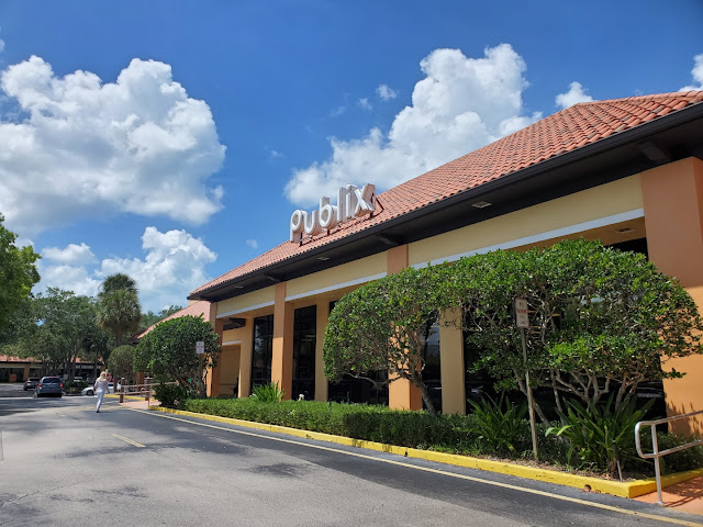
be nice! Located just off the famous Tamiami Trail, Publix #172 was
built with the Spanish-inspired version of the typical 1980’s façade and matches
the remainder of the shopping center. It reminded me of
something that would be on St. Simons Island, GA, with all of the established trees and the quaint parking lot. I feel like it has far too much character
to be torn down! The beautiful May weather only seemed to improve the aesthetics as well!
In contrast to many modern Publixes built today, this store's façade feels much less imposing and much more approachable, so let's quit blabbering about it and approach the store!
Unfortunately, I didn't find any tile murals on the outside and only saw stucco gracing the exterior walls. Since I'm not very familiar with these older Publix stores, I don't know exactly when the Patty Mills murals fell out of fashion, but I believe the last ones were installed in the early-1980's.
Although I didn't find any tile murals, I did find a small storefront adjacent to the Publix, just to the right of the store.
Just inside the vestibule
was a small storage area for a few carts and the typical Toledo scale. No signs of Classy Market 1.0 here. Part of me is surprised, however, how every buggy in this store looks to be the newest chrome style used by Publix (they have since switched to powder-coated grey ones of the same design). No white-handled carts here either. For some reason, I still come across those old friends every now-and-then.
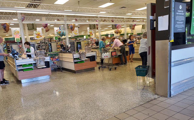
The first thing I noticed when I made it to the sales floor (besides the old décor) was how all of the registers still had the 1990’s trellis lighting fixture above them, which also incorporated columns for wire-runs to the cash registers.
If you look off in the distance, you can also see a small mirror above the awning for
the customer service desk. I can't imagine that this would be a window
to a second story office space, so I wonder if it just has cameras
mounted behind it to look over the registers. Any ideas?
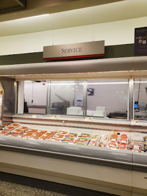
As with most of the 1980’s stores, the restrooms were located in the front right corner, sandwiched between customer service and the greeting cards section. While the store kept some of its wooden paneling surrounding the perimeter from its “Florida’s Market” days, it still had a decently thorough Wavy Pastels remodel since it received awnings over the customer service, meat and seafood counters.
Other than the
front end, the layout of a 42E is very similar to that of a 42N or 49N store. I do wonder why Publix continued to build 42E stores for two years after the 42N made its debut in 1986. Maybe the 42N was a more premium model?
Don't get me wrong, I was thrilled to be able to visit this store, especially since it was a key piece in my documenting of every Publix décor package used since 1990 (well, every one except for Metallic Marketplace). However, the only thing which could have made this store better was if Publix had not installed their post-2016 Sienna checkout cubes! I have no clue why they would bother swapping those out when the rest of this store was stuck in 2004, but they did. Fortunately, somebody managed to get a picture of those original to Classy Market 1.0 here & here, with a closeup of the express checkout cube here.
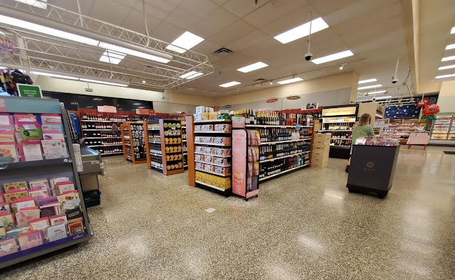
Taking a look across the front end, we see this store's small greeting card section in the front right corner, with the registers and wine department off in the distance. Although I'm not entirely sure, I believe the primary decorative function of the lighting trellis was to provide more light over the checkout lines and provide a space for banners like these to be hung. The larger stores had a different style of trellis which featured canvas-covered light fixtures over each checkout line.
Surprisingly, the store was not very crowded when I visited, but the customer service counter had quite a number of people buying various things from the department. I just wish I could've gotten a better picture of this sign from straight on; I was trying to be stealthy with my photography and dodge all of the people! At least this angle gives us a good look at the 3D nature of this sign!
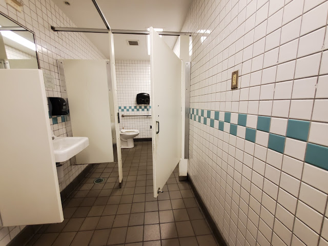
If you have read many of my previous posts, you may notice how I don't usually post photos of restrooms (I try to avoid stinky situations). However, one of those exceptions happens to be Publix #172. To most people, the picture above may just look like a (thankfully) empty restroom, but I see something much more interesting.
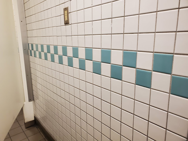
By now, you should know that I love looking at tile patterns in stores – not because I particularly like the way they look, but more so because they can provide a wealth of insight into a building's history. I will say that I am not familiar with this particular teal pattern, but I believe it is original to this store's 1986 opening and the décor Publix was using at the time. You may remember that different color variations of this pattern were used by Publix with Wavy Pastels, Metallic Marketplace, and Classy Market 1.0, for at least the next two decades. It is simple, but it seems pretty timeless!
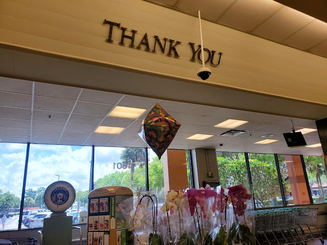
While Publix may promise that they will give you a free item if the scanned price exceeds the shelf price, I promise that this sign is very vintage! This guy was hanging over the water fountain, just outside the restroom, proudly displaying the serif font Publix used from approximately 2002 until 2007.
We'll next take a look down the right side of the store, with a shot that shows us some interesting contradictions. For starters, we see the obvious Classy Market 1.0 décor elements and signage set off by a standing sign with a post-2018 Apron's logo and a green CM 3.0 endcap topper. Additionally, we still see the track lighting mounted under the awning, which has typically long-since been removed from an updated store, in contrast to a modern NFC-enabled credit card reader at the customer service desk. For context, just remember how cell phones with retractable antennas were all the rage back in 2004 and not modern smartphones capable of replacing your wallet.
Continuing on, we see Dairy lining the right side of aisle 1, along with the typical Classy Market 1.0 accents. This store also looked like it was still set up to have a dedicated GreenWise section on aisle 1, even though those products have since been distributed to the rest of the store. This space was now occupied by beach supplies.
Although much of the paint did look nice, there
were a few water stains along aisle 1’s perimeter wall. If you look above the faux window closest to us, you can see the water stain on one of the ceiling tiles.
I found it odd how the CM 1.0 lettering had a “marbled”
pattern on it. While this is very dated, it still looked nice! I'd also like to point out how each department has its own subtle accent color (Dairy's happens to be yellow). Unfortunately, it looks like this store either removed its category signs on this aisle or the aisle never received them, but they also would have used yellow for an accent color.
Moving further down aisle 1, we see the cooler dedicated to GreenWise products on our left and the aisle sign indicating how this section of the store used to be home to the GreenWise department in addition to the standard eggs and milk.
Let's take one last look down aisle 1 toward the customer service counter. I'd like to point out how it looks as if the sconces on the wall are purely decorative and don't light up. I wonder if they were always this way or if Publix gave up on changing out the light bulbs in these fixtures?
I also want to note how this terrazzo is darker than what we typically see in a modern Publix. During the 1980's, it seems that Publix used this darker color around the perimeter of the store while reserving the lighter terrazzo for the grocery aisles.
If you didn't get your fill of vintage signage above the water fountain, I managed to spot a tertiary trio of Classy Market 1.0 signs in the store's back right corner. Here we see ones for the "Publix Guarantee" and "Publix Carryout Service" in addition to another copy of the sign for the checkout promise we saw earlier.
I
found it interesting how the rear aisle of the store was wide enough to
receive coffin coolers down the middle, while some 1990's 42N stores don't have space for this – maybe Publix moved all of the aisles toward the back of the store to allow more space up front in the newer model?
This store did receive a number of wall décor pieces with its Classy Market 1.0 remodel, but I was thrown off by how flat the walls were without the Wavy Pastels awnings that I'm used to seeing in newer 42,000 sq. ft. stores, or the endemic crown molding installed in newly-built CM 1.0 stores.
Who knew that #PubSubs were popular enough in 2004 to justify their own lettering! Even with Classy
Market 1.0, Publix still knew their “Custom Subs” were a hit with their clientele!
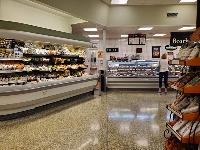
While the deli did have some customers, thankfully it wasn’t super crowded during my visit. Here we see the right side of the deli, which could've originally featured a light fixture like this (I'm not sure).
Aisle 3 was the first aisle on the right side of the store to feature the raised ceiling, which still retained its original wood paneling, just painted over.
Next up, we'll take a look at aisle 5 to snap a head-on view of the deli.
I personally like the effect of the curved deli sign, a feature which would foreshadow Publix's subsequent Classy Market 2.0 package. There's a chance that I just might be able to offer a tour of that extremely endangered décor as well . . .
This shot doesn't look all-that different from one in a Publix which has been remodeled in the last decade and a half. I've even seen that vintage Publix Deli sign survive in an Evergreen deli! (thanks to Retail Retell for that photo)
We'll take one last look at the deli sign before moving in, while also getting a nicer look at the Classy Market 1.0-installed aisle signs (remember that comment, because I'll soon have over half a post dedicated to that style of sign and its hidden past).
This shot looks so dramatic; I wonder how it would be in black & white.
Fascinating. I like the effect of the shadow gracing the wall behind the deli sign; I also thought it originally looked too sterile and decided to add a pinch of noise. Maybe I should have an entire "stour" in black and white someday . . .
A Publix deli wouldn't be complete without sliced meats! It is interesting how most shoppers who navigate this store in a counterclockwise fashion would never see this sign; I assume Publix would rather market the novelty of their custom subs instead.
The remainder of the rear actionway in this store is where you can find meats, seafood, and produce. I do have a question to pose: why did Meats get a wall sign, but Seafood received a hanging sign perpendicular to the wall?
I feel like the placement of the Wavy Pastels awnings in this store do
a good job of highlighting where the service departments are, even if they don't continue around the perimeter like I am accustomed to.
While
the primary CM 1.0 signs had 3D lettering on a 3D backing, the secondary
signs only had 2D lettering on a 3D backing. I particularly like the light resulting from the spotlight shining on this sign.
However Publix managed to fit these guys in this store, the coffin coolers do seem to add a lot of space for extra meat products. They also don't seem to terribly hinder the flow of traffic.
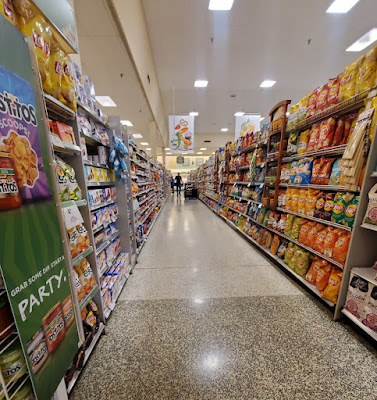
Aisle 6 is where pet supplies and charcoal are found and interestingly has received Sienna category markers and tertiary signage. If it wasn't for the CM 1.0 aisle sign off in the distance, you could have tricked me into thinking this was a regular Publix!
However, those thoughts ended as I approached the front of the store and saw all of the vintage relics come back into view.
We'll take a quick dip into aisle 10 as we chip away at the rest of our tour. This is the final aisle on the left side under the raised ceiling, and it also retains some vintage grey Formica shelves on the left side of the aisle. In stores which have received a more recent environment package (ehm, all 1,303 other Publixes at the time of this writing), these were reskinned or replaced to make them have a light-wood finish for Invigorate / Sienna or a grey wood finish for Evergreen.
Your next low-quality picture was snapped from the front end of aisle 11. Again, we see where Publix went through the effort to install Sienna signage marking the locations of various H&BA products.
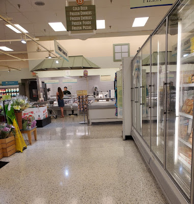
Aisle 13 hosts a plethora of party items, including cold beer and frozen appetizers. We even see some more vintage category markers!
The sign for juices was the one I decided to highlight; consequently, I just realized that frozen juices weren't even located here!
At least the pizza sign matches the product on display in the freezers! We also now have a good view of the fresh seafood counter and the edge of the floral section.
The floral department had a
strange (in my opinion) placement as the 42N stores have a coffin cooler here. I assume this was the common setup in these 1980's Publixes?
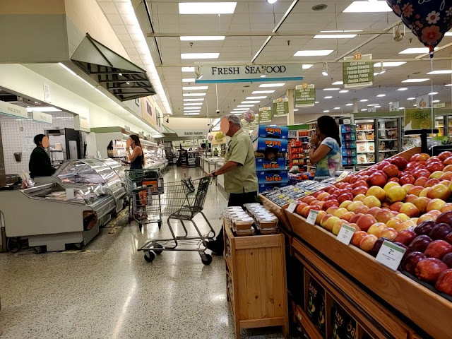
Regardless, the floral department is our third and final example of a flat hanging department sign versus lettering mounted directly to the wall (the other two being Customer Service and Fresh Seafood).
This section of the store felt a little cramped; I guess that is one reason why Publix intends to tear it down.
Our last look down the rear actionway was taken from the produce department. Contrary to other parts of the store, this picture could have easily been taken 15 years ago! The new-style shopping carts, one bright green CM 3.0 aisle endcap topper, and possibly the price tags are the only modern things my eyes are drawn to (I could be missing something).
Likewise, the produce department also looks like it was frozen in time. I believe the physical displays may have been replaced in the last decade, but the wall signage is original to the Classy Market 1.0 remodel. The track lighting trellis is likely original to 1986 (or at latest the 1990's).
If I haven't made this clear before, this store still felt well cared for in the midst of its circa 2002-2003 interior. Don't those apples look nicely stacked?
We can also see more of the lighting grid in this shot, which partially obscured the aisle 14 sign.
The décor may be stale, but the produce is still fresh!
In the front of the produce department, I noticed this "Specialties From Around The World" lettering on the wall. This seems a bit random in 2022, but I wonder if Publix originally used this space for gourmet products or if it was part of a larger marketing campaign.
I apparently wanted a tighter shot of that sign in addition to the one above.
I noticed how the perimeter of the store also featured rectangular ceiling tiles in contrast to the square ones used over the grocery aisles. I wonder why that is?
Frozen vegetables and breakfasts are located in the middle of aisle 14, sandwiched between produce and the bakery. I personally think this shot turned out nice.
Contrary to the frozen juice section, vegetables were indeed located beneath the corresponding sign.
Turning toward the bakery, I noticed how the store also had Evergreen-era bakery display tables, which was odd to see. Additionally, the number for the aisle 14 sign was crooked and might've needed some new adhesive pads!
I have a feeling that the CM 1.0 remodel removed some earlier
tile patterns in the service departments, as most of them featured the boring square white tiles. Conversely, the bakery
received the CM 2.0 / 2.5 tile pattern at some point which really confused me. It also looks like the roof is
still sloped, which originally provided a space to display cake samples (it looks like this practice was continued into the Wavy Pastels years). I also found the "Publix Premium" lettering over the ice cream freezer to be unique. Since I am a big Publix fan, I know it is referring to the ice cream; I just wonder what the average shopper would think (if they even noticed the sign in the first place).
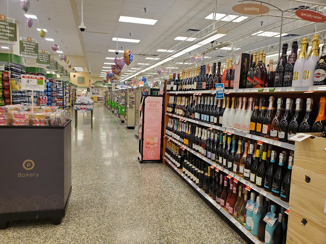
Leaving the bakery, we find ourselves back in the front speedway looking at the wine section. I'm not used to seeing this department here, but it seems to be a common feature in 42E Publix stores which never received a pharmacy.
As I was leaving the store, I noticed that the checkout lines dated back to the Wavy Pastels days (or before) because they still had the white plastic “lane closed” cards that could be pulled out at the end of the line (zoom in to the shot above). I wish I had noticed this sooner so I could have pulled one out and relived my memories! Even though the conveyor belts are likely over 20-years old, Publix did manage to stick a new tan veneer on these to match the CM 3.0 style, as they previously would have used the speckled grey pattern we saw earlier.
Not bad for a "vintage" supermarket tour, eh?
It looks like our tour is almost over, and it is time for me to pay for my 35¢ banana.
Thank you, Neopolitan Way Shopping Center, for providing me the opportunity to add one more Publix décor to my quiver. Although you may be nearing the end of your tenure, I believe you have gracefully served the residents of Naples and maybe, just maybe, you will get the chance to survive to see an Evergreen remodel (since I would rather that as opposed to a full demolition). This store had so much character and seemingly needed just a bit of paint and polish to bring it up to snuff!
But wait, there's more! When I was checking out, I asked the cashier if the store was still scheduled to be torn down. She responded by saying that she wasn’t sure if or when it would go through, and that plans had hit a snag. The man in line behind me acted surprised that the store was going to be torn down, and said he hoped it wouldn’t because it was very convenient for him to shop there. I guess #172 will get to live on indefinitely and still has no concrete plans for demolition! Publix did, after all, bother to upgrade the checkout cubes to match the post-2016 Sienna style (we can't let those go to waste!).
I don't believe the indefinitely-paused redevelopment plans include demolishing the neighboring businesses, which include a Walgreens next door, since they are in an entirely separate building.
Our closing shot shows the edge of the Publix building to the left and the Walgreens building to the right, taken from Neopolitan Way.
As I was polishing up this post, I decided to check the internet one last time to see if any new information had been published on this store's potential for redevelopment. I didn't quite find what I intended, but I did stumble across something interesting.
Here we see page 3 of a civil engineering plan for the demolition of Publix #172 which is dated August 25, 2021. That date happens to be just over a year ago at this point, yet we still don't have concrete evidence that demolition and construction will proceed. Maybe one of you has come across something that I haven't found!
What's even more interesting is how page 6 illustrates the layout of the new store, complete with the details of the new prototype! The replacement is slated to be a 49M-2 (or a 48.11 according to Publix's internal naming convention) meaning it will have slightly more space than the current 42,000 sq. ft. store. Check out the rest of the documents here, and you can even see an overlay of the new building's footprint on the old store on page 4.
Well, I hope you enjoyed that blast from the past. Call me crazy for traveling all that distance just to see a 36-year-old grocery store, but I don't regret it at all! I suppose there wouldn't be history to share with others if it wasn't for crazy people like me and AFB! Speaking of AFB, don't forget to check out his post, if you haven't done so already, to see what he noticed about this store that I may have missed. I'm not sure when my next regular post on The Sing Oil Blog will be but check back in a couple of Saturdays to see where I explore next.
Don't forget, "If you see something interesting, never hesitate to photograph it because it may not be there the next day."
Never Regret!
- The Sing Oil Blogger
Update (October 16, 2023)
 |
| Courtesy Publix - Publix #1782 Front Elevation |

















As I mentioned in my reply to AFB's post on this subject, the idea of dual posts about a subject is interesting! I can't say I'd drive as far as you did to see a supermarket, but I'm not complaining as at least your trip makes for an interesting blog post! It's a bit interesting seeing the two different sets of photos to see what difference different cameras can have in how a store looks. I think your photos might have a slightly warmer white balance which might make this store look a bit closer to how it really looks, but I suppose it's hard to say since I've never been here.
ReplyDeleteI suppose the interesting thing for me as a non-Floridian is to compare the Publix here to the Winn-Dixie in your last post. Both have decor which looks dated. The Winn-Dixie looks more dated than the Publix in most ways, but I can't say for sure that the Winn-Dixie looks less inviting to the shopper. In some ways, I might actually prefer shopping at the Winn-Dixie, but I'm guessing most Floridians would have disagreed with that at least 20 years ago. Maybe things are closer now!
Thanks! Although I really wanted to see this store, I didn't drive all the way to South Florida just to see it; luckily I had other reasons for the trip! It's funny how you mention the white balance difference because I wouldn't have even picked up on that. I believe AFB and I have phones from the same manufacturer, but mine is from a different series and a few years newer. I'd now be curious to see which photos are more realistic. The store didn't feel cold on the inside, so the warmer colors are likely closer to the real atmosphere.
DeleteThe font in the Winn-Dixie may look more dated, but I think I like the look it creates better than the marbled serif letters in this store. I can certainly appreciate aspects of both decors. That being said, I prefer the overall atmosphere of the Publix to the Winn-Dixie because I'm more familiar with the store layout and "feel". It is neat that I was able to compare two stores from similar eras back-to-back!
Great photos and great post! The idea of a collaboration like this is very cool and, if y'all are ever up to it again, I think it would be interesting to see further takes on the same stores. But even if this is just a one time only special event, this is definitely a great store to feature for it!
ReplyDeleteI never zoomed in close enough to notice the marbled department letters until you pointed that out -- thanks for writing that; that added a whole new dimension to the décor for me, and it's one that I definitely like! Speaking of dimension, though, I do also agree with you that the walls look a little flat in some places with this package. Thanks also for the shout-out and photo link, and lol at your Aisle 10 paragraph!
Looking forward to your Classy Market 2.0 stour, and I definitely echo your sentiment at the bottom of the post -- there have been a few times where I've regretted not taking pictures; it's not a fun feeling, but it has definitely inspired me to be more on top of things in later times...
Thank you! It seems like the collaboration was generally well-received, so maybe we'll have to try it again. If we do, I already have a few stores in mind . . . For one, I liked the format because it showed me some things, like the fact that this store was a planned-GreenWise, that I never found in my research. I'm sure I taught AFB a few things too.
DeleteJust like you mentioning how you never had noticed the marbled department letters, I felt like I had to try and see this store for myself in order to accurately describe it and fully absorb any nuances. I thought it was a cool find too, and glad you appreciated that! I've got a few more subtle things to point out in future posts which I think you will appreciate too. I'm also glad you picked up on my pun and shade in the aisle 10 paragraph!
Even if I may not have time to post every store I visit, I'd rather take the chance to photograph it now than regret not having done it! We'll see what fun surprises Classy Market 2.0 will have as well!
We both drove way out of our ways to see this store, but like you said, it was worth it! I hadn't seen CM 1.0 in years, and it was fun getting to relive that era of Publix one last time. It seems really strange that the most "outdated" Publix ended up being in one of the ritziest parts of Florida, and we both saw our fair share of Bentleys while in Naples!
ReplyDeleteI didn't even think about going into the bathroom to see what kind of tile vestiges could be lurking in there, so good find with that old teal tile! I'd agree that's probably original to the store, as that teal pattern was used quite a bit by Publix in their 1980's decor designs. I also feel better that we were both confused by the tile patter over the bakery counter too - it's strange Publix did what random updates they did here, while the rest of the store has managed to keep its CM 1.0 decor perfectly in-tact. So many questions about this store and its strange history!
It was interesting seeing this store from someone else's perspective too, and who knows, maybe we can try out something like this again in the future...
Just like you, I hadn't seen CM 1.0 in years. I also wasn't lucky enough to casually photograph a SS CM 1.0 store (ehm, #371) without even realizing it! It is a really strange feeling to walk out of a store and know it will be the last time you ever see that décor, but at least I got to photograph it. Now I just need to get one of those CM 1.0 aisle signs before they all disappear into a landfill!
DeleteA consequence of traveling a long way to see a Publix is having to visit the restroom! I didn't intend to see a vintage tile pattern either, but couldn't resist photographing it once I saw it! Publix #306 has kept that same pattern in its restrooms so I wouldn't be surprised if other 42E stores still have it as well. As I mentioned in my reply to your post, I wonder if the bakery tile was installed whenever the pharmacy was removed as part of the failed GreenWise conversion. I'm sure some drywall, ceiling, lighting, etc. had to be repaired where the wine currently is so it wouldn't surprise me if Publix decided to spruce up the bakery at the same time. The 2008 timeframe would also make sense as that tile pattern had already begun to roll out with CM 2.0. It turns out that Publix #599, which I toured a few months ago, underwent a $750,000+ remodel in 2018 just to keep its Classy Conglomeration CM 2.5 in place. Something similar could've also happened at some point here.
Your ellipsis creates all kinds of suspense, I wonder what else we may have in store . . .
It's official: demolition plans have been sent out for bid.
ReplyDelete