

Publix #582
Hillsboro Plaza
Tampa, FL 33614
Welcome back to My Florida Retail Blog—the premiere location to find all of your Floridian retail news (well, in addition to The Albertsons Florida Blog, my namesake blog, and Flickr pages like those of YonWoo Retail). Today we are going to explore an interesting store to the North of Tampa Bay (which essentially means it's in the city of Tampa proper). You may remember that AFB recently shared a quirky Jewel-Osco Albertsons Safeway Publix located a short drive away in Pinellas County (it was only last week, BTW), but this adventure will take us just across the Howard Frankland Bridge into Hillsboro County.

Publix #582 opened on October 31 23, 1996, (so spooky!) meaning I visited this store just days after its 26th birthday; however, that's not where this story begins . . .

This 37D (as I refer to it) store served as the replacement for a much older Wing Store which opened on February 3, 1960. Publix #51 also happened to be located in Hillsboro Plaza, which at the time was located amidst sparse housing developments interspersed with orange groves on the Northwest edge of Tampa.
 |
| Courtesy Pleasant Family Shopping - Publix #51 |
Thanks to the Pleasant Family Shopping Blog, we can even catch a glimpse of former Publix #51 while its wings were still flying high. In addition to the Publix, this shopping center also included Speyer School Supplies (shown above), Grants, Woolworth, Martin Pharmacy, General Shoe, and General Finance.
 |
| Google Earth - Publix #51 - January 23, 1995 |
This store seemingly retained its original footprint and façade up until the end since we can still see the undeniable shadow of Publix wings in the satellite image above. While it is possible that Publix #51 expanded into an adjacent storefront, I think it is unlikely Publix would have left the wings and original arched ceiling in place.
The original store would close less than a year after the satellite image was snapped in order to make way for the new, modern #582. I'm guessing that #51 last served shoppers around New Year's Day 1996 based on the aforementioned newspaper article.
 |
| Courtesy Otherstream (Flickr) - Publix #582 - January 9, 2010 |
Update (8/7/2023): GeorgiaPubDude shared this photo of #582 with me a few days ago which highlights a few interesting facts. First, we get to see this store's original teal signage and façade, which were likely modified during the 2011 expansion. Second, if you zoom into the left vestibule, you can see the checkout cube for lane 6 which features a dark blue Gill Sans Ultrabold numeral. Both of these point to the store having a Wavy Pastels interior up until its 2011 expansion when it would have undergone its first full remodel.

So, what makes Publix #582 special? Well, it happens to be one of only three Publixes I can think of that have been expanded during the 2010's.

You heard me right, Publix doesn't always fire up the wrecking ball when they outgrow a store, as frequent readers Swifty & GeorgiaPubDude have brought to my attention several other Publix stores which have either recently expanded or have plans to expand (Update: Swifty informed me that potential road work behind #846 will likely result in it being demolished and rebuilt rather than expanded).
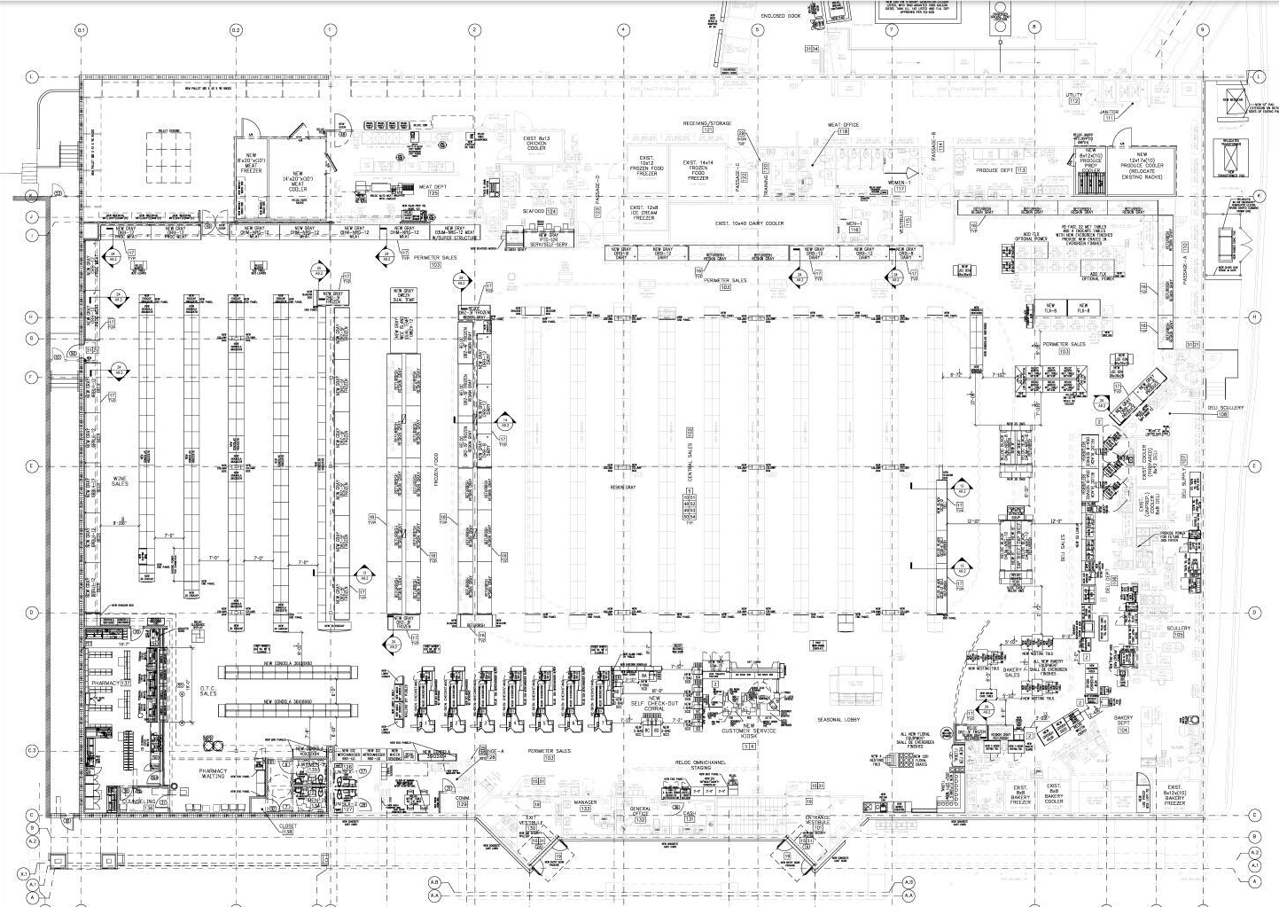
The Hillsboro Plaza store added over 10,000 sq ft to the left side of the store in 2011, with that space encompassing the edifice behind the three decorative boxes with the "X" inside we see here. The column that begins the taller portion of the façade (roughly centered above) was the original left wall of the store.

One thing that still surprises me, however, is the fact that Publix has left these likely original "Entrance" and "Exit" signs in place. The Font Fanatics out there (Ehm, Ryan B. and Swifty) should recognize the Gill Sans Ultracondensed lettering which dates back to this store's Wavy Pastels interior. While uncommon to see, there are still several other stores out there with similar signs still in place. We can also see one of this store's original checkered tile patterns just inside the vestibule.

I've got to say that I'm not a huge fan of 37D stores because they always feel a bit claustrophobic. Typically ringing in at just over 37,000 sq ft (with this store and its sibling expandee having been enlarged to 48,000 sq ft), the layout and low ceilings often make these stores cramped for the number of shoppers I usually witness inside. I suppose that's one reason why others like #576 in Greenville are up for replacement.
Stepping inside, we see the floral department located in this store's "multipurpose nook". Considering the current pharmacy license only dates back to January 2011, this store didn't previously have such a department prior to the expansion; otherwise, it would have been located to my right.

Moving along, we see the bakery/panadería can still be found in the front right corner. It isn't every day that I get to photograph the bilingual flavor of Evergreen!

Likewise, the deli and pharmacy are the only two departments I noticed which didn't receive bilingual signs. I guess Publix treats both as brands rather than generic names?

Heading past the deli, we can see the produce department partially come into view. I can tell that this store was really busy when I visited considering how poorly-framed my shots are; at least they aren't particularly blurry!

Turning around, we can see that the expansion has allowed Publix to shift aisle 1 to the left since the original shelves would have fallen in between the two curved ceiling accents (likely aligning with the darker portion of terrazzo we see running to the left of the center). What's even more odd is how a full-height cooler, which is home to whipped cream and pudding, was installed opposite the deli.

Had I taken this photo in landscape, we would've at least seen one full produce sign in the shot! Anyhow, I'm not a huge fan of the contrast between the two signs with the one on the left using Publix Green paint for the Spanish accent bar while the one on the right uses Black Fox. I'm also not a fan of the lettering on the right being set right in front of the green band: I feel like the black letters don't "pop" against the emerald. Oh yeah, and don't get me started about how the primary lettering protrudes above the backing accent bar in both cases!

Heading back up front, we see the enlarged customer service mausoleum that was installed for Mr. George Instacart staging. The ceilings are way too low in this store for something that large to block the front-end sightlines!

Moving past that monstrosity, we find the crowded checkout lines spanning the gap between customer service and the pharmacy. I do have to give this store props for having at least six manned checkouts open in addition to five self-checkouts.

Here's another question for y'all: why did the dairy department receive a pre-built sign while all of the other areas got lettering attached to the leftover Sienna accent bars? The least the install crews could've done is place a standard Evergreen "Dairy" sign here and attach the "Lácteos" lettering to the Black Fox-painted bar below. A pre-made sign also would have solved the issues we saw in the produce department earlier! It seems like Publix really wasn't prepared for the extra space required for this store's bilingual signage.

Is it just me, or does it look like the "OO" letters in "Seafood" are pushed back toward the wall a bit? At least the seafood and meat department signs otherwise seem to be reasonably installed.
This shot also showcases where the ceiling accents swoop back toward the front of the store, indicating that we are nearing the edge of the original footprint. Likewise, meat and seafood didn't have to move from their original homes.

The freezers on aisle thirteen (the sign for which we see in the top left) formerly lined the left wall of this store and while the physical fixtures never moved, this space was previously signed as aisle fourteen. Despite these changes, it is still home to frozen treats like potatoes and ice cream.
This would also help explain the large column that lands between aisles 13 and 14, as the ceiling structure of this store likely had to be bulked up to handle the extra span. Furthermore, I'd imagine this column provides some nice cover for refrigerant lines running up to a compressor.

Up in the front left corner of the store, we see the new pharmacy nook which was carved out of whatever neighbor Publix devoured.
Probably the most shocking thing about Publix's terrazzo this addition is how seamless it is. It looks like Publix even went through the effort to install real terrazzo floors here (based on the silver expansion joints I see) rather than opting for less expensive epoxy terrazzo or vinyl tiles I've seen elsewhere.

Other than the fact that the right half of this store looks like a regular 37D, and the left half is laid out like a strange 44T/45M hybrid, most people would not be able to tell you that this store has been expanded from its original footprint. AFB and I went back and forth as to whether this store was originally this large, and he was solidly convinced that #582 was always this way. Even when I was inside, the only things that felt off to me were the non-conventional layout and how the raised portion of the ceiling stopped at aisle eleven: had this layout been original, the accent almost certainly would have extended until aisle fifteen or sixteen.

I haven't delved too deeply into this observation, but I noticed #582 also lacks the lower ceiling section over the registers like we saw back at #599. It is quite possible that some stores never received this feature, but that seems unlikely since #599 is only a few months younger than #582.

Now, before I jump into the next section, I want to bring up something that I've noticed recently. It's come to my attention that somebody seems to be plagiarizing my work and the work of others in this hobby. I only mention this because I'm sure this person would otherwise likely jump back to one (or more) of their posts and edit them with new information they learned here. All of that is fine and dandy, except for the fact that they often neglect to mention that they didn't find or coin that information themselves: they took it. Something else I've noticed is that many of those posts don't even include a single photo taken by or for the writer—they are just scrapped from the internet without any (or in a lucky case, very little) accreditation to the original photographer or source. As many of you know, I do occasionally use pictures from other sources to show change over time, etc., but I feel it is extremely important for me to link back to where I found said picture to give credit where credit is due. I also better be writing about a very special store, one that's long since been demolished or converted, if I've never taken a single picture of it!
Consequently, don't be so low to plagiarize other people's work; I spend hours performing extensive research on locations, planning and taking trips, photographing stores, and organizing my thoughts, and it's a big buzzkill when I see somebody has scalped information off my own posts to put on their own page without any acknowledgement as to where it came from. I try to do my best to cite any information I come across and link to other people's work because the community atmosphere of sharing knowledge is part of what makes this fun (please call me out if I ever miss a link or a recognition). I've learned a tremendous amount from others, and I hope to inspire future researchers with my work while providing them with a variety of tools and resources to explore. I hope this request, in addition to the extensive notices placed throughout this webpage, can bring a change of heart to the offender.
Cite your sources, people!
That being said, I'd like to thank some of my many research assistants (in no particular order, and I'm certainly missing a few): The Albertsons Florida Blogger, Retail Retell, Henry H., Ryan Brotherston, Anonymous in Houston, Swifty, Battery Mill, the Sing Oil Sidekick, the Publix Pirate, the Sing Oil Chaos Crew, and GeorgiaPubDude. I know I couldn't share many of these cool things without your help, so I want to make sure that you are recognized!
In short, the person I'm calling out should know exactly who they are, and just know that the Internet Archive exists (Wow, I can archive copies of other people's pages before I push something live?!) and that some of my information isn't meant to be taken seriously . . . (gotcha!)

Ooh, look what you made me do! I hate bringing up this drama, as I suppose some players are just gonna play play play play play. This is why we can't have nice things. Oh well, I'll just shake it off as we check out my next big find!
So why did I pull this store out of my archives? Well it turns out #582 is "Not the Only One" (what a great song, by the way. Although it seems on-par with other Publix hits, I've actually only heard this song in Kroger!)
 |
| Publix #597 - 2023 Expansion Plans |
That's right, #582 is about to have a twin! (That was mysteriously born over a decade later—not sure how that biology works.) I was doing some research this week when I came across remodel plans for Publix #597 in Columbia, South Carolina. I decided to click on them and was shocked when I saw the above expansion plan.
GeorgiaPubDude had to remind me about Alabama's own 37D which was also expanded off to the right of the store around 2011, but it looks like #597's addition will resemble Tampa's #582 rather than the Owens Cross Roads location.
I can't answer as to why some Publixes are spared from the wrecking ball while others of the same vintage and design unceremoniously meet their demise, but Publix #597 seems to be spared for now. I wonder if real estate is really tight in this part of Columbia and Publix couldn't find a suitable tract nearby to build a new 48M?
 |
| Publix #597 - 2023 Expansion Plan |
We find the real magic of the design deeper within the document, as the equipment plan we see above showcases the added or retrofitted fixtures in a dark black while existing shelving is featured in a light grey.
What's that? Oh, this plan is identical to what Publix executed in 2011 at #582? Yay, another mystery solved, and another shelved plan dusted off!
As I mentioned before, the changes include eliminating one aisle on the right side of the store to provide more clearance for the deli department, while also relocating the pharmacy, customer service counter, beer, and portions of the meat, dairy, and household departments from their original locations.
 |
| Publix #597 - 2023 Demolition Plan |
It's really fascinating to see how Publix goes about retrofitting a new store inside the walls of an old one in 2023, considering how they just don't do funky expansions like they used to.
If we take a look at the above plan, we can see the store's existing footprint and layout, with the darker fixtures indicating which ones are planned to be removed or altered. We can also get a better idea of how much room #582 gained when it was expanded 12-years ago.
 |
| Publix #597 - Ceiling Detail |
Another interesting thing I noticed is how the raised ceiling over the center of a 37D store isn't symmetrical. I've always known the "grand funnel" was offset to implicitly welcome shoppers into the wider reaches of the store as they entered, but I had never realized the outer rectangle extends further from the inner rectangle on the left than it does on the right.
 |
| Publix #597 - 2023 Right Interior Elevation (Evergreen) |
 |
| Publix #597 - 2023 Left Interior Elevation (Evergreen) |
 |
| Publix #597 - 2023 Front & Rear Interior Elevations (Evergreen) |
As for these other drawings, it wouldn't be a remodel plan without some interior elevations! Yes, these do look like most other Evergreen elevations I've come across, but it is still interesting to see this store's future layout in another dimension.
Update (7/9/23): Swifty informed me that he had previously come across some documentation of Trenholm Plaza before Publix arrived on a site called "Columbia Closings". The site seems to cover various business closures around Columbia, SC, but one in particular caught his eye.
 |
| Courtesy Columbia Closings - Lucy A Nolan book signing at Chapter Two Books - 1987 |
That particular post documents a book signing for the author's sister, Lucy A Nolan, at Chapter Two Books, a local bookstore which resided in the plaza for several decades. Probably the most interesting piece is how we can clearly see the A&P Centennial store which Publix replaced in the background of several of the photos (like the one above, taken from this perspective). Make sure to check out the original post to see some other perspectives as well!

As I was driving from #582 to my next destination, I passed by one of Tampa's many Amoco stations. Tampa, Jacksonville, and of course Tallahassee were strong markets for American Oil Company back in the 1990's, so it doesn't come as much of a surprise that many former Amocos converted back to the brand following a two-decade stint under the British company's flagship brand. It's especially nice, and a bit ironic, to see the Amoco torch-and-oval placed in the oddly shaped sign hardware BP used for the majority of its early-2000's Amoco conversions. It's a shame this store doesn't have an actual oval sign, but at least the original Amoco signpost is still being used!
Anyhow, that will wrap up this week's post, but be sure to check back on my blog in two weeks for part one of another Floridian adventure!
Until then,
- The Sing Oil Blogger

I'm so used to those stores Publix expanded in the 1980's and 1990's where it's super obvious from every angle that an expansion was built, this one really threw me off (both with how clean the expansion was, and how an expansion in 2011 was a bit out of the ordinary too). It seems like 37Ds are the primary expansion targets these days, with the upcoming Daniel Island store being the first exception to that in a long time (although I'm surprised Publix hasn't tried to expand other 28Ms, at least to my knowledge). It also seems like these modern expansions are more common outside of Florida too, as all those other 37D expansion projects were Atlanta Division stores (so I wonder if there is a divisional influence on determining if a store is replaced or expanded?) At least Publix still sees some life in these (relatively) newer buildings rather than just flattening them, which is refreshing to see.
ReplyDeleteAlso, I'm a bit confused on how #1008 in Warner Robbins (which you linked to under the 6th photo above) was expanded - that looks like a regular 45M in every way, so Publix did a good job with that one!
Unlike the CM 3.0/Sienna remodels (which looked good in just about every store), Evergreen remodels are really hit or miss. I'd have to categorize this store's remodel into the "miss" file - the produce signage looks wonky, the signs on the back wall don't look right against the lower ceiling, and the remodel overall just feels cheap. The photos of this store with Sienna on Google also show the ceiling heights were messing with the installation of that decor too, so maybe it's just the design of these stores that makes them look a bit off without the original decor.
I am too! Publix certainly stepped up its game with the expansion of this store and the other recent stores I mentioned. I suppose three 37Ds marks a trend with these expansions as well? Shortly after I published this post, Swifty reached back out to me and informed me that the Daniel Island expansion may be scrapped now due to pending road work. He said there are now talks to demolish the current store and move the new one further into the parking lot, and I have updated the post accordingly. That's really unfortunate, because I would've loved to see the expanded store for myself! I wonder if the fact that expansions outside of Florida is more a coincidence than a trend. If you think about it, Publix had already done a decent job of saturating Florida by the late-1990's when 37Ds were rolling out, and that prototype was likely just reserved for smaller markets in the Sunshine State while it was used more for emerging markets that Publix was beginning to dip its toes into elsewhere. Based on my count, there were 10 37Ds built in Florida and 11 built in Alabama, Georgia, and South Carolina (combined). One in Florida has closed while four have closed (or are about to close) in the aforementioned states. I doubt there is necessarily a divisional influence, and rather is just the result of Publix's fairly new northward expansion in the 1990's.
DeleteI was mystified by Swifty's statement that #1008 was expanded as well, but I came across this photo from 2018 on the Google listing which shows construction taking place to the left of the store. You can then look at this photo and see the same space now has a blank wall which matches the rest of the Publix. I have no clue what changes occurred on the inside, but I'd imagine Publix added a few extra aisles and maybe some storage space to the left side of the store. I need to check out this location next time I'm passing through the area!
You're right that Evergreen remodels can be hit or miss, and this one really does fall into the "miss" category and looks cheap. I'd be really curious to see a 37D in its original form because I think they lacked a lot of ornamentation when they were built, but at least the colorful checkered tile and curvy, colorful neon ceiling accents likely made the space feel less drab. The funny thing is, I think Wavy Pastels and Metallic Marketplace stores which retain many of their original features (namely the awnings) are some of the best looking stores to sport Evergreen since their original packages were otherwise fairly bland anyway. I do wonder if this store would've looked better without the Spanish text though since they do take up a lot of the limited real estate.
I'm glad AFB pointed out the poorer elements of this remodel in his comment -- I wasn't sure if I'm the only one who thinks this remodel was a "miss"! That's unfortunate to see such a thing, and while I of course don't want to jump the gun, in combination with some other impressions I've gotten about Publix lately, I'll just say that this is a little strange to see. Then again, they did spring for real terrazzo in the expansion here it seems like, so not everything was done cheaply!
ReplyDeleteIt's also interesting to hear about modern-day Publix expansions, and cool that you've uncovered some others as well.
I can't believe you wou-
DeleteI totally agree with you! I often say that Evergreen looks better in person than it does in pictures, but I can't really say that's the case here. Like I think I mentioned in the post, I'm not the biggest fan of 37D stores to start with since the really low ceilings and relatively small size make them feel cramped, and all of that is only compounded by the drab grey walls. It looks like Publix didn't even have room for many of its typical green stock photos to break things up. All of this makes the fact that Publix sprung for terrazzo floors throughout the store even more surprising, too. Maybe that was to counteract an inferiority complex that the store was flawed since it had been expanded!
It is kind of funny that your latest post is about a Publix with an off-the-mark remodel and my latest guest post at HHR is about a Kroger that is above average for a Kroger! I suppose July is turning into the 'not up to expectations' month! There are some obvious fit-and-finish issues here, and nEvergreen still looks dull and dark here, but I think the low ceiling/wall heights and such does a little something to limit the dullsville nature of nEvergreen. There are still problem areas, like the meats wall, and the lettering blending into the different stripes is, well, something I'd expect to see on NW Retail's blog about a bad Kroger remodel, lol.
ReplyDeleteHaving six manned registers open is quite something! It's newsworthy when Kroger has four such lanes open! This may not be Publix's best effort on the visual front, floors aside, but at least Publix does maintain some standards. It is also interesting to see the bilingual signage. Bilingual signage is hardly uncommon in Houston, but it is something the big chain grocery stores tend to avoid for whatever reason.
I actually remember school supplies stores like that Speyer School Supplies store in the photo. Chains like Office Depot finished off stores like that. At least it was a Florida company if that helps any, lol. The local school supply store was pretty neat in that they had stuff that stores like Office Depot don't sell, but I suspect most people under the age of 30 probably have no clue that stores like that even existed not that long ago!
Instead of More Than Convenience, we have a More Than Publix segment in today's post! We've probably discussed Amoco before, but Houston did not have Amoco stations, or BP, even though Amoco had a massive refinery in Texas City which blew up in 2005 due to, according to the investigation, BP's lax maintenance and other measures. Because of this, and things which happened later on in the Gulf, BP is a bit of a tainted name around here and BP had to sell the Texas City refinery. I wonder if some of these events led to a negative reputation of the BP name and that might be why Amoco has made a comeback. It is also possible that BP wants to keep the Amoco intellectual property active and so that's why they're using it with some stations. Valero recently brought back the Diamond Shamrock name here in Texas, but I don't know the reason for that. Valero doesn't have a poor reputation here, but I suspect Diamond Shamrock is probably still a more loved brand than Valero.
That's a real shame to hear about the plagiarism, but I'm pleased to be listed as a Sing Oil Blog research assistant! Every now and then, I'll come across something and I'll think to myself, "Hey, Sing Oil would like to see this," lol.
I know, maybe we should make July the official month for blog posts covering retailers "trading places". Next, I need to show a high-end Dollar General and a rat-infested Whole Foods! I will say that, typically, Evergreen looks pretty good in low-ceiling stores (since there isn't much empty wall space), but the ceilings in the 37D stores are a bit too low for my liking. Eventually, I'll cover a 42N or a 45T Publix that has Evergreen, as both of which look surprisingly good with the package. That probably has to do with the fact that the former opened with Wavy Pastels and the latter with Metallic Marketplace, both of which were packages designed with extensive wall "props" to make up for the limited paint color palettes. These "props" do wonders with an otherwise bland Evergreen store! All in all, I'd say this remodel does remind me more of something I'd see in a "bad Kroger".
DeleteHaving all of those manned registers is something, but it's also pretty common in Publix stores. That's probably one of the main reasons I get so frustrated with Kroger is because I typically don't have an issue checking out quickly at a manned register in a Publix. I suppose Kroger hands-down beats Publix on deli wait times since, well, the former's delis are never open to start with! Jokes aside, the Publix deli has been known to bring out a similar frustration for me as the Kroger checkout. As for the bilingual signage, Publix wouldn't be able to survive in South Florida if it didn't cater to the large Hispanic population. I've been in a Publix before that not only had bilingual signs, but also defaulted to taking my sandwich order in Spanish! Language (and funky signage) aside, that store felt just like any other Publix I've been to.
I had briefly wondered how a school supplies store could've survived on its own; it makes sense that "category killers" like Office Depot killed them off. I guess Office Depot is "local" too! My hometown still has a local office supplies store, but that is certainly not the norm today.
Wow, we do have a MTP segment in today's post! I think you have mentioned it previously, but it is surprising that Houston didn't have Amoco stations. No surprise that BP chose not to enter the market following the Texas City explosion or Deepwater Horizon oil spill, though. I know 2010 was not a good year for the company, and I remember counting the days that oil was spewing into the Gulf (all while BP's reputation and stock price was drowning). By far, the most memorable quote from that time for me was, "Plug the damn hole," which the Huffington Post credits to President Obama, but I seem to remember hearing from a morning news anchor. I know there were rumors that BP would revitalize the Amoco name in 2010, but they Ultimate(ly) waited until 2017. I think the motivation to keep the IP active and provide a different brand for more market saturation (ex. having a station across the street from another station) are more likely candidates than the distant memory of the spill. I don't have much insight into the Valero/Diamond Shamrock deal (considering I've only seen the latter on my few trips out West), but there must've been some long-term strategy there.
As usual, thank you for all of the tips you provide, and it's my pleasure to list you as a research assistant!
Thank you for the shoutout! -BatteryMill
ReplyDeleteYou're welcome!
Delete