

Publix #1165
Hurricane Creek
8644 E Brainerd Road
Marketplace Madness: Green with Envy

If you cannot look at the photo above and tell me who built this store, then you probably are in the wrong place! Sing Oil Sidekick here! I had the pleasure of touring this store along with the Sing Oil Blogger; comments in italics (except photo captions) are mine.

All jokes aside, the store we will be examining today started its life in 1997 as Winn-Dixie Marketplace #1936. This store's general façade design is indicative of most mid-1990's Winn-Dixie stores, but I can't recall seeing another one where the building is so symmetrical and also has an awning flanking the left side of the store.
Winn-Dixie has a strange way of leaving mementos behind in markets they have left over the years; take for example Huntsville, which has a Golden Girls-themed appliance parts store, or Atlanta, which has numerous poorly-decorated discount grocery stores (thanks a lot, Save Rite), or there are the countless towns across the Southeast who suddenly gained prime real estate for a Tractor Supply Store. In the case of Chattanooga, it got a Pub-Dixie (among other things).
 |
| Courtesy the Hamilton County Property Records - Former Winn-Dixie #1936 |
Thanks to the Hamilton County Property Records, we can get a taste of how this store looked when it was under the care of The Beef People. Publix did paint the front of the building, but it generally doesn't look that much different today than it did over 15-years ago.
Following Winn-Dixie's 2005 bankruptcy, the company decided to close all of its stores in the Chattanooga area while shedding a total of 326 locations. This is also when the chain left the following marketing areas: Alexandria, LA; Atlanta, GA; Augusta, GA; Charleston, SC; Charlotte, NC; Columbia, SC; Columbus-Tupelo, MS; Greensboro-High Point, NC; Greenville-Spartanburg, SC; Huntsville, AL; Jackson, MS; Raleigh-Durham, NC; and Savannah, GA. I know from other research I've done that Winn-Dixie had a sizable presence in many of these markets, including entire divisions and distribution centers, that were left behind.
 |
| The Chattanoogan - Holiday Sign - December 12, 2007 |
While Winn-Dixie was rapidly retracting its territory, Publix was happily expanding. In 2006, Publix announced it would enter the Chattanooga area with store #1166, but that store seemed to encounter some delays which forced it to open in October 2008. There were also rumors of a Publix being built at this nearby intersection, but those plans were squashed by residents, likely playing a role in Publix choosing to open up shop in the old Winn-Dixie.
 |
| The Chattanoogan - Grand Opening - December 12, 2007 |
Regardless, it seems like most Chattanoogans were thrilled for the Florida chain to enter the market and would gladly drive across town to not shop at BI-LO, Food Lion, or Walmart. The new store officially opened its doors on December 12, 2007.
I'm surprised the inflatable grand opening bag still featured products with Publix's ribbon logo in 2007 because it appears that the branding had been largely phased out by 2006 according to sales flyers (2005 for comparison). Luckily, Publix had a new prop made by 2020, which itself features Publix's now-outgoing packaging. At least the inflatable sign signifies the opportunity for Chattanoogans to be "tempted by the fruit of another" sub sandwich than the run-of-the-mill Subway option! I guess salt and vinegar chips and a #4011 (AKA banana) round out this meal as the other "part[s] of a good breakfast." Why settle for a puny sub-sandwich when there's the lip-smacking bite of Pub Subs? Subs are better when they're Pub Subs! (Okay, enough quoting 2007 cereal commercials).
 |
| The Chattanoogan - Ribbon Cutting - December 12, 2007 |
Photographer Wes Schultz documented the entire grand opening experience for The Chattanoogan, so let's sit back, relax, and take a trip down memory lane to 2007.
 |
| The Chattanoogan - Speaking to the crowd - December 12, 2007 |
 |
| The Chattanoogan - City, County, & Store Officials - December 12, 2007 |
 |
| The Chattanoogan - Store Manager Carl Weinzierl - December 12, 2007 |
 |
| The Chattanoogan - Free roses to the ladies - December 12, 2007 |
 |
| The Chattanoogan - Managers handed out free items - December 12, 2007 |
Take note of this picture because you will see pieces of it again . . .
 |
| The Chattanoogan - Service Desk - December 12, 2007 |
 |
| The Chattanoogan - Music was provided - December 12, 2007 |
I can only imagine what kind of music that man was playing: Gwen Stephani? No Doubt. Phil Collins? Oh Lord! Naked Eyes – well, how can I forget?
 |
| The Chattanoogan - Busy Checkout Lanes - December 12, 2007 |
I hope you enjoyed that adventure, as I couldn't think of much commentary to add. One thing that does deserve commentary is the fact that we can see how this Publix featured self-checkout kiosks way back in 2007! I'm amazed at how long it took the company to roll them out more broadly, as I still come across relatively new stores without the feature. Meanwhile, Winn-Dixie was installing them way back in 1998.
 |
| The Chattanoogan - Bread was free while it lasted - December 12, 2007 |
Let's grab our complimentary loaf of Sara Lee bread (and a single rose) and continue on with business as usual.

Now that we know how Publix got here, let's take a look at how the Sing Oil Blogger got here. Let's just say that I took a left onto Hurricane Creek Road . . . We can see that even the road sign matches the old Marketplace truss feature!
It was a cold, misty day in Chattanooga following Hurricane Nicole, and what better day to see a store at "Hurricane Creek". I had just made the trek northward for a special sight: a Pub-Dixie.

Publix has a history of bulldozing their way into new markets (just look at Atlanta in the 1990's, Birmingham in the 2000's, and Pensacola around 2008), and many of these efforts were accentuated by purchases of existing stores from other retailers. Atlanta had the 9 A&P stores which were purchased in 1999, Birmingham had several Delchamps stores which reopened in 2002, and Pensacola had four Albertsons acquired in 2008.
Publix used a similar tactic for Nashville in 2002 (more details on those funky stores in the near future) and followed suit by acquiring former Winn-Dixie #1936 in 2007 to enter Chattanooga.

Taking a look from the left side of the exterior, Publix has kept most of Winn-Dixie's original configuration in place, with the exception of swapping the two sets of swinging doors for one set of central sliding doors.
It looks to me like this store still uses Publix's older-style of building signage since the letters are much more condensed than usual and the dot on the "i" is wider than the stem of the letter. This would make sense considering how most Publixes have also gotten rid of the "Deli & Bakery" lettering from the front of the store over the last few years.

Other than the fact that this store is only one of five Pub-Dixies to exist, the strangest thing I saw on my tour has to be the "Thank You" lettering off in the distance. Those eight innocent letters may look like nothing special, but they happen to be a rare relic which date back to this store's 2007 opening. I want to remind you that the Invigorate Environment Package made its debut in mid-2007, only months before this store opened to the public. This means that the package was still ironing out the details, one of which was the wall lettering. If you zoom into the photo above, you will notice that the Avenir letters feature the same marbled texture that we saw with Kiwi / Classy Market 1.0 at Publix #172. I'm almost certain I realized this detail while I was in the store so I have no clue why I didn't attempt to get a better photo of it. I also wonder how many other CM 2.0 stores received marbled letters as opposed to the standard black foam ones seen elsewhere.
Publix added the second set of sliding doors we see under the "Thank You" lettering to conform to their standard practice of having two methods of egress. Winn-Dixie would have previously used the space in front of us for wine, promotional products, or the SunTrust bank branch.

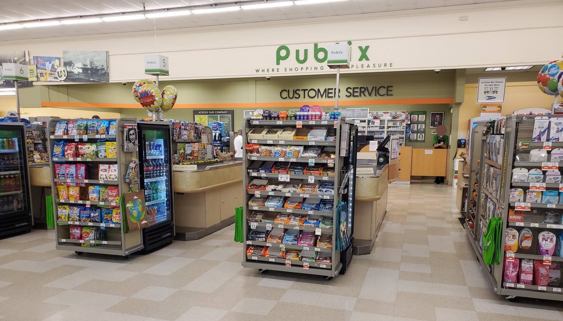
With that behind us, it is also odd that Publix presumably enclosed Winn-Dixie's old customer service counter and extended their new space toward the sales floor. My extensive research into Winn-Dixie #535's history tells me that The Beef People originally had a (likely self-checkout) register line directly below the leftmost florescent light strip, right where the lady in the blue shirt is standing. I also know that the iconic lower ceiling feature would have been entirely isolated rather than abruptly landing against a wall. I'm guessing Publix did this to enlarge the pharmacy and bakery space just beyond said wall.

Winn-Dixie operated SunTrust bank branches inside their last five Chattanooga stores, and I'm assuming it would have been against the green tile wall (in the space LaGrange used for a post office branch). I also have a
feeling the collage we see here is unchanged from how it looked in 2007, since this store opened with Invigorate / Classy Market 2.0.

What has changed is the signage used in the produce department since Winn-Dixie opened this store in 1997. Back then, I'd imagine that this store looked very similar to the Pensacola store we saw a few weeks ago other than the layout differences resulting from this store not using the deluxe Food Pavilion format.

To add to the unique qualities of this store, Publix installed this "Publix Loves Chattanooga" text located on the Jonquil soffit between the exit door and the produce patch. I've been to a lot of Publixes in my time, but I've never seen a store feature local flare like this, especially in a font that is inconsistent with any Publix décor – ever.
I think the "Publix Loves" still uses a font in the Avenir family (the same font family that SS CM 1.0, Invigorate, Bamboo, and Sienna all use), but it looks to be a much thinner weight than I have seen anywhere else which is really throwing me off. At least "Chattanooga" appears to use a weight that is closer to being correct, but the inset photo collage just makes it look really cluttered and out of place. I applaud the effort but I think it could have been much better executed for consistency-sake. Who knows, maybe this was an early feature of the Invigorate Environment Package that was dropped after only a few trials.

Turning back to our right, we can get a nice glimpse of the most blatant Winn-Dixie relic in the store: the ceiling over the checkout lines. These specific florescent light fixtures are also a leftover from WD, and have seemingly been disappearing from the Jacksonville chain's remaining stores across the Southeast.

As for the green paint we see on the walls around this department, that happens to be the same Ruskin Room Green we saw all over the front end of Publix #1331 (sorry AFB, it's not Avocado green). This also happens to be a "historic color" according to Sherwin-Williams making it much older than the 1970's. The paint website mentions it being associated with the Arts and Crafts movement which roughly lasted from the 1880's until the 1920's. I believe the paint color itself may be named for John Ruskin who inspired the aforementioned movement.

Oh fruit, I almost forgot to mention the banana prices at this store! "Winn-Dixie's" banana prices are a shad lower in Chattanooga than they were in Columbus, but still not as cheap as what Anonymous in Houston has seen in Texas or even what I've seen in the nearby market of Atlanta. Here (presumably just as it was in 2007), customers can find an edible version of the ubiquitous Cavendish #4011, rather than an inflatable plastic one out by the street!

The banana display was still just part of the larger produce department setup, which was complimented by our diagonal line of aisle signs separating the deli area from the floral department.

I've learned through many posts from The Albertsons Florida Blogger and tours of my own that Publix often retains the layout of the original tenant in buildings they take over: this store was no exception. The floral department was exactly where Winn-Dixie would have left it; likewise, this store's general layout was nearly identical to what we saw back in LaGrange.

Heading further back into the store, we can see the area which was presumably home to Winn-Dixie's deli café. We can also see proof of this store's faux terrazzo flooring with the line running across the bottom of the photo: whereas real terrazzo would crack in a jagged line that follows the edges of the encased rock, faux terrazzo cracks in a straight line based on the material used underneath. The flooring in this store also lacks metal expansion joints which are a tell-tell sign of the real thing.

We will pause periodically to perhaps peruse past a plethora of promotionally priced products as we ponder back toward the Produce Patch . . .

. . . prior to us pivoting toward the prominently placed Publix deli placard.

Something else I haven't seen in years was this CM 2.0-era "refreshments" station situated in the back right corner of the store.
In case you were wondering, Spicy Hue happens to be the name of orange accent band's paint color (and one of my favorite paint color names in the package). Notice how it is subtly different from the Baked Clay color used in the produce department.

Turning back toward the front of the store, we'll take a quick look down one of the greeting card aisles which occupies the old deli cafe. I'm always shocked at how much space is devoted to greeting cards, which must reflect that they are a high-margin item despite being lower volume. I also think this is the only time I've ever seen two aisle signs for different aisles feature identical category cards.

As we walk past the deli, we begin to get a glimpse of the meat and seafood counter.

I visited this store just before lunchtime, so I'm surprised the PubSub counter wasn't busier than we see here. Alas, without the inflatable sign out by the road, perhaps the local Chattanoogans were unaware of what quality sandwich options lay inside.

Publix spent a decent amount of money to redecorate this store to their liking, and one example is the soffit they added above the meat and seafood counter. This feature is covered in Sherwin-Williams' Iron Ore paint, which seems to compliment the other colors well.
Most of the paint colors and tile patterns remained the same for both the Invigorate and Bamboo Environment Packages, except for in the seafood department. The tile did remain the same but the primary blue paint color changed from Blueblood (CM 2.0) to Blue Nile (CM 2.5).

The fact that Publix bothered installing their own tile should show that they wanted to make a "splash" into the Chattanooga grocery market. I'm guessing I intended to capture the "bubbles" or "fish scales" tile pattern behind the seafood counter with this photo. We can also see the secondary "crate" signage for this department which recycles some graphics first seen with Invigorate.

Interestingly, I don't think Publix ever had a tile pattern for the meat department with CM 2.x (I've only seen white panels in new-build stores) which is why we see that they extended the seafood tile into that area.

We'll take one last look at the meat / seafood counter before moving on, along with the updated secondary signage the meat department received. The custom cut meat sign that went with the Bamboo package originally looked like this and the one we see above coordinates with what I refer to as "third-generation" Sienna.

Looking down the rear wall of the store, we see the remainder of the meat coolers with dairy off in the distance (here's a look at how this part of the store previously would have looked with WD).

Some of you might have heard about my Publix state bag collection, but this store had a rack full of first-generation Tennessee Publix bags ripe for the taking (I actually bought my Tennessee bag in a Georgia store). If you wonder what I mean by first-generation, Publix has since released a newer version of these state bags with the "P" logo in a brighter green.

On the back of the bag display was a rack full of Thanksgiving cooking accessories – makes sense since I visited this store in December!

Spinning around, we see the frozen foods department which is located in the same spot Winn-Dixie would have left it (aisles 9 and 10 with Publix's alignment).

What is that I see, a Publix Checkout Promise sign staring back at me? I believe it is! Like the "meat" below, I was beyond thrilled to see these, considering they date all the way back to 2007. If you remember, I also saw one of these above a water fountain in #1331 while it was still open.
In case you wondered, I'm pretty sure that loud shade of orange we see on the poster happens to be the namesake for Publix's original Invigorating package for this location.

Had we toured this store back in 2007 we also would have seen a stripe of Invigorate above the customer service counter, along with more Ruskin Room Green in place of the Rookwood Red and bamboo panel we see today.
As I mentioned before, Publix left the customer service counter in the same general location as Winn-Dixie would've had it; however, they extended it out into the sales floor a bit while adding space to the adjacent pharmacy.

Turning toward the pharmacy, we can see that Publix heavily modified this corner of the store by completely redoing its space along with the bakery. This store certainly felt like one of the most premium CM 2.5 stores I've been to, and I could tell Publix spent a lot of money during its original conversion to CM 2.0.

Continuing on with our zig-zag through the store, we'll turn around to head down the wine and (cold) beer aisle (aisle 11).

I observed this on a couple of the aisle signs throughout the store, but some of the category cards appeared to be from a different generation of signage. Notice that most of the cards use small caps and a darker green, while the one we see for "Wine" uses sentence case letters and a lighter green. I've seen both variations in other stores, but most seem to use the small caps cards (including stores with both CM 1.0 and CM 2.0-style signs).

Popping back into the rear actionway, we see where the meat department's Red Bay paint transitions into the Jonquil meadows for the dairy department. Something Blue lies ahead.

We'll also take one last look over the right half of the store before moving on.

I honestly wouldn't be surprised if Publix has decided to rearrange some of the products in this store over the last 15-years. Both aisles 12 and 13 appear to be missing some category cards from the bottoms of their aisle signs and I doubt these would have just fallen out.

Our next mix-matched category card was placed on the sign for aisle 14. The "Medicines" card appears to be from Sienna, although, I'm not sure what resulted in the original, matching card needing replacement.

Aisle 16 of this store is home to all sorts of paper products, and provides a nice glimpse of the bakery off in the distance.

Here's a look at the same aisle from the other direction.

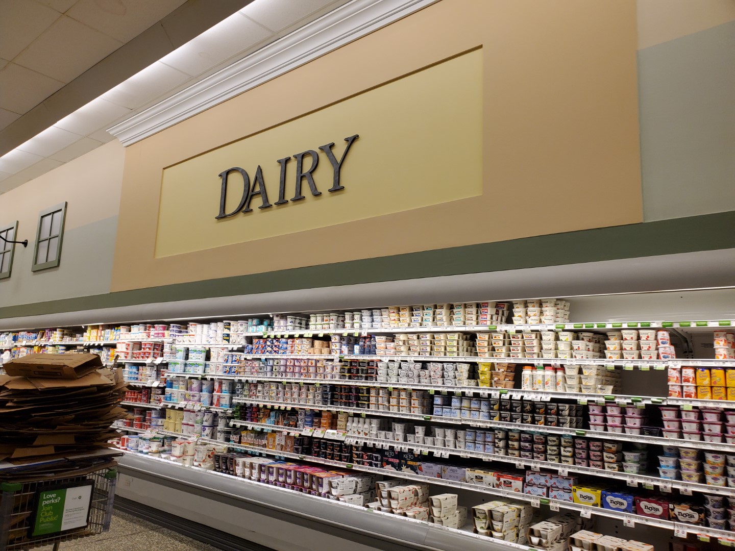
Finally, dairy products can be found along the leftmost wall of the store: just where Winn-Dixie left them.

Water, sports drinks, "New Age Beverages", and bread can also be found on this aisle.

Speaking of bread, I've always found it odd that Publix specified this aisle features "Rolls" and "Publix Bread". This is a common feature with the older CM 1.0 and CM 2.0-style aisle signs (and would make for a nice collectors piece if one were to come available).

Our Thanksgiving finds wouldn't be complete without a turkey butter sculpture; what a perfect complement for some BOGO butter flaky and honey butter crescent rolls!

The bakery space looks a lot different than it would have with The Beef People!

Other than the old florescent light fixtures, I'd be hard pressed to tell you that this photo was taken in an old Winn-Dixie – Publix did a really good job with this space!
I do think it is relatively rare to come across a bamboo-backed suspended bakery sign like this in 2022, so I wanted to make sure I got a decent picture of it before I left.

This store also didn't feel hopelessly too large like many former Albertsons stores do.
I wish I had taken more pictures of the lettering on the lower ceiling
over the registers, but there were too many employees handing out
samples all around the store which had me on edge. Again, what is it with Publix having well-staffed stores!

We'll begin to head toward the registers, but first stop by something fitting to find in a Tennessee store: a Jack Daniel's Tennessee Whiskey Pecan Cake. That's the extra kick I needed!

Publix really opened up the pharmacy space compared to the boxy, closed off configuration Winn-Dixie likely had.

Taking one last look at the pharmacy, we can see the mosaic tiles installed under the counter as part of this store's original Invigorate package (along some Sea Salt and Leisure Blue paint).

Our final picture from inside the store showcases something I can't recall seeing anywhere else: a single height express checkout cube. I do want to specify that Publix began making single height express cubes with post-2015 Sienna and Evergreen, but all of the earlier models like this were seemingly always double height. Consequently, the newer single height cubes are almost always stacked on top of a regular number cube.
Another question I have: is the orange used for this cube the same hue as Sherwin-Williams' Invigorate? The world may never know (unless I happen to take a paint swatch into a Publix . . .)

That will conclude our tour inside this Pub-Dixie, but we'll take a quick look at a few other things before I wrap this post up.
Winn-Dixie loved to use yellow poles in the parking lot instead of cart corrals (see my pictures from Tallahassee and Troy) and surprisingly, the one at this store has managed to survive for over 15-years under Publix's reign. I'm nearly certain the sign itself is original as well. Don't you think it would get in the way if there were two rows of buggies stacked in Publix's green corral?

Since I got on the topic of investigating when the ribbon logo died off at the beginning of this post, I ended up digging through several sales flyers from the 2004-2007 era. This made me realize that Publix seemingly kicked off a major brand refresh to commemorate their 75th anniversary, which makes me wonder if their current packaging is a result of their 90th anniversary in 2020.
 |
| The Atlanta Journal-Constitution (Newspapers.com) - April 11, 2004 |
Taking a look at the April 11, 2004, circular, we can see a page full of serif fonts (this was the heyday of Classy Market 1.0 after all), vintage logos, and artificial computer generated food graphics. I think my favorite part (besides the vintage ribbon logos) is how the Publix Deli tea ad shows the old logo on the bag and tea bottle but the new one in an overlay.
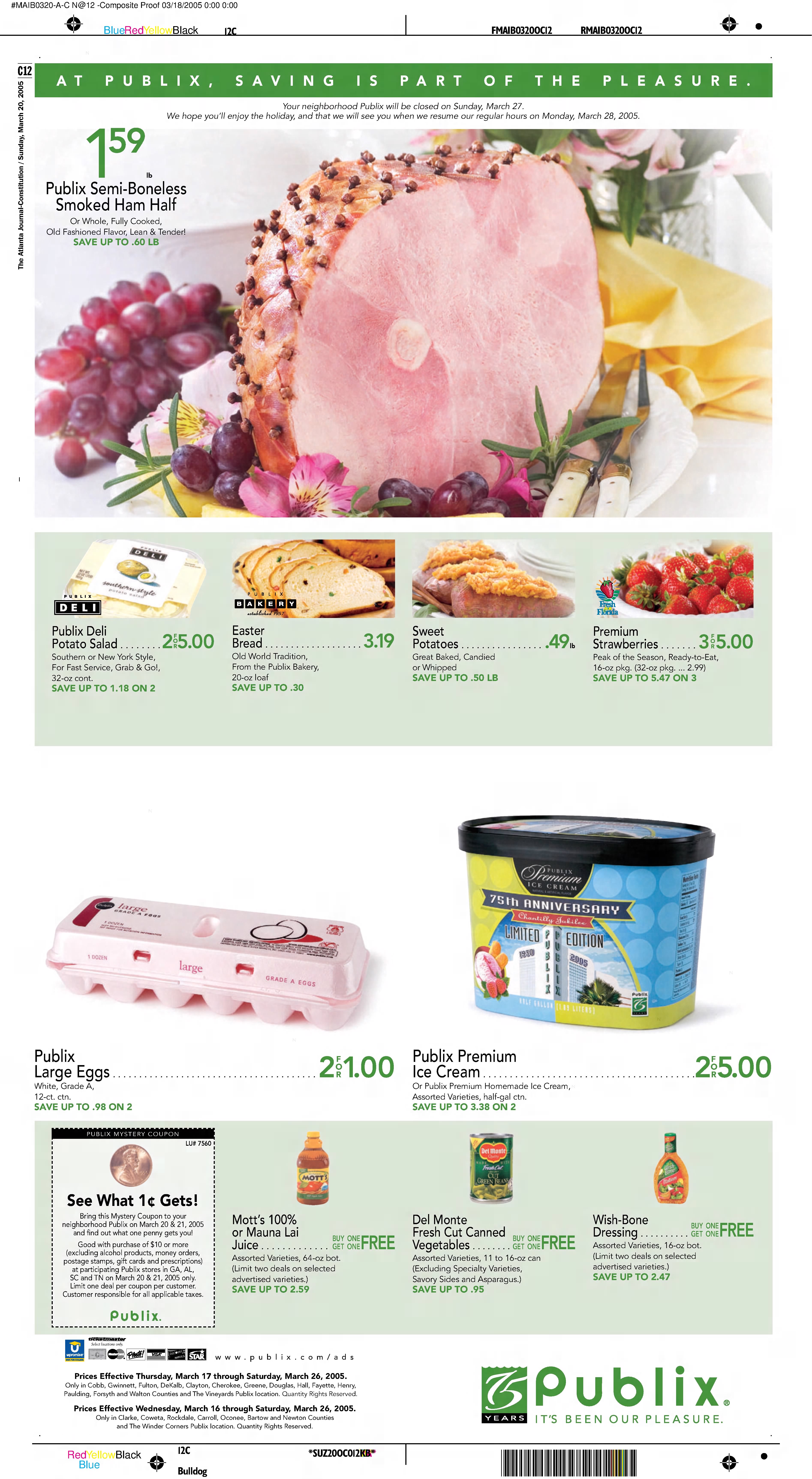 |
| The Atlanta Journal-Constitution (Newspapers.com) - March 20, 2005 |
Jumping up to March 20, 2005, we see an entirely new design language in force utilizing real photography and updated logos galore. We even get to see a special Chantilly Jubilee ice cream to celebrate Publix's 75th anniversary. If only eggs were 50¢ a dozen today!
 |
| The Atlanta Journal-Constitution (Newspapers.com) - July 16, 2006 |
The 2006 circulars, logically, dropped the 75 branding but maintained the new "classy" look and 1¢ deal. Publix Premium ice cream also received new packaging to make it look much more, ehm, premium.
 |
| The Atlanta Journal-Constitution (Newspapers.com) - February 25, 2007 |
Flashing forward to 2007, we see a very similar design to what was rolled out in 2005. Two things worth noting are Publix's Vivia Italia Sale, which is still held annually following Valentine's Day, and the trendy-at-the-time South Beach Diet (it has been years since I have thought about that fad) frozen dinner that's on BOGO.
 |
| Publix - March 9, 2023 |
Now if we take a look at the current sales ad for the week of March 9, 2023, we can see that the overall design hasn't changed too much. Seeing this ad also made me wonder why I paid $7.49/lb. this week for a top round roast rather than paying $5.99/lb. for a chuck roast! Oh well, I did attempt to look for a chuck roast but couldn't seem to find one. I'm planning to make a Mississippi pot roast in my crock pot; hopefully it will be tasty!
The thought also came to my mind about sprinkling in some cooking segments: we can go shopping with Plato (only if it is fat Plato, skinny Plato is a bit creepy) then come back for cooking with the SOB!

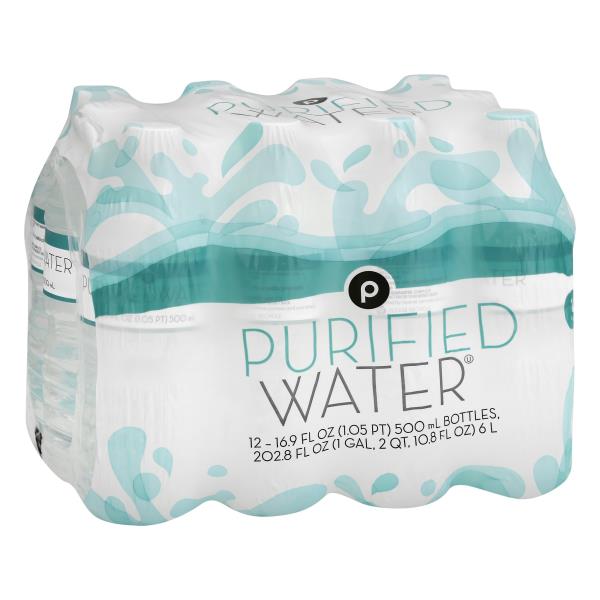
I wanted to highlight a few other packaging changes that Publix initiated around 2005. The first is their re-branded bottled water: the design above was likely launched in the 1990's and was used until it was replaced by the more standardized design we see below.

Publix ended up using this design until a minor refresh occurred around 2018. Publix would have to change their bottle design again once they swapped the black "Publix" circle for a simple "P" around 2020.

I decided to throw these hotdog buns in as well since they provide a larger look at Publix's old ribbon logo just before it was phased out.
The last circular we'll take a look at is by far the most bizarre: Publix's 2022 Outdoor Furniture Catalog.
 |
| Publix - May 12, 2022 - March 31, 2023 |
I can understand being in Panama City at #1249 and wanting to pick up an Adirondack chair to sit at the beach, but who in the world is going to order a $149.99 Acacia wood bistro set at their Publix's customer service desk?! Talk about random – I feel like this is something I would see on a Saturday Night Live sketch!
That's all I have for today, but you can catch me again in two weeks back on The Sing Oil Blog.
Until then,
- The Sing Oil Blogger and the Sing Oil Sidekick

It is interesting to see what The Florida People did to make the old home of The Beef People into their home! Yes, I know Winn-Dixie is based in Florida as well, but when someone says "name a Floridian grocer," Publix is going to be the answer in almost every case! Maybe people from New Orleans or some area that has Winn-Dixie and not Publix would say otherwise, but even that is unlikely I think!
ReplyDeleteBelieve it or not, Kroger has used inflatable bags like that here in Houston. I say Houston, but I believe the City of Houston, or at least Harris County, does not allow such signage so it's only really visible at Kroger stores on the far outer edges of the Houston metro area. Even then, Kroger does not use it all the time. They recently put a bag like that up in an area where HEB built a new store. I suppose Kroger was willing to try anything to try to keep their customers, lol.
I have to say that I am impressed by your knowledge of the Sherwin-Williams paint colors used by Publix! I'm more of a Pratt & Lambert fan, but it seems that Sherwin-Williams owns Pratt & Lambert these days so I'm not sure if it even matters. Mike from HHR once found an architectural drawing of the Rice Village Half Price Books, which is now closed, that had the Pratt & Lambert paint color codes on it, but that's about as close as I can come to naming a paint name used by a retailer!
This Pub-Dixie looks quite nice. All in all, the interior looks way more Publix than it does Winn-Dixie, but I'm not too surprised by that. Does Publix have the same reputation for knocking down old Publix stores and replacing them with similarly sized new Publix stores in states outside of Florida? Now that I think about it, most of the knockdown stories I've heard have been from Florida, but then again, that's where most of the Publix stores are and the out-of-Florida Publix stores are probably newer than the older stock of Florida Publix stores.
I appreciate the photo with the banana prices! It helps me gauge what the level of competition is in this location. I don't know much about the grocery game in Chattanooga, but I see there is a Food City nearby. The Food City looks to be a bit more dated on the inside than the Pub-Dixie, but it also looks to be a pretty nice store. The Food City is even trying to show their Floridian side! That said, when I think of Florida, rolling hills aren't the first thing that comes to my mind! Then again, advertising corn with a beach scene might have been a bit strange! Link: https://goo.gl/maps/HZPuHezs8v47VDHb6
Pub-Dixies are fun to visit, especially since the three I’ve been to have some striking differences. I also think that Publix is much more synonymous with being “The Florida Grocer” than Winn-Dixie.
DeleteI haven’t noticed any inflatable bags like that at a Georgia Kroger, but I feel like there haven’t been many Krogers opened in the state in a while either. It appears that Publix is really eating their lunch as far as expansion goes. Although, I don’t recall Publix seeing an inflatable bag at either of the two grand openings I went to last year.
It isn’t a coincidence that I know all of those Sherwin-Williams paint colors (and it isn’t because I work in a paint store, either). If you’ve taken a look at my Publix Store Models page recently, you’ll notice that I have floorplans for a number of the store designs. Those same plans would often list the paint colors used during a remodel and I was able to piece it together that way. I eventually plan to compile a comprehensive list, but I’m not sure when I will have time for that.
Publix hasn’t quite gotten to the point where they are on a replacement rampage outside Florida; however, most of the Florida stores that have been up for replacement are the "40E", "40N", "49N", and "56E" prototypes from the 1980’s and early-1990’s. Georgia is the only other state to have any stores of that vintage, and one of the five (Publix #476) was replaced in 2015. That being said, I’ve seen plans surface to replace a circa 2004 39M in Villa Rica, GA so I have a feeling that replacement stores are about to crank up in Publix’s other territory. So far, only 9 Publixes have been replaced in Georgia, one in Alabama, two in South Carolina (with a third in the works), and none in any other state. It appears that this store will be the first in Tennessee to go.
I’ve never been inside one, but the Food City to the East looks fairly nice. It also appears the store was built in 2007 (possibly as a BI-LO) and is right across the street from where Publix #1165’s replacement is going. As for the one you sent a link to, that store was built as a BI-LO and presumably operated as one until the company left Tennessee after getting entangled with The Beef People. I also don’t know much about Chattanooga’s grocery scene, but it seems like the big players are Publix, Food City, and Food Lion.
I've finally found people as interested in retail as myself!
DeleteI live near the Hunt Club (Wekiva Springs, FL) store - and when I started going to it back in 2013 it had an 80's feel to it, I'd guess it's a 55E store. Large, centered drop ceiling, and really it felt like Publix acquired it from another company and just rebranded it. The store was remodeled around 2015 and is a lot more modern. I was inside it today for the first time in years and it still felt like an 80s store with modern touches. I hope they don't change it.
Hello, and welcome to our little corner of the internet!
DeleteJust because it ties into something I've been working on (and was just looking at earlier), I wanted to say that the Hunt Club Publix (store #227), as odd as it looks, was actually built by Publix. That building design was actually very rare, and only 3 of those prototypes were ever built (there might have been a 4th, but it was demolished, and I haven't been able to get a good look at the original building to confirm). That design was originally intended to be used for Publix's discount banner Food World (which existed in the 1970's and early 1980's), with the first "deluxe" Food World opening in 1977 in Lakeland (which is now the Lake Miriam Square Publix). In 1980 Publix decided to build 2 more of those Food World prototypes, although neither of the 1980 builds opened as Food World, they instead opened as regular Publix stores (and Hunt Club was one of those two). That last new Food World store opened in 1980, although I haven't been able to confirm if the two deluxe prototypes opened in 1980 were intended to open as Food World stores but plans changed, or if Publix had always intended for them to open as Publix.
Simply put, you live near a very unique piece of Publix history! I was in that Publix once for some photos a few years ago (which I've yet to post), and it is a very strange store. You would never think it was something Publix built themselves, but it was.
Cool beans - I knew it was something interesting. I preferred the store back before the remodel but they stay plenty busy so they're doing something right. We started shopping the Walmart Market right down the road as it's closer to us, but they've remodeled it and now it's so tight I absolutely hate the new layout.
DeleteSpeaking of the Art Deco (#54?) store in Tampa, I recall there being a very old Publix nearby in Britton Plaza (s. dale Mabry). Was that old #54?
Finally, there is one of the large scale prototype Publix's over on the corner of Bryan Dairy and Seminole in largo, FL. One like you all featured being in the Atlanta area. Always thought that was a neat store.
Maybe someday I'll tell how I was interviewed to help develop the Publix gas station small scale format. They didn't get the offer letter out in time, as their process takes forever, so I ended up going to another retailer instead. They cancelled that whole project shortly after.
Welcome as well! I think AFB did a good job of summarizing #227 so I don't really have anything to add to that.
DeleteBritton Plaza was Publix #34 and it opened on August 16, 1956 as a Wing store. The original #54 was in Riviera Beach, FL, and opened in November 1959.
As for #95 (Bardmoor Promenade), it is only a few months older than #33 in Marietta that I covered last year, opening on August 1, 1991. I actually photographed that store last time I was in Tampa as it still has one interesting feature that I haven't seen remain in any other "65N". As the largest store design Publix has ever used, those stores are amazing to see in person.
I'm guessing you are referring to the Publix Pix gas stations? I know that #95 used to have a Pix, so that connection would make sense.
I grew up going to this store! Also if you didnt know this store is being replaced soon witha ground up location down the road….
ReplyDeleteThat's so cool! I'm glad I was able to document it for you and I hope I did it justice! Feel free to let me know if I missed anything.
DeleteAs for the replacement plans I didn't realize that there were any in place. I've seen construction documentation for #1863 (Shops at Enclave, 1688 Ooltewah-Ringgold Rd), but didn't realize that store is planned to replace #1165. That's sad how Publix wants to replace the Pub-Dixie considering it appeared to be in good shape; however, it doesn't surprise me since it is a late-1990's Winn-Dixie building.
Publix grand openings are something that really hasn't changed much between 2007 and now, as they still give away the cooler bags, the roses, and the loaf of Sara Lee bread! I think the only difference now is you also get a plastic Club Publix cup too in addition to all that other stuff, so it was interesting to see how little that's changed through the years.
ReplyDeleteOf those 5 Pub-Dixies to exist (I guess 6 if you consider that #1119 saved the Winn-Dixie building, even though the inside was gutted), I've been to 3 of them (all the Florida ones). Publix did something different to all three of those stores, although all three still had a very strong Winn-Dixie feel to them. Even though I've been to all kinds of crazy Publix conversions from Publixsons, to Pub Teeter, and even the Pub Lion, those Pub-Dixies are the weirdest ones to walk around. There's just something about a Publix that feels like a Winn-Dixie Marketplace that really messes with my mind!
The "Publix Loves Chattanooga" sign is odd too. I can't help but wonder if that sign was made by the store itself and not corporate (which is why it looks off), as a way to comemorate that this was Chattanooga's first Publix when it opened (as when Publix enters a new market, they print up matching reusable bags that say "Publix loves [city or state name]" to give away at the grand opening).
The weird "Wine" placard you saw on aisle 11 is probably due to the fact that Tennessee only began allowing grocery stores to sell wine in 2016: https://www.tennessean.com/story/money/2016/07/01/wine-grocery-stores-s-been-long-road/86447400/ Therefore, that placard was a later addition someone didn't do a very good job of matching to the old sign! Some of the other mis-matched signs could have come from the shuffling around of products in 2016 to make way for the new wine aisle.
It's sad to hear that this store may be getting replaced soon too. It seems like there's a decent buffer between #1165 and #1863 that the two could co-exist, but if it does close, at least you got to document this store for us!
I guess Publix figures they have a good formula with their grand openings so they shouldn’t bother changing it! At the Crawfordville store, my grand opening experience was pretty similar to what Chattanoogans experienced with #1165 (I just got a box of Thomas muffin tops, another Bimbo Bakeries product, rather than Sara Lee bread). However, the Chamblee store only gave me a carnation and a paper bag with a water bottle, granola bar, and informational flyers from the pharmacy. They didn’t have any sort of free cooler bags.
DeleteI’ve been to the other three Pub-Dixies that you know of (you’re still forgetting about one though that neither of us have been to), and all three were very different from each other. I’d still consider #1119 a Pub-Dixie as well even if the inside was mostly gutted; there are plenty of other places where The Beef People still shine though. It messes with my mind too when I see a store like #1165, especially when I’ve been to nearly identical stores with the original interiors intact! That being said, there are several Atlanta & Publix stores that are just as weird.
I feel like the “Publix Loves Chattanooga” was made by the local employees, yet I’m still surprised that corporate has let it fly for this long. Considering I had the rare pleasure of going to the grand opening of the first Publix in a certain Florida county, I wish they had printed up special bags for that store too!
I didn’t realize grocery store wine was only legalized in Tennessee in 2016! I still wonder how you knew that random factoid, but that would explain the mismatched category card for that aisle! Now I’m a bit curious as to what used to be on that aisle: maybe chips had to migrate one aisle to the left.
I agree that there seems to be a decent buffer between #1165 and #1863, but knowing Publix, I wouldn’t be surprised if #1863 will serve as a replacement for the old Winn-Dixie. Only time will tell.
Ha -- the TN wine sales bit probably came from learning it in real time on my photostream back then :P
Delete@Retail Retell - That's exactly how! :)
DeleteWow, that makes sense! Glad I was at least able to take advantage of the second-hand news!
DeleteIt's pretty crazy to see such a Winn-Dixie-like Publix! Fun post overall too, with lots of great puns and song references.
ReplyDeleteHow'd the Mississippi pot roast turn out? I love that recipe!
I agree, and thank you! The Sing Oil Sidekick and I always like to joke about Publix's music choices so I couldn't pass up an opportunity to integrate some of the hits in my post.
DeleteIt turned out pretty good! I've had a Mississippi pot roast before, but this was the first time I made one myself. I took the advice of my mom and only used half of a package each of ranch seasoning and au jus mix, but I think I may opt for a bit more next time since it turned out a little on the bland side. I just know those seasoning packets usually have a lot of salt and other stuff that you don't want to eat tons of.