Winn-Dixie #535
Blue Angel Crossing / Pelham Plaza
50 S Blue Angel Parkway
Marketplace Madness: The Final Four
I may not have been as active here on My Florida Retail Blog as of late, but I'm considering whether I want to alternate between one Sing Oil Saturday / MTC post a month and use the other Saturday for a MFR post. No matter how hard I try, it is nearly impossible for me to churn out more than two posts in a month that are up to my standards; moreover, I'd like to be able to cover some of these other locations I have photographed over the last 18-months or so. Additionally, I realized that two Sing posts a month would lead me to exhaust my supply of stores in just over a year's time, and I would personally like to draw that out a bit more (especially since I still need time to reach some of the far-fetched locations). So what do you think, does that sound like a plan? I may also explore the idea of featuring more non-Sing Oil Co. content on my primary blog, but I have yet to make a final decision on that. In the meantime, let's explore something well within the MFR wheelhouse: a Floridian Winn-Dixie!
As is the case with nearly every other Winn-Dixie I have covered, the store we will be touring today replaced an older Winn-Dixie just down the road.

|
| The Pensacola News Journal (Newspapers.com) - May 31, 1978 - Winn-Dixie Grand Opening (Page 2) |
The earliest trace I could find in Winn-Dixie #535's lineage dates back to June 1, 1978 when a new store roughly 3 miles away opened in Fairfield Village. This new shopping center included Revco Drugs and Radio Shack as junior anchors.
The grocery chain soon outgrew the roughly 22,000 sq. ft. store as they decided to build a new structure next door around 1985. The roughly 36,000 sq. ft. WD that #535 directly replaced can be seen above on the left (with Grocery Outlet as the current tenant) along with the circa 1978, 22,000 sq. ft. WD next door (with Dirt Cheap as the current tenant). To make things even more fun, we can see Winn-Dixie's original 1970's sign post off to the left in its current, decapitated state. I'm always baffled at how Winn-Dixie had the tendency to replace stores every 10-15 years during the late-Twentieth Century with this serving as a great example.

|
| The Pensacola News Journal (Newspapers.com) - December 11, 1997 |
As for the current 52,000 sq. ft. location, store #535 was first announced in December 1997 as part of a new development at the corner of Blue Angel Parkway and US Highway 98. The developers also intended to attract a new discounter to the area, such as Target, but those plans never came to fruition. Both Target and Walmart would eventually build stores three-miles south of here.

|
| The Pensacola News Journal (Newspapers.com) - December 10, 1998 |
Nevertheless, Winn-Dixie #535 held its grand opening on December 10, 1998. This store is located relatively on the outskirts of town, situated between Pensacola, Perdido Bay, and the Pensacola Naval Air Station.
The Food Pavilion
Now that we know how this specific location was conceived, let's take a look at the origins of the deluxe Food Pavilion concept it was built for.
|
| Courtesy Archive.org - 1993 Winn-Dixie Annual Report - Former Winn-Dixie #2265 |
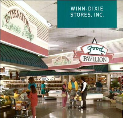
"The prices will be low, but the look will be different. Our new Winn-Dixie Marketplace and Food Pavilion is one of the most exciting advances in our store formats since the introduction of the Marketplace store in 1984. Providing customers with the very best shopping environment has always been one of our most important priorities. In recent years, we've accelerated our efforts to close small, tired stores. Our new stores offer more variety and service departments such as seafood, floral, a full-service pharmacy and an expanded deli and bakery to meet changing lifestyles. A quick tour through our new food pavilion in Poinciana, Florida will give you a taste of what's to come." - 1993 Winn-Dixie Annual Report
In order to fully understand this concept, we will explore Winn-Dixie's 1993 annual report to shareholders which highlights the new concept in addition to some photos Keith - Cape Kennedy Retail discovered several years back. The excerpt above gives us a good idea of what The Beef People intended with this "exciting" new concept. The chain was so enthusiastic about this new format, they dedicated the majority of that year's annual report to photos and descriptions of what I believe to be the first Winn-Dixie Food Pavilion in Poinciana, FL (shown above). That prototype store has since been closed for over a decade and is now a
self-storage facility. I guess that is the building's way "to meet changing lifestyles"!
|
| Courtesy Archive.org - 1993 Winn-Dixie Annual Report - Former Winn-Dixie #2265 |
"It's unlike any Winn-Dixie you've seen before. Inside, you'll find new colors, a new decor and our exciting new Food Pavilion, where you can eat in or take home delicious foods prepared right in the store by our own chefs." - 1993 Winn-Dixie Annual Report
The Food Pavilion stores appear to have been Winn-Dixie's flagship prototype throughout the 1990's and were used up until the company's financial downturn in the early-2000's. Likewise, back in 1993, Winn-Dixie operated 1,151 stores in 13 states. That number is now down to roughly 546 stores in 5 states.

|
| Courtesy Keith - Cape Kennedy Retail - Winn-Dixie - Hialeah, FL - Supermarket Design 1 - 1996 |
What's interesting is how the nearby Cantonment store that opened a year prior advertised a "Deli Cafe" rather than a "Food Pavilion". That location appears to be the same prototype as the LaGrange Pig-Dixie I toured a while back, so I wonder if the "Deli Cafe" was just used in smaller or less-premium stores. This Food Court appears expansive, yet it shadows in comparison to an all-out Food Pavilion store.

|
| The Pensacola News Journal (Newspapers.com) - March 31, 1999 - Winn-Dixie #495 Grand Opening |
"In the Food Pavilion, customers will find international cheeses, a bakery, fresh seafood, special cuts of meat, a deli, a pizza shop, a frozen yogurt bar and much more. We've included area registers for quick checkout and installed a comfortable eating area for our customers." - 1993 Winn-Dixie Annual Report
I managed to find a map for a similar, since closed store on Mobile Highway where we can get a better feel for how #535 was originally laid out. (Interestingly, it looks like #495's "grand isle" was removed during the store's Post-Bankruptcy remodel). This does bring the question to mind: was the Montevallo Road Transformational Store we toured several months back originally laid out like this (just mirrored)? I could easily see how the "grand isle" was just a remnant from the Food Pavilion and the other side was ripped out to enlarge produce and beer/wine. It would be very expensive to move water and gas lines so this seems like a plausible theory. The floors might've also been tiled in this area to cover any concrete patches.

|
| The Pensacola News Journal (Newspapers.com) - December 10, 1998 |
If the Food Pavilion wasn't enough of a draw, this Winn-Dixie happened to be the first in the area to roll out a self-checkout system. I went into more detail on how this system worked in my post on Winn-Dixie #86, but this article above also describes how customers would interact with the registers. The biggest difference I see is how these older machines used mounted lasers to scan the barcodes while the products moved down a conveyor belt, rather than you scanning the item and then placing it on a scale in the bagging area (feel free to correct me if I misunderstand the process).
Isn't it fitting that the man in this article is using the antiquated machines to purchase a VHS tape!
Now that we've seen how this store came to be, let's check out what it has been up to for the last quarter-century.
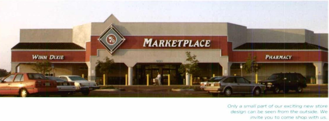
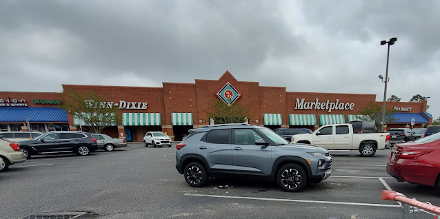
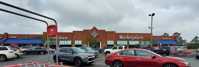
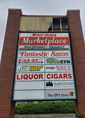
Contrary to what you may think, all of my pictures were taken in April 2022! If this sign is any indication, we are in for a total blast from the past with this tour: just tell me the last time you have seen an in-tact Marketplace road sign?!
Other than the fact that this sign may well be the last one remaining at an active Winn-Dixie (how in the word did this thing survive so many hurricanes!), it is also important to point out the "Food Pavilion" branding which remains visible. If you look closely, you can see where Winn-Dixie had covered up the "Pavilion" lettering at one point but has since allowed the patch to fail.
As it stands today, this store has been stripped of many of its prior amenities, including the Food Pavilion. Regardless, the store still looks very symmetrical and stately with its brick façade and canvas awnings. I won't be surprised if these awnings are removed whenever this store does remodel.
|
| Courtesy dirtyblueshirt (Flickr) - August 15, 2008 |
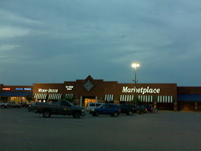
You may remember him from my coverage of Publix #1343 / Former Albertsons #4441, but Flickr user dirtyblueshirt will come to the rescue again (hint, this won't be the last time either) and give us a taste of how Winn-Dixie #535 looked close to 15-years ago. Time has proved to be less dramatic for this store (considering it has never undergone a remodel since it opened in 1998), but we will still get to explore some subtle differences.
First up, I'd love to note the old "One Hour Photo" sign that was still present. The fact that everything else on this façade is very symmetrical leads me to believe the opposite side of the Marketplace diamond previously bore "Food Pavilion" branding, indicating that department had already closed by 2008. We can also see the old Family Video store in the storefront to the left.
Jumping back to the present, we'll take a closer look at that Marketplace diamond before heading inside. These are also insanely rare to come across this day in time, so I'm glad I was able to photograph one!
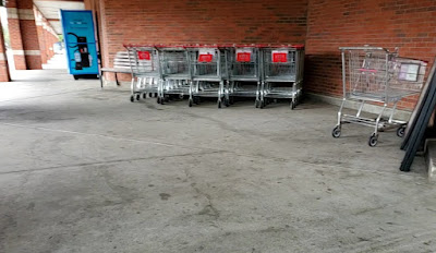
This store used this small "patio" to store extra grocery carts . . .
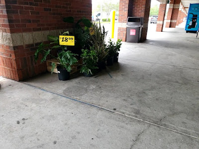
in addition to a few plants. I do think Kroger has Winn-Dixie beat by a mile in this regard!
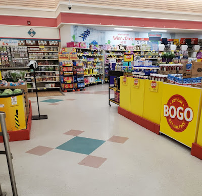
Stepping inside, we'll get our first low-quality look at this store's janitorial department entrance / checkout area.
In retrospect, I find it odd how most 1990's Winn-Dixies funnel shoppers past the checkout lines to get to the rest of the store. It seems like most retailers would rather shoppers be welcomed by a plethora of products for sale instead of some conveyor belts.
Anonymous in Houston should be thrilled because this store looks to be straight out of an episode of The Golden Girls! What's even better is unlike the Chiefland Winn-Dixie, this store was purpose-built for the Rose & Teal Marketplace package and was one of The Beef People's deluxe store formats.
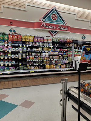
It may not be the first thing shoppers see, but Winn-Dixie makes sure customers ponder past a plethora of promotionally priced products along their path to peruse the Produce Patch.
Panning to the right, we see that little nook full of promotional products for the upcoming Easter holiday.
|
| Courtesy Keith - Cape Kennedy Retail - Former Winn-Dixie #2265 - Supermarket Design 1 - 1996 |
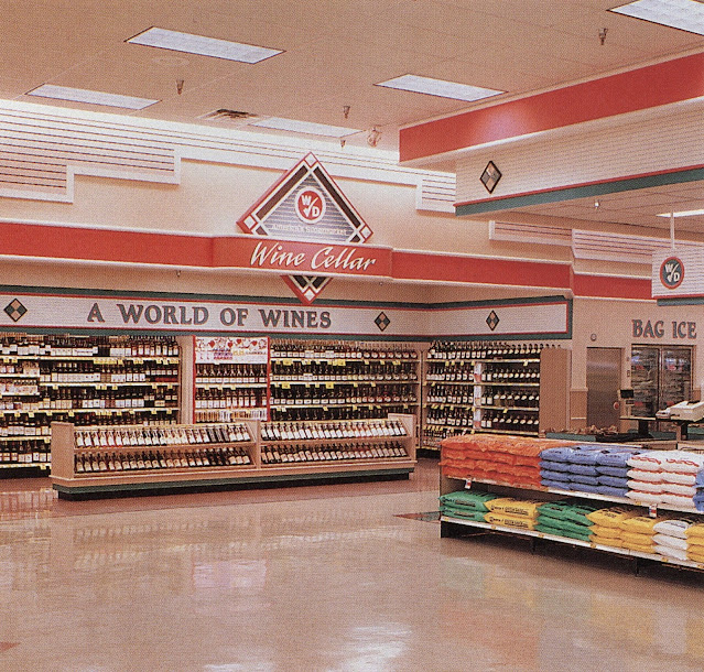
I didn't realize this until writing this post, but it appears that alcove was originally used for the store's wine department. We can also see the edge of Winn-Dixie's old checkout signage on the right side of this photo (above the "Bag Ice" lettering). The Poinciana store looked so much less cluttered than the Pensacola store does!
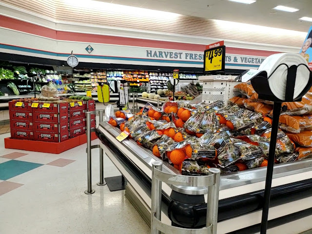
Next up, we'll take a look at the Produce Patch which is prominently placed in the front right corner of the store.
Speaking of the Produce Patch, we can see that the department even includes color-coordinated pink and teal floor tiles.
Does anybody else think it is odd that Winn-Dixie is using a Kid's Choice watermelon bin to display bags of what appear to be cherries? Also, that watermelon face looks a bit too happy to me . . .

|
| Courtesy dirtyblueshirt (Flickr) - August 15, 2008 |
It turns out that Anonymous in Houston isn't the only one who thinks of The Golden Girls when he sees one of these Rose & Teal Marketplaces!
Oddly enough, it appears this store has received a light remodel of some sort over the last 15 years! I'd like to point out that the pink pendant florescent lights have been removed as have the teal cart bumpers on the produce fixtures. I almost wonder if all of the old fixtures were swapped out because the current coolers have multiple shelves rather than the old mirrored cases we see here.
Lastly, I think the suspended lights were likely removed whenever all of the ceiling light fixtures were swapped over to the new LED models we see today. At least I know my phone takes better photos than a 15-year-old Blackberry!
I don't go to Winn-Dixie often enough to know if this is the case in other stores, but when was the last time you saw one of those suspended produce scales? Publix (mostly) swapped over to more compact models close to a decade ago.
Compared to the brighter red used for this package's accent stripe, I always think the faint pink/purple used for the accent wall tiles and ceiling tiles looks really old and faded.
Regardless, that same tile color is used throughout the store. Here we can take in a nice overview of the front end, complete with the lower section of ceiling over the register lines, the old wine nook, and the cheese counter.
Turning the corner, we get our first exposure to the full Food Pavilion experience! Whenever I hear mention of a Kroger "Power Alley", this setup always comes to mind as it seems to aptly fit the description.
Our first destination on the grand aisle beyond produce is The Florist. This department is perched on its own prominent corner with a lower ceiling to give the effect of a small flower shop. I believe the small section of tile we see on the left side of the picture was previously home to a triangular cut fruit / fruit juice island.
|
| Courtesy Archive.org - 1993 Winn-Dixie Annual Report - Former Winn-Dixie #2265 |
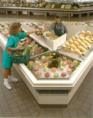
That island was probably removed around 2004-2005, coinciding with the company's initial round of financial troubles. We can see here how it would have looked in front of the large section of deli salads off in the distance.

|
| Courtesy Keith - Cape Kennedy Retail - Former Winn-Dixie #2265 - Supermarket Design 1 - 1996 |
As for The Florist, that department looks largely the same as it did back in 1998.
This store may not have as many plants as it used to, but the section isn't empty by any means.
|
| Courtesy Archive.org - 1993 Winn-Dixie Annual Report - Former Winn-Dixie #2265 |
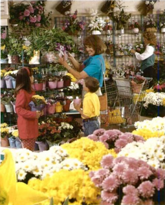
Winn-Dixie #2265 opened in February 1993, but I would assume this picture from its annual report was taken in September or October of that year due to the fact that we see Chrysanthemums for sale.
I believe my main intent with this shot was to showcase one of the tile accent diamonds in addition to the teal trellises in the floral department. I'd say that this wall probably looked a bit less pitiful when the store opened. Last I checked, Russel Stover chocolates are not a type of plant . . .
Jumping back across the alley we'll see the other side of the old cut fruit wedge (on the right side of the photo) along with the rest of the former Food Pavilion. I do like how the wedge used to point shoppers into the Food Pavilion, as did the triangular signage. Implied design cues like this are always intriguing to study.

|
| Courtesy Keith - Cape Kennedy Retail - Former Winn-Dixie #2265 - Supermarket Design 1 - 1996 |
The layout and design itself doesn't look much different than it would have in 1998, other than the fact that we are missing the original Food Pavilion signage like we see here. Interestingly, it looks like Winn-Dixie decided to remove the pavilion awnings from the bakery and deli areas of new stores at some point between 1993 and 1998 since #535 doesn't have them.
Heading over a bit further to the left, we see the old International Cheese Shop which now offers a selection of pre-packaged deli items.

|
| Courtesy Keith - Cape Kennedy Retail - Former Winn-Dixie #2265 - Supermarket Design 1 - 1996 |
Thanks to our vintage photos, we can see the variety of cheeses and other foods which used to be available to shoppers.
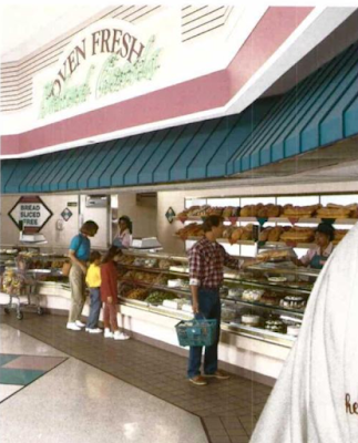
Walking over to the bakery, we can see the various cakes this store has to offer. I would like to note how I believe the window to the back prep area was originally obscured by racks full of freshly-baked bread.
|
| Courtesy Archive.org - 1993 Winn-Dixie Annual Report - Former Winn-Dixie #2265 |
I'm also shocked at how well my photographs ended up lining up with Winn-Dixie's own photography! The best part is, I never even saw these photos until after I photographed the store!
Back across the alley is the deli, which continues to feature various cold salads, sliced meats, and fried chicken.

|
| Courtesy dirtyblueshirt (Flickr) - August 15, 2008 |
We've lost a few pieces of signage in this department over the last 15 years, but it generally looks the same as it did back in 2008.
|
| Courtesy Archive.org - 1993 Winn-Dixie Annual Report - Former Winn-Dixie #2265 |
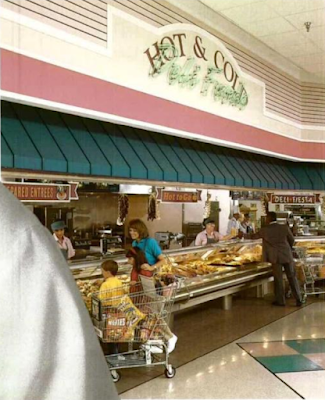
As for the original Poinciana store, the décor still looks the same even if the selection of products has been significantly trimmed down.

|
| Courtesy Keith - Cape Kennedy Retail - Former Winn-Dixie #2265 - Supermarket Design 1 - 1996 |
Look at all of that popcorn! I'm amazed that any store could sustainably offer the this many prepared foods, as Winn-Dixie even admitted that this was the main reason these stores weren't used more widely. I'd be curious to know how much food was thrown out at the end of the day; therefore, how much money was wasted on unsold product.
Anyway, we can see the back left portion of the Food Pavilion in this shot, with the meat and seafood counter off in the distance.
It appears that #535 removed the Italian Deli and Oriental Stir Fry Wok at some point, leaving behind the tiled area we see under the lower ceiling on the left. If this photo was taken back in 1998, we'd be looking directly at the old soup and salad bar, with the seating area where the Lay's chips are to the left.

|
| Courtesy Keith - Cape Kennedy Retail - Former Winn-Dixie #2265 - Supermarket Design 1 - 1996 |
Again, I'm shocked at how well my shots lined up with these old pictures! Like we saw above, the tables and chairs have since been replaced by shelves of snacks and the salad bar has been removed for shelves of wine. It looks like these pictures were taken just before this store's grand opening since the salad bar is still empty.
Just to note, those pink and teal diamonds on the floor can still be seen under the new snack department.
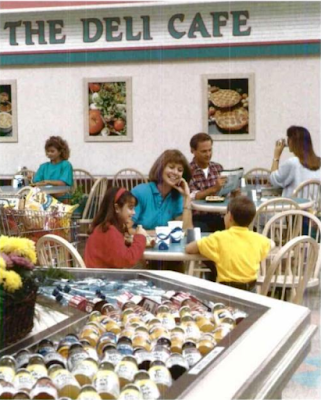
|
| Courtesy Archive.org - 1993 Winn-Dixie Annual Report - Former Winn-Dixie #2265 |
We'll take another look at the old Deli Café before moving on.
Across from the Cafe is where the restrooms can be found. We can also see the tile where the salad bar island used to sit. I'm guessing the tiled area to the right of the restrooms used to be the drink / ice cream station.
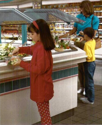
|
| Courtesy Archive.org - 1993 Winn-Dixie Annual Report - Former Winn-Dixie #2265 |
It looks like lunch meats used to be found in the back right corner of the store, but these have since given way to beer and wine (as common with many Winn-Dixies). Beer was previously located on the left wall of the store, next to the pharmacy (ooh fun, booze and pills!).
We'll take one last look at the Pavilion from the perspective of the old salad bar before we move on.
The Beef People couldn't have a store without a butcher counter!
The combined meat & seafood counter is found at the back of the Food Pavilion alley, just beyond the beer and wine displays. Why do I have a feeling that this store's wine selections have slowly declined over the years . . .
Whether you need Natty Light or a T-bone steak, Winn-Dixie can hook you up under the neon light!
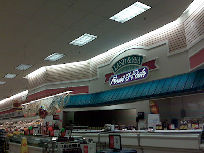
|
| Courtesy dirtyblueshirt (Flickr) - August 15, 2008 |
The main change I see when comparing 2008 to 2023 is the old suspended pink light fixture covered in a fishing net. I think it's probably best that Winn-Dixie removed this.

|
| Courtesy Keith - Cape Kennedy Retail - Former Winn-Dixie #2265 - Supermarket Design 1 - 1996 |
Notably, Winn-Dixie changed the backsplash tile pattern they used between 1993 and 1998 because the Poinciana store doesn't appear to have the teal stripe that Pensacola does.
As for the back actionway of this store, not much seems to have changed from when this location opened.
We'll take one last look at the back right corner and the old salad bar and lunch meats space before moving on.
It's a bit hard to read, but I'd like to point out how Winn-Dixie added "The Beef People" to the teal portion of the department sign, just above "Fresh Meats".

|
| Courtesy dirtyblueshirt (Flickr) - August 15, 2008 |
Similar to other portions of the store, the meat coffin coolers used to be accented by pink florescent lights as well.
Since this store's power alley is unsigned, aisle 1 begins opposite the deli's "grand isle" and contained crackers and condiments during my visit.
The store's "Wall of Values" is located further down the aisle toward the front of the store, but it appears this shelving was repurposed for more crackers when the seasonal merchandise was moved to the old wine nook.
Next, we'll jump over to aisle 4 to take a look at the pet foods aisle; even an old store like this can still have a Fresh Pet cooler!
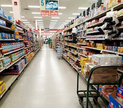
If you didn't notice already, this store is a classic example of one where every single aisle sign features a terribly UV damaged stock photo. Somebody mentioned that a company in the 1990's originally sold ads which were inserted in place of these photos, but that company went out of business and quit supplying new prints. Interestingly, the photo of a new Marketplace I shared at the top of this post shows these aisle signs with the same set of (at the time, unfaded) stock photos we see here. Who knows, maybe Winn-Dixie never intended to display ads in these! All I know is the LaGrange Pig-Dixie lucked out since most of their stock photos are still in decent shape.
Heading toward the middle of the store, we find frozen foods on the unsigned aisle 6 and some more Marketplace floor patterns. It's interesting how these Food Pavilion stores don't seem to have the typical double-wide frozen aisle.
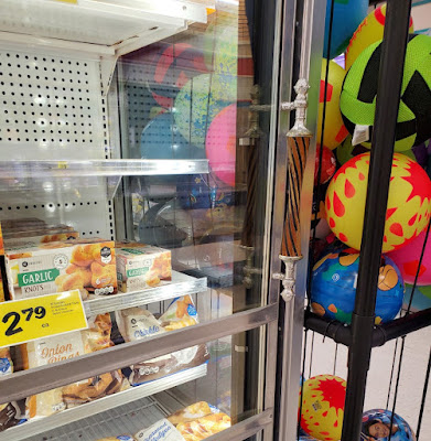
I do know that the handles on these freezer doors are quite interesting. This is far from the only Winn-Dixie I've seen them in (I was in a Down-Down store last week which still uses them), but the design is more so something I would associate with a beer tap at an old English pub rather than a freezer handle at a 1990's grocery store. I'm not sure Blanche Devereaux would approve of these, although I'm sure she would happily use one to access the frozen cheesecake cooler to take one home and share it with Sophia, Dorothy, and Rose.
Hardware and kitchen supplies take up aisle 7. Does anybody else think it is odd that the shelf on the left has a topper with a florescent light bar on it?
Meanwhile, aisle 8 has a whole host of cleaning supplies to accompany its stock photo of meat (?). We can also see the customer service desk off in the distance.
Returning to the rear wall of the store, I noticed how the department sign for "Frozen Meats" had 2D lettering compared to the 3D letters on the rest of the signs. I wonder if it has always been like this, and if not, what used to be here. I can tell for sure this has been up since at least August 2008.
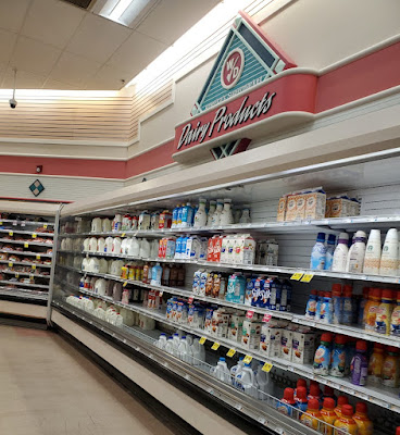
Milk and creamer can be found along this back wall.
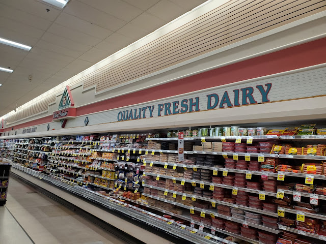
Meanwhile, luncheon meats and cheese are along the left wall of the store. It looks like most of the dairy products just shifted forward when beer was moved to the back right corner and the prepackaged meats were moved here.
I am surprised that Winn-Dixie went through the effort to shuffle departments in so many of these older stores without a full remodel. What benefit does this have?
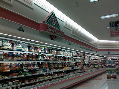
|
| Courtesy dirtyblueshirt (Flickr) - August 15, 2008 |
It appears that Winn-Dixie could have shifted around these departments whenever they decommissioned the Food Pavilion since lunch meats were already on aisle 10 by 2008. This aisle also had a Pepto pink cart bumper back then!
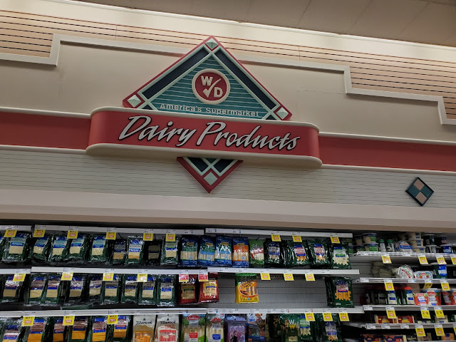
I did manage to take this closeup of the "Dairy Products" sign on the center of the left wall, but I wish I had photographed the one closer to the pharmacy. I'm not sure whether that sign still read "Cold Beer" or if it was changed to match the current products. I suppose the world may never know.
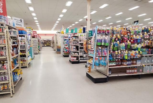
Turning around, we'll see my one-and-only shot of this store's center actionway. By now you should know how much I despise stores with this "feature", but Winn-Dixie can't seem to get rid of them!
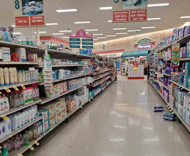
In the front half of that actionway, we have a few HBA aisles in front of the pharmacy. I've since heard that the sombrero-style "Drug Store" sign we see between aisles 8 and 9 is really rare to come across in a modern Winn-Dixie; who would've known!

|
| Courtesy dirtyblueshirt (Flickr) - August 15, 2008 |
We'll take another quick flashback to 2008 to get a better look at this section of the store. I'd like to point out that the "Health & Beauty" department sign seems to have gone missing over the last 15-years (I know I would've photographed it had it been there), and the photos for aisles 8 & 9 are significantly less faded. It also looks like aisle 8 has an entirely new set of products on it.
I might ask: why are craft supplies located on the baby aisle, directly in front of the pharmacy?
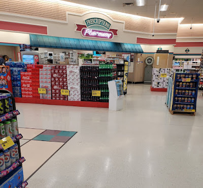
I can't solve that mystery, but I can provide a better view of said pharmacy.

|
| Courtesy Keith - Cape Kennedy Retail - Former Winn-Dixie #2265 - Supermarket Design 1 - 1996 |
I can also show you what the pharmacy would've looked like in 1998 when the store's photo center was located just out front. Here we can see the old beer section in the right edge of this photo.
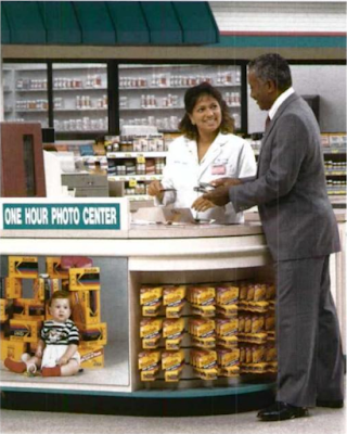
|
| Courtesy Archive.org - 1993 Winn-Dixie Annual Report - Former Winn-Dixie #2265 |
The reason I think the photos from Keith - Cape Kennedy Retail were taken before store #2265 opened is due to the lack of the "one hour photo center" sign in the top photo when it is present in this one. That is assuming that both of these photos were in-fact taken in former #2265.
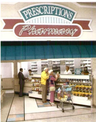
|
| Courtesy Archive.org - 1993 Winn-Dixie Annual Report - Former Winn-Dixie #2265 |
To the right of the pharmacy was this store's Toledo scale. I find it interesting how Publix typically gets all of the hype for their in-store scales, when I've come across similar scales on many of my Winn-Dixie expeditions. Maybe WD should have sold some of them to The Green Giant during one of their bankruptcy rounds!
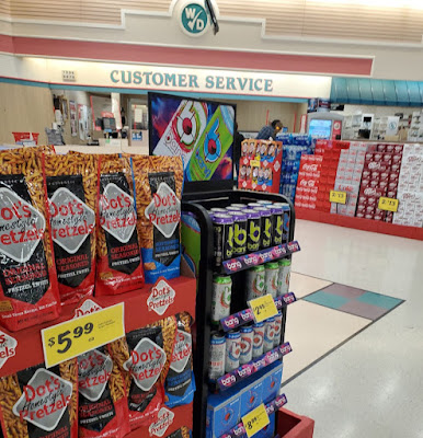
To the left of the pharmacy, we find the customer service desk.
I'm not entirely sure what that brown stain on the floor is from, but we can see this store's eight check lanes from the perspective of the old photo counter. I believe each strip of lights in the lower portion of the ceiling represents where a check lane previously sad below, meaning this store used to have a total of 13.
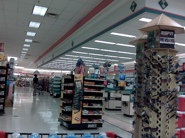 |
| Courtesy dirtyblueshirt (Flickr) - August 15, 2008 |
Back in 2008, it appears this store still had its original self-checkout lines (numbered 1-3 with the pink signs) in addition to the eight standard lines we see today. I'd imagine the additional two standard lines were removed from the side closest to produce to make room for the expanded seasonal section.
As for those original self-checkout machines, they appear to have the same touchscreen CRT monitors we saw in the 1998 news article but have the added benefit of accepting credit card payments. I'm personally surprised the machines lasted 10-years based on Winn-Dixie's financial troubles and the advancement of technology. If they hadn't done so already, Kroger was about to roll out Fujitsu U-Scan self-checkout registers in most of its stores in 2008, and those seem light-years ahead of the machines we see above. Kroger still uses the same, if not very similar Toshiba machines, to this day!
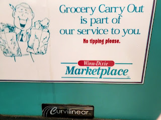
Our final interior remnant from the past is this sign I saw on the front of one of the checkout lines. I never knew Winn-Dixie offered carryout service and I'm really curious as to whether they still do. I should have tested out this service!
I suppose all good things must come to an end because as of November 2022, this store received a major department reset which likely foreshadows a pending remodel.
Oh well, I can't say that a remodel is without merit here. The sign facing Blue Angel Parkway certainly doesn't inspire much confidence that Winn-Dixie #535 is still open. At least the duct tape covering "Pavilion" hasn't fallen off!
So what did you think of this blast from the past? I thought it was cool to be able to compare such a well-preserved store to the prototype's original marketing materials while also learning more about Winn-Dixie's flagship Food Pavilion design. It also turns out that this is one of the final four Winn-Dixies to retain the Rose & Teal Marketplace interior. Don't worry, we'll get to see those other three stores at a later date.
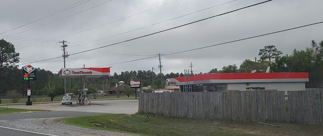
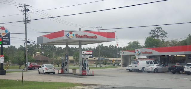
I'll close out this post with two pictures of a nearby Tom Thumb convenience store. For those who don't know, Kroger actually had a brick-and-mortar retail presence in Florida until 2018 when they sold off most of their standalone convenience store assets to Cumberland Farms. Last year, EG Group announced they would be converting all 113 Tom Thumb locations to the Cumberland Farms banner which inspired me to photograph nearly every Tom Thumb I came across on my trip.
There's nothing particularly special about this location, other than the fact that it still sported Kroger's "Quality Across America" branding and the Tom Thumb word mark at the time of my visit. It took me the longest time to realize the diamond logo was a stylized map of the continental US rather than a funky coffee cup! I recall the cashier who informed me also stated the different colors represent the various regional brands, with Tom Thumb covering the Gulf Coast, Loaf 'n Jug calling the Western US home, and Turkey Hill occupying the Northeast, etc.
Regardless, it looks like it won't be long before the longstanding brand is wiped away from the area. I'm also shocked to learn that Dillon Companies, a subsidiary of Kroger, acquired the chain back in 1984!
That will conclude this week's coverage of the Pensacola area, but make sure to check out The Sing Oil Blog in two weeks for some history on a Sing Store that should have never existed and some more Marketplace Madness that may or may not relate to today's post.
Until then,
- The Sing Oil Blogger
Update (May 20, 2023): Winn-Dixie has officially held a grand re-opening for this store to show off it's new Winn-Win décor. I have also received confirmation that the similar Bainbridge, GA Marketplace has begun its remodel.




















I remember when Winn Dixie used to relocate their stores for larger stores. I can remember a couple of places where you would see a brand new Winn Dixie across the street from a defunct shopping center with an obvious old Winn Dixie on one end and an even older Winn Dixie on the other.
ReplyDeleteI've been told that up until their bankruptcy in the 2000s, Winn Dixie used to lease every single one of their stores. Many of their 20-30-year leases came up in the 1980s and 1990s which is why they were able to negotiate for newer larger stores.
Yes, it seems like it was a common practice of the chain during the 20th Century to replace a store and just move next door. I'm probably thinking of some of the places you have in mind as well, and we just might get to see one of them in two weeks on The Sing Oil Blog . . .
DeleteI can't imagine why they wouldn't lease any stores following their 2005 bankruptcy; it's almost like they weren't worthy of being extended credit or something! Anyway, that theory would make sense as to why there are so many Winn-Dixies that were replaced during the 1980's and 1990's. It also appears they must have signed a number of 10-year leases during the 1980's or either thought it was worth the effort to find a sub-letter in order to build a shiny new Marketplace.
♫ “Thank you for being a friend. Travel down the road and back again. Your heart is true, you're a pal and a confidant. And if you threw a party, invited everyone you knew. You would see the biggest gift would be from me. and the card attached would say, thank you for being a friend.” ♫
ReplyDeleteWell, that seems to be the only appropriate way to describe one of these Golden Girls stores from The Beef People! I’m glad to see that one of these well-preserved Winn-Dated stores lasted until 2022 at the very least. In some ways, this store would have looked a bit dated by even 1998’s standards as the pink and other pastel color trends were more of a product of the late 1980s and early 1990s than the late 1990s. Nonetheless, The Beef People probably put a lot of effort into developing this Marketplace store design and so they were going to get some use out of it even if it was starting to look a bit dated. The late 1990s were certainly a time of bizarre and often cartoonish supermarket designs with Albertsons’ Grocery Palace and some of the things Kroger was doing in the Atlanta division (though I’m almost we never got that here in Houston as Kroger was trying to compete with Randall’s upscale image and so cartoonish décor was certainly off-limits). I know this is MFR and AFB might not want to hear it, lol, but I think the Golden Girls Marketplace décor is actually better than the over-the-top Grocery Palace décor. Oddly enough, Marketplace seems to have survived better than Grocery Palace, at least at actual Albertsons locations, even though Marketplace probably does look more dated these days especially when very outdated items like those aisle markers are still in-place.
The colors of the clothing people are wearing in the annual reports photos match the décor! Of course, that was probably intentional, but those were popular colors in the early 1990s. By the late 1990s, well, not so much! Those are some good finds in the annual reports though.
The handles on those coolers were outdated even by 1998’s standards. Handles like that were common at supermarkets and C-stores in the 1980s and prior, but I don’t remember any 1990s-built stores using them around here. It’s surprising, if not shocking, to see a late 1990s-built store with those.
I see a link to my Gerland’s Food Fair Prodigy and Kroger Power Alley blog post from a few years ago! Speaking of Gerland’s, they were the one grocer who used Golden Girls colors for their décor in the early 1990s and they used it until they rebranded most of their stores as Food Town in the early 2000s (Gerland’s and the Food Town people had some kind of agreement to run their stores together). One Food Town which still has some Golden Girls elements, at least on the flooring, is the former Safeway location on Uvalde & Wallisville here in Houston. Someone uploaded images of the nearby Joe V’s Smart Shop to the Food Town page, so ignore those, but you can see what I’m talking about here: https://goo.gl/maps/hmV8UbE3cE1uK9Fs5
I wasn’t too familiar with The Beef People’s version of a food court so it is interesting to read about it here. As for the power alley concept, yep, it certainly looks like Winn-Dixie used a power alley! It’s a bit different than Kroger and Randall’s implementation which often put the bakery and deli before produce, but there is more than one way to do a power alley. Speaking of power alleys, next month’s The Year of Kroger post will have a lot more about power alleys at Kroger so stay tuned to HHR for that in March!
I figured you would enjoy this Golden Girls special! I'm also glad that this store survived until 2022, but I am just waiting for the day when a photo of a remodeled WD #535 surfaces online. Surprisingly, Winn-Dixie was all-in on the pastel pink and teal during the late-1990's since they seemed to remodel a lot of stores to that package (in addition to the new-builds). I really wonder when The Beef People began to see the writing on the walls because I feel like the 2005 bankruptcy couldn't have come as much of a surprise. I feel like I remember the 2003 or 2004 annual report beginning to spell doom but I have a feeling the signs were starting to show around the time this store was built (especially considering how many relatively new stores were being replaced). I can't give a fair judgement as to whether I like Grocery Palace or Rose and Teal Marketplace better, but I do think the general wall décor in this store looked to be in pretty good shape; all of the neon worked too! I already have too much supermarket décor for one person, but I'd be tempted if the opportunity arose for me to get one of the neon signs from this store (maybe that is partially nostalgia talking too).
DeleteAs for the annual reports, I have to thank you or whoever it was on HHR for first sharing those with me! They were a great find indeed!
I was also shocked to see those dated freezer handles in this store. Nevertheless, I've seen these in plenty of other Winn-dated stores.
Yep, those are some dated vinyl tiles indeed! However, I don't think those clash quite as much as former Marketplace stores which kept their pink tiles after a Down Down remodel.
I think a power alley is the perfect way to describe Winn-Dixie's old food court concept and I'm glad I was able to link back to your Kroger post. I'm looking forward to next month's HHR post!
I'm sorry it's taken me so long to comment on this post - remembering to read new posts on your own blog is something I still haven't gotten used to even after all these years!
ReplyDeleteVery interesting write up on the Food Pavilion! I've always been intrigued by this concept, although I've never seen one in person (at least with everything in its original form). The only stores like this I've ever been to had Down Down decor already, and I missed out on visiting one of these stores with the original decor thinking it wouldn't remodel anytime soon! (It was the early Down Down days, and it hadn't sunk in to me yet that Winn-Dixie was serious about remodeling). I would have loved to experience one of these stores in the late 1990's, as Food Pavilion seems even more deluxe than what the Transformational stores were trying to be!
I guarantee you the Birmingham Transformational store was not a mirror layout of what we see here - I've never seen a mirrored version of any Marketplace store before. Transformational is actually the only Winn-Dixie design I can think of that ever had a mirrored version, and I believe that layout was always intended to have the "grand aisle" on the right side of the store, as the three new-builds used that layout. I think the mirrored layouts were only used in certain remodels where the official right-aligned layout wouldn't have worked well.
I'm also pretty sure the November 2022 reset is a precursor to a Winn Win remodel. Winn-Dixie #2333 (also an old Marketplace store, but not a Food Pavilion) had a similar reset, and within a few months had the full remodel begin. It was nice you got to visit this store with the original decor still in-tact, even if a lot of the deluxe features were ripped out years ago. Those old photos were fun to see too - I remember when Keith - Cape Kennedy Retail first found that album, and it was great seeing them again here!
Better late than never!
DeleteI'm surprised that you've never seen (and therefore likely won't ever see) an original Food Pavilion like this! I guess the timing worked out perfectly for me to see this store since I was just far enough along into my retail photography to focus on the few remaining Marketplace stores when I visited Pensacola. I had the same thought as I was writing this post that I wish I could've seen this store back in 1998, but I'm still satisfied with my 2022 substitute.
Now that I think about it, you are probably right about the Birmingham store not being a mirrored Marketplace. It is odd that Winn-Dixie used mirrored layouts of the Transformational stores (the two retrofits that I have been to use the left-aligned design while the Harv-Dixie in Americus had the right-aligned).
I have a feeling that we will see an announcement for this store's grand reopening any day now because that department reset likely was a sign of times to come. I just wonder why they would bother with installing temporary paper aisle signs and not go ahead with the new Winn-Win ones.
Picture it: Pensacola, 1998.
ReplyDeleteAnother great post -- I really enjoyed it! Incredible research as always, and of course it doesn't hurt that the subject is intrinsically interesting as well. Winn-Dixie's Food Pavilion, décor notwithstanding, is perhaps the most innovative (or, at least, expansive) that I think I've seen from the era when these concepts were new and up-and-coming. It's too bad the company couldn't sustain it, but then again, as time would reveal, it doesn't seem like any but the highest volume stores can sustain that much in the way of varied and numerous prepared foods offerings, even today.
I definitely dig the implied design cues, too, and really like that phrasing for them -- would love to investigate more of those; please keep pointing them out in future posts if you come across any! Intended angling of eyesight aside, I also just think the triangular shape of that fresh fruit counter was funky and cool regardless, lol. Same goes for the mirrored image of it over at the photo center. And of course, the directory map published in the newspaper showing all these fixtures is awesome to look at as well!
I agree with you that it's incredible how well your photos line up with the historic ones, especially considering that was completely unintentional! Makes this post very easy to follow and helps a heck of a lot with comparing the before and after (or, well, old-before and current-before, lol). Love your graphics as well -- you're really talented with creating those.
Those frozen foods door handles are very weird -- I can't recall ever having seen something similar in person before, let alone in photos, and it's even more surprising to hear that those were not a special Food Pavilion feature but in fact were common in many Winn-Dixie stores. Speaking of décor oddities, though, I can at least confirm that the Frozen Meats sign probably was always just two-dimensional from the beginning. Don't ask me how I know that, though :)
Concerning department resets that take place without décor remodels: I'd imagine that's a lot more common than we'd think; after all, stores are constantly moving items around, so it's not hard to believe even larger department resets would also take place separate from larger remodels, even if to us it would make sense for a remodel to occur at the same time.
I'm really glad you were able to capture that road sign; that sure was a treat to see, with both the Marketplace and Food Pavilion branding surviving! Finally, good idea to photograph the Tom Thumb as well. I always recognized the US shape, but didn't realize the different colors actually represent different regional brands!
Lol! Pensacola, 1998, colorized.
DeleteThank you! This was a fun post to write (as you can probably tell by how deep into the weeds I got). I never expected to find this much content on the store when I visited, and the only reason I went was because it still had the Rose & Teal interior as of last year. Winn-Dixie seemed to put a lot of effort into developing the Food Pavilion and I’d agree that it was likely one of the most expansive examples out there. I wish I could have visited this store back in 1998 too! It is rare to come across a sustainable model of prepared foods in a supermarket, but I have a feeling that my next two posts will be an interesting counter example – we’ll just have to see how long they can last.
I’m not always one to pick up on implied design cues, but this store sure seemed to have a lot of them! I’ll try to take note of more of them during my research because they are fun to examine once you find them. It seems like retailers don’t use triangles often in their designs, but Winn-Dixie really embraced them in the Food Pavilion to create some cool and funky designs. I was very glad I found that directory map too.
Thank you! My graphics may not be perfect replicas of the original (I sort of made a mash-up of early-2000’s Marketplace with the colors from the 1990’s variant), but they were still fun to make. The last one I used with my blog name is more indicative of a sign you could actually find in a Winn-Dixie at one point. The historic photos also came in handy and really show how little has changed over the last two-decades.
The Troy Pig-Dixie that I toured last summer had those same freezer handles, and I feel like I may have seen one or two other stores with them as well. I think they may have been something WD used during the late-1990’s even though they would appear much older than that. Now I really want to learn how you know the Frozen Meats sign was always 2-dimensional!
I stopped in a different Winn-Dixie last weekend that was undergoing what appeared to be a similar department reset as this store, and that store was most definitely about to undergo a full remodel. I have seen Kroger and Publix perform resets without remodels, but any sign of movement in a Winn-Dixie this day in time means a remodel is on its way (considering Down Down and Winn-Win are stated to be the only remaining decors in the chain by the end of the year). Like I’ve mentioned, it is bittersweet how many of these decors are about to go extinct all at once, but the change will ultimately be good for the once struggling chain.
I’m glad I managed to capture the road sign too! Winn-Dixie may be slow to do a lot of things, but they somehow managed to eradicate most of those signs over a decade ago. I also have several more Pensacola Tom Thumb stores that I’ll get around to sharing eventually.
This is absolutely AMAZING!!!!! As a Pensacola/Perdido Key native, I am so passionate about our history and learning about older buildings. It really tells the story of a life long ago. As Eddie Money put it— I wanna go back and see it all! Love the color schemes!! Thank you for all your history work!!
ReplyDeleteI'm so happy you enjoyed the post! I love having the chance to share this history with others and know it is particularly special to see a store you are familiar with. I was honestly blown away when I walked in this Winn-Dixie because I felt like I was going back in time – and it was so cool! Every time I revisit this post I'm reminded how impressive it was to walk through this store. You are certainly welcome!
DeleteI also like how you took pictures of Tom Thumbs too. So sad to see them go, they are a piece of my childhood. Cumberland Farms — the name sounds so wacky for Florida?! I really love seeing when certain Tom Thumbs were built and noticing design layout changes throughout the years. Most were built in early 80s in Pensacola, the rough cut CMU block on outside. One of my favorite Tom Thumbs was on Perdido Key Drive, it features a nice early 80s shed style roof. It recently was renovated and made me so sad!
ReplyDeleteDo you know anything about the Winn-Dixie in Perdido Key? I found an old sketch on a tourist map from 2004 of it, and it looked similar to the late ‘70s early 80s design of the original Fairfield Winn Dixie location in Pensacola. Now, its very early 2000s, and the interior is also fairly original and a fun store to visit! Do you know if it was built in the 80s and remodeled in the 2000s? Probably after Hurricane Ivan. Thank you so much! Have a great day!
It is sad to see the Tom Thumbs disappear. I remember seeing one off I-10 as I drove by a few months ago, but have all of the ones in the Pensacola area been converted now? Cumberland Farms does seem out of place in Florida! It is fun to see how companies change store layouts over the years: that's half the fun of this blog!
DeleteI've never been to the Perdido Key Winn-Dixie, but I partially wish I had last time I was in Pensacola. It has certainly been on my list! Property records claim the store was built in 1985, and the pictures on Google Maps appear to indicate that the store has never been expanded. Correct me if I'm wrong, but that store looks to be nearly identical to Winn-Dixie #446 in Montgomery on the inside. The Perdido store was last remodeled before the 2005 bankruptcy, as the package it has was only used from roughly 2001-2005 to spruce up smaller, non-Marketplace stores. It's entirely possible that Hurricane Ivan caused it to remodel.
Not sure if it was already mentioned, but the photos from 'Courtesy Keith - Cape Kennedy Retail - Original Source Unknown - Former Winn-Dixie #2265' are scans from the book 'Supermarket Design/1' by Progressive Grocer - https://www.amazon.com/Supermarket-Design-Progressive-Grocer/dp/0934590796
ReplyDeleteThank you for catching that – I went ahead and updated the post. I really wish that I could find a copy of that book to flip through because it appears to have some cool content. I have another post on a former Delchamps featuring pictures from it as well.
DeleteDoes anyone know if store 445 did well in sells I saw it was a Transformational store I also read an article I'd it's debute and remodel they put millions in that store
ReplyDeleteThe sales numbers at #445 were not good. I think it averaged around $32k a day, which would only put it around $225k a week. Considering how there are two Publix stores just down 280, one of which was the only in Alabama to have a cooking school, Publix does pretty well in the area. I have nothing to base it off of, but I'd presume that those two stores combined bring in at least $1M-$1.5M a week.
Delete