Publix #1119
Howell Mill Village
Atlanta, GA 30318
Former Winn-Dixie #18?? / SaveRite #2726
Welcome back to The Sing Oil Blog My Florida Retail Blog! Today's post will be a bit different, as it served as the template for a "PowerPoint Xperience" presentation I recently gave to friends. For those who aren't familiar, the purpose of a PPtX (okay, I totally pulled that name and acronym out of nowhere), is to share knowledge on an obscure topic in your repertoire for others to relish in. I knew a topic on Sing Oil or Publix in general would be too basic, so I decided to dig back in my archives for something a little more obscure . . .
In order to travel down the cold, dark, and damp rabbit holes of my mind, we must first examine some background information. That's the fact that the Publix we will evaluate today began its life as a Winn-Dixie.

|
| Courtesy Sky City Retail History - Winn-Dixie #1290 (Franklin, NC) - April 2005 |
That's right, folks, the retail sleuths of the Southeast should instantly recognize that the Howell Mill store's façade dates back to "The Beef People" with its signature set of centered transom windows. Compare the vestibule setup to this former store in Franklin, NC, and you can see the similarities in design (with the Atalanta location receiving a more upscale look with an annoyingly off-centered brick wall.
This flavor of façade was popular with Winn-Dixie during the 1970's and 1980's, all the way through the company's debut of the Marketplace concept in 1984.
Presumably for the bulk of this Winn-Dixie's life, it would have featured the amazingly '70s wooden interior. While (shockingly) none of the remaining 369 WDs have insides which date back that far, I was able to uncover a picture of what this store likely looked like in its heyday. In the shot above, we can see the original mustard brown floor striping, khaki dairy cases, bold orange and yellow wall paint, groovy cypress detailing, and most importantly, the original milk and egg wall graphics.

|
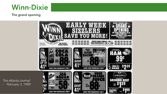
| The Atlanta Journal (Newspapers.com) - February 3, 1980 |
Likewise, the store we will be touring today held its grand opening during the week of February 3, 1980, following the East end of the center's completion in 1979. The shopping plaza was originally scheduled to be constructed in 1971; however, the complex was almost squashed due to a lengthy nine-year court battle with the city involving the commercial zoning request.

|
| The Atlanta Constitution (Newspapers.com) - November 2, 1974 |
My interest was piqued when I learned about the fight, and I soon found I was only scratching the surface. According to a 1974 article in The Atlanta Constitution,
"Out at the northwest corner of Howell Mill and Collier roads there lies a wooded, L-shaped tract of land. It is vacant.
But despite the serene appearance of the 3.5-acre tract, it has been the theater of operations for an ugly battle that has raged, off and on, for many years.
The cast of characters in the battle includes a former Georgia Tech quarterback, a partner in Mayor Maynard Jackson's old law firm, a federal judge, and a full array of city officials and concerned citizens. The subject, on the surface, is rezoning . . .
The site plan included with the petitions envisions a "Howell Mill Village" with five office and retail buildings and a bank branch . . .
According to city records, commercial zoning 'does not conform' with the land use plan in the area.
In addition, the staff warned that additional traffic caused by the shopping and office center 'could result in a breakdown of traffic service on both Howell Mill and Collier roads.'"
My initial impression was that the nearby residents simply didn't want a commercial shopping center in the midst of their quiet neighborhood, but I soon learned that there were many more factors at play here.
Prior to 1974, there had been unsuccessful attempts to rezone the tracts from R-5 (residential) to C-I-C (commercial) in 1971 and in 1972; however, both proposals drew starkly different reactions from local residents while calling for an identical outcome. The first petition sought to rezone the property to build a commercial shopping district and was struck down because,
"Virtually every citizen in the area expressed vehement opposition to the commercial rezoning.
And then, in February of 1972, an unusual thing happened. A committee appointed by U.S. District Judge Newell Edenfield came out with a list of 37 suggested sites for public housing.
The L-shaped tract at Howell Mill and Collier was right there on the list."
Two months later, a new shopping center rezoning request was approved.
"Opposition from the community had all but vanished. In fact, most residents had suddenly decided they would rather have a shopping center than a public housing project."
The rezoning request was later tossed out by the Georgia Supreme Court on the grounds that it was proposed too soon following the initial rejection. Regardless, none of this was a good look for the community. While the Atlanta Housing Authority denied having any plans to build a complex on the property, many of those involved were accused of the swift reversal in opinion being due to racial fears. In short, others claimed that the predominately white Springlake community did not want public housing nearby that would potentially have black residents. All of these accusations were denied, as was the latest zoning request, but the whole debacle threw a wrench in things I certainly wasn't expecting!
Guess what? The 1974 denial was then thrown out by a Superior Court judge who stated that a building permit should be granted. That ruling was then overturned by the Georgia Supreme Court.
In 1977, the city embarked on a surprise rezoning attempt for the 3.5-acre property to be zoned for multi-family residential, following a previously unsuccessful attempt in 1976. It seems that the subsequent attempt fell apart a month later following a petition signed by many area residents. This forced the city to wait two years before any further requests.
If you aren't confused by all of this drama yet, then you are better at following tennis match legal arguments than I am!

|
| The Atlanta Constitution (Newspapers.com) - July 5, 1983 |
Once the dang thing was finally built, Howell Mill Village seemed to be a hit. After all, the 1980's were a boon for the supermarket industry, and it seemed that this troubled tract of land was on the up-and-up. In the summer of 1983, following only 3.5 years in operation, Winn-Dixie announced it had plans to expand the Howell Mill store by adding an additional 10,000 square feet to the left side of the building at a cost of over $1 million. That construction was presumably completed by 1984 and brought the space to its current size at roughly 31,000 square feet, along with adding the entire western end to this plaza.

|
| The Atlanta Constitution (Newspapers.com) - April 13, 1985 |
In 1985, this store was the first Winn-Dixie in Metro Atlanta to receive an automated teller machine called "the Money Shop". This machine was located just inside the right entrance to the store, adjacent to the produce department (whose trellis can be seen in the background).

|
| The Atlanta Constitution (Newspapers.com) - July 10, 1986 |
Another new trend of the 1980's that was brought to this location was a supermarket flower shop. Pictured above, we can see the many bouquets offered at this store.

|
| The Atlanta Constitution (Newspapers.com) - March 27, 1991 |
By the time 1991 rolled around, Atlanta's two largest grocers, Winn-Dixie and Kroger, were in an all-out price war to win over customers' wallets. While Atlanta's #3 and #4 players, A&P and Big Star, would also join the fray, little did all four of the companies know that their worlds would be turned upside down by the end of the decade. Remember that Publix entered the region just over a year later with store #33 in Marietta, and ended up blitzkrieging its way into the top two at the expense of A&P, Big Star, Bruno's, Cub Foods, Winn-Dixie, and others (all of whom would cease to exist in the region by 2005). Winn-Dixie's "Everyday Low Prices" and Kroger's "triple coupons" were no match for the big "P".
I also like this article because it showcases a piece of the Howell Mill Road Kroger's Bauhaus interior along with a flip up shopping cart that was popular during this decade. It will be a cold day in Hell if you ever see me publish a post on that store, but I can't resist a neat historical photo!
That will wrap up the general background information on this Winn-Dixie, but his story doesn't end there.
That's because the masterminds in Jacksonville determined that the best way to save the flailing Atlanta Division was to convert all of its outlets into discount warehouses. I guess, as they say, "When they go high, we go low."
I feel certain that this move was a direct reaction to Publix coming to town in the decade prior, but that doesn't mean it was the right choice. By the time The Beef People charted this course, most of Atlanta's low end stores, like Cub Foods, had already bowed out while high-end players, like Bruno's or Harris Teeter, were in no shape to take on the dominant forces in the market.
I know many other factors were in play, but I do wonder if the massive loss of market share WD incurred in North Georgia during the late-1990's greatly contributed to the company's 2005 bankruptcy. It most definitely did not help matters.
Enter SaveRite
Following on the heels of 17 Metro Atlanta stores closing over the prior two years, Winn-Dixie officially announced it would convert "at least some of its 40 or so local stores to SaveRite Grocery Warehouses." Along with this change, came the introduction of the 2700 block of store numbers allocated to the Atlanta-area SaveRites. This store would have originally borne a 1800 number, but I wasn't able to uncover which specific one during my research. If anybody reading this knows such information, drop it down in the comments or shoot me an email!

|
| The Atlanta Constitution (Newspapers.com) - January 31, 2002 |
"'It certainly hasn't been a good five-year run' for the chain overall, said Chuck Gilmer, editor of The Shelby Report, a grocery trade publication. 'They were a little late to the game in reacting to modernizing their operations.'
Like other grocers, Winn-Dixie was hurt by Wal-Mart's push in to the food business . . . the new SaveRite stores may have trouble staking out the space locally, Gilmer said, citing Cub Foods' fate.
The difference, he said, is that Cub Foods stores were larger than the local Winn-Dixies and carried a wider variety on their shelves, making it hard to keep a low-price focus." - The AC Jan 31, 2002
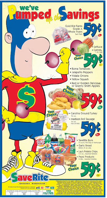
|
| The Atlanta Constitution (Newspapers.com) - April 21, 2002 |
Earliest Howell Mill SaveRite ad I could find.
To quote J.T. from Sky City Retail, "After the Atlanta area Winn-Dixies closed, Winn-Dixie tried something very strange...resurrecting the more profitable of the Atlanta area stores into a warehouse grocery concept called "Saverite". Saverite was hardly a hit, but their mascot in their slogan was quite amusing featuring a comical, bug-eyed man in a cape who was going to save you from high prices. Honestly it looked like the cape was on too tight causing his eyes to bulge through them! In real life, such a character would be hauled off to the psych ward and likewise this crazy and rather dated attempt at advertising wasn't enough to disguise (pardon the pun) that it was Winn-Dixie's last gasp in the Atlanta market."
And J.T. is exactly right: this was Winn-Dixie's last gasp for air in the Atlanta Metro. Having been to several former SaveRite stores myself, I can tell you that the flailing chain did not spend much money on these "conversions" in a similar vein to how they did not spend much money on ad design.
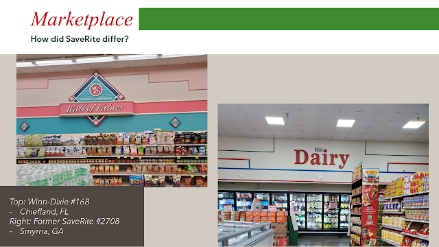
In a nutshell, Winn-Dixie took down most existing Marketplace signage, painted the walls white, and painted the existing quarter-round trim blue, red, or green to match the SaveRite color scheme. Oh yeah, and they left behind the old diamond wall accents while painting them as well. These count as some of the cheapest supermarket "remodels" I've ever witnessed, and that says something.

|
| Courtesy Sky City Retail History - SaveRite #2722 (Kennesaw, GA) - September 2005 |
Needless to say, the good times did not last: All SaveRite and Winn-Dixie stores in the Atlanta division were closed in 2005 as part of the company's infamous bankruptcy proceedings.

|
| Fulton County Property Records - SaveRite #2726 - March 2003 |
This included former SaveRite #2726 which is shown above. Thanks to the aerial imagery available on the Fulton County Property records, we can even get a surprisingly clear look at the old SaveRite while in operation! Furthermore, the Eckerd store seen above (now Walgreens, née Rite Aid) had been in the shopping center since its completion in 1979.

|
| The Atlanta Constitution (Newspapers.com) - July 30, 2005 |
Publix purchased this location, along with #1118 in Conyers, while Winn-Dixie was battling bankruptcy court in July 2005. SaveRite officially closed its doors on Howell Mill Road that year.

|
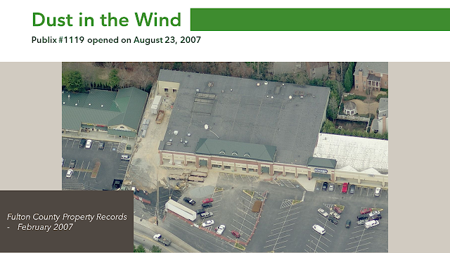
| Fulton County Property Records - Future Publix #1119 - February 2007 |
What's especially interesting is how it took Publix over two years to open this store after the initial purchase was announced. Stores #1117 in Clearwater and #1118 in Conyers, both former Winn-Dixies, opened in November 2005, which means Publix really took its time with this space – I'm sure that will become apparent in a bit. We can see that construction was well underway in this February 2007 shot, and this parking lot remained just as small as it was back in 1980.
Publix #1119 would officially hold its grand opening six months later on August 23, 2007, but the affair didn't seem noteworthy enough for local newspapers based on what I could find.

|
| Courtesy Maria H. (Foursquare) - January 6, 2013 |
The other piece that apparently was not noteworthy enough was this store's interior. I was only able to scrounge up a single picture of this Publix featuring its original interior: Invigorate. Many wouldn't pick up on that detail from this 2013 shot alone, but I'd recognize that stainless steel restroom sign from a mile away. It's also worth pointing out how the greeting card display is situated against the front wall below the stripe of dark green "Evergreens" paint – this will come into play in a bit.

|
| Courtesy Lindy F. (Foursquare) - May 4, 2017 |
Fast fourwarding 4 years, we find ourselves in checkout line 1 looking back at frozen foods on aisle 9. That aisle marker indicates that this store was remodeled to the Bamboo interior package later in 2013, despite keeping the original "Classy Market 2.0" blue and white banners hanging over the freezers.
After all, this is one of only seven Publix stores to be housed in a former Winn-Dixie building, and the only one in a pre-Marketplace build. This should lead to some interesting discoveries.
We'll hop over to the opposite side of the vestibule to take a look at this unconventional store's surprisingly conventional layout. I believe Publix added the interior wall to my left, but The Beef People also would have used part of this space to store shopping carts. The taller exterior wall (below the "Welcome to Publix" sign) would have been where an elevated manager's office was originally placed, which provided a nice bird's eye view over the entire salesfloor.
Inside
the store, we find that the customer service counter, decorated by a
display of pumpkins and gourds, replaced the old greeting card wall
during the Bamboo remodel. We also see the familiar Publix "P" which is a hallmark of post-2015 Sienna installations.
As far as I can tell, this store was never converted to the Marketplace format while a Winn-Dixie, but did include a full deli, bakery, and seafood department according to a 1995 newspaper ad. Even with those service departments, we would have been looking at the old Produce Patch in the front right corner if this were taken 20-years ago. I'd be hard-pressed to tell you we were looking at a circa 1980 Winn-Dixie based on this photo alone; this shot makes the place look like a new-construction 45M!
Heading down the grand aisle, the only shot I got in front of the deli was this one: mediocre at best. At least we can partially see all of the intricate tile work installed at the bakery.
Continuing the theme of Publix cramming a 45M layout inside 31,000 square feet, we find the produce department located in a partial alcove in the back right corner. I'd be curious to know how many copies of this artichoke photo Publix printed over the years.
While I may not know that, I do know that its presence indicates this Sienna install occurred before 2019. I guess that leaves us with late-2017 or 2018? (Well, it looks like the latter based on Google Maps.)
It's always amazing to see one of these buildings with the dropped ceiling removed because you wouldn't realize how high the roof actually is. I'd guess that the dropped ceiling height used to be roughly in line with the top of the "Dancing Green" seafood wall.
"The room is hot and that's good
Some of my friends came by from the neighborhood
The people starting to climb the walls
Oooh, it looks like everybody is having a ball"
"Oh, what a feeling when we're dancing on the ceiling"
I guess I did it to myself, but I feel like I just walked right into that last Lionel Richie song (almost like how I just walked right through the produce department with very little to say. We'll take one last look down the grand aisle before continuing on – take note of how the produce displays are perpendicular to each other in order to maximize the tight space.
I know I see food, but do you sea-food? Well, that didn't go swimmingly, but I'd say that my Bamboo seafood department sign mock up still looks quite fresh.
While this store did previously feature a sign similar to the one above during its Bamboo days, it originally would have sported a design like this along the curved wall with the circa 2007 Invigorate package.
Anyway, I've thought it was interesting how Publix left behind the pieces of wall that stick out in the bottom corners of these CM 2.x seafood signs with Sienna – those originally would have secured a string of pendant lights which did little more than add a pop of blue to the space.
The rectangular wall behind the meat sign is another remnant from CM 2.x, as this space previously featured a larger barn graphic with Bamboo (CM 2.5), or a similarly shaped wood-grain graphic from Invigorate (CM 2.0).
Looking down the rear aisle of the store, the walls are noticeably bare (save the Portabello and Tatami Tan paint) with Sienna compared to how they originally looked with Invigorate or Bamboo. Sienna really needs the extra soffits to bulk things up.
The awkward column placement is also a result of Publix inheriting this building. At least the shiny, metallic wrapping is reminiscent of Winn-Dixie.
Peering down aisle 8, we find some vegetables that are frozen in time, along with some Atlanta United FC advertising materials.
Something I especially found interesting is this sign above a meat freezer printed on a sale tag: it stated,
I commonly come across signs for the managers of a given service department, but I've never seen the same done for frozen foods (or just printed by a local store, like this one seems to have been). I guess Dee is really proud of her work!
Looking over at aisle nine, we find more freezers and a whole lot of wine displays. An entire side of aisle seven was dedicated to wines, so I'm not sure why Publix felt the need for four separate displays within this one area.
Aisle 10 is home to all things baby (and some shoe shining supplies for when baby barfs down there).
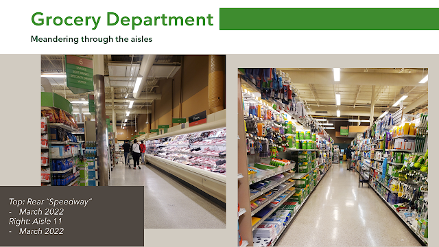
And aisle 11 is home to everything else you need to clean up after baby, as well as school supplies. Publix did pretty well with stuffing a 39M or 45M into this space, but we still ended up with a few random outliers like the tiny section of notebook paper being right next to paper towels.
This store also received the extra pegboards over several of the aisles to make up for the lack of space. I've otherwise only seen this in a 28M or smaller store.
The Internet's favorite aisle (as coined by AFB) provides pet products, paper plates, and plastic packages.
Oh, and I guess toilet tissue, too. It looks like the milk cooler even received its own "stocked and managed" tag like we saw back in frozen foods.
The remainder of unlucky aisle 13 looks like any standard 45M, just without some extra candy added between the bread and the pharmacy. Oh yeah, and most of these items would be on aisle 16 in the aforementioned larger stores.
Nonetheless, the organization in this dairy display looks "egg"celent, wouldn't you agree?
We'll round out the aisle with a look at the pharmacy and the abbreviated section of H&BA aisles sandwiched against the registers.
While the flooring in here resembles the real thing, this store only received the faux, epoxy-based terrazzo. I'm not sure what determines if a floor receives faux or real terrazzo (considering how I have seen both in new construction stores), but Publix still wanted this space to feel nicer than a quick conversion with vinyl flooring.
Our parting shot is of the life safety plan posted in the vestibule. I typically have to scour the internet to find such for a given store, but Publix willingly posted a CAD floor plan here for some reason. Despite being the wrong orientation for the piece of paper, we can still get a nice overview of how this retrofitted store is laid out and how little backroom storage space is available.
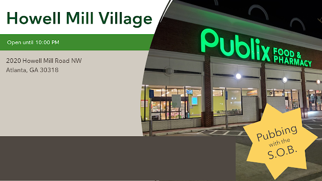
Anyway, that will do it for this week, but make sure to check back in a few to see if I'm able to crank out another post (or if I have to resort to "plan b" like I did this time). As a bonus, I'll include a few of my PowerPoint slides below for you to relish in.
Until next time,
- The Sing Oil Blogger
This shouldn't take too long to get through, so keep on reading as long as you aren't sick of me yet.
On the first in-person edition of "Pubbing with the S.O.B.", I explored the wonders of a vintage Pub-Dixie with a group of people who likely care much more about Star Wars than couponing with Star. That's fine, they can keep to their strange addictions.
It was an interesting change from the norm to create a PowerPoint from a post since I first had to draft my content as an outline, then pull pictures and details for the slideshow that I thought were relevant. The hardest part was keeping to my 5 (or was it 10) minute time limit. In any regard, I wonder if this means one of my future mediums could be slide show presentations on YouTube? Maybe more of you would pick up on my extreme sarcasm!
With the crowd of spectators being largely unaware of the intricacies of Publix design, I pulled out all of the stops with this presentation (which means it also includes a few spoilers for upcoming blog content). Whatever. We'll see if you even notice them out of context . . .
I figured it would be a waste to straight-up narrate these slides (considering how you can just open up a new window with the top half of this post and read along as you scroll through the pictures).
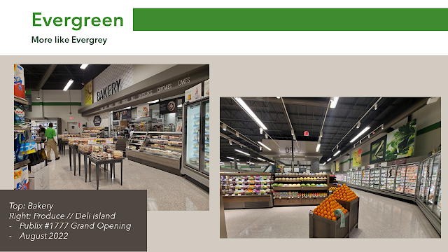
However, I still wanted to include them since I thought they turned out well, if I do say so myself! I really had fun transforming the aura of Evergreen into a design theme while seeing what kind of witty titles I could throw up top.
I think the inclusion of the Evergreen Revision 3 font helps to complete the look (that turned out to be a pain, though, because it doesn't just come installed on most computers. I had to scramble to download and convert it on my friends laptop before beginning my presentation. At least I wasn't the only one at the party who ran into that issue!)
All-in-all, people seemed to enjoy the keynote and found some of the idiosyncrasies of one of Georgia's stranger Publix stores to be fascinating. I, too, was shocked at some of the information I uncovered during my background research which led to this store being an unintentionally good choice. I just thought I'd find that it opened and closed as a Winn-Dixie before converting to a Publix, but no, there was much more to that can of worms!
I had to give a lot of background information, but the meat of the presentation still consisted of my typical "stour" images.
Despite its small stature, it's still hard to embody the feeling of the store with just a few pictures. I knew I had to include my picture from aisle 11 because I feel like the extra pegboards atop the shelves showcase a Publix that is edging toward the cavernous feeling of a Kroger. At least the floors look much better!
Who knows, some people may just think that I'm an egg head after hearing all of the stuff I had to say.
Despite that, I still managed to throw some green vegetables into the mix to make sure I wasn't totally full of . . . cholesterol.
I've even since had friends come up to me and say, "I noticed that so-and-so store looks a lot different from the one you talked about. Does it have Evergreen?" I'd call that an accomplishment!
Wow, all of these green foods almost make it seem like Sienna was the precursor to Evergreen. Add on top of that the fact that Invigorate and Bamboo used a paint color entitled "Evergreens", and you really have a confusing mix.
Surprisingly, I didn't realize that I neglected to include my store map in the slideshow! At least I was rushing through this portion of it anyway, so people probably didn't notice my orphaned caption.
Y'all probably have fewer questions than my audience did several months ago (I passed around several 'props' to boot), but if you do, just shout 'em out. Or type them below in the comments if you don't want to look like a total loon. On second thought, maybe that ship has sailed since you are already reading a blog dedicated to the history and makeup of Publix or other adjacent businesses.
Okay, that will for sure do it for this week's My Florida Retail post but make sure to take a glance at my last post covering the only true Publixsons outside of the state of Florida if you haven't already. It's especially crazy to see how this one received special treatment compared to the Sunshine State stores.
Signing off (for real) until next time,
- The Sing Oil Blogger









Wow, I thought you were kidding about the PowerPoint, but I guess you weren't! I'm not sure what to think about you making a PowerPoint for your friends. One thought is "With friends like this, who needs enemies?"
ReplyDeleteOTOH, it would be neat if my friends surprised me with a retail PowerPoint party. Well, maybe not if it is of 'The Floors of Kroger in the 2010s+,' but a Kroger Neon slideshow? I'd sign up for that as long as not much time is spent on Kroger Fake Neon, lol. Oh, my initial reaction before clicking on the link was that you were probably being too harsh on that Kroger you mentioned, but then after seeing the images of it, no, you weren't being too harsh, lol.
I suppose between the Kroger and the Publix, one can choose an overly bare ceiling or an overly bare floor. I'd probably choose the overly bare ceiling in this case. At least I can tell myself that it is still an improvement over what The Beef People, or whatever that SaveRite clown spaceman is, had before!
At 60 cents per pound, if I'm reading that sign correctly, I dare to say that Publix is selling bananas cheaper in Atlanta than they do in Florida! Then again, I'm sure that broken and empty shopping basket container would not be deemed acceptable at a Florida Publix! Now, at a Florida Winn-Dixie? Well, that might be a different story, lol.
Interestingly enough, Kroger did try a discount format in Houston in the 1970s. It was called Bi-Lo. I'll let you chew on that for a while, lol. Bi-Lo didn't last long. Well, not the Kroger Houston Bi-Lo at least!
No, I was not kidding at all! The thing is, they had just as much right to judge my topic as I had to judge theirs! In the end, I think they were entertained; several of them even mentioned the other day that they still can’t believe they had never heard the word “vestibule” before. If anything, I taught them a few new vocabulary words!
DeleteYou know, “The Floors of Kroger in the 2010s+” would make for a fun post topic: Retail Retell, here’s an idea for your next April Fool’s post. I still wish I could have photographed the Fake Neon in the Lanett Food & Drugs before it was gone, much less an actual neon Kroger. I’m also glad you agree with me about the Kroger down the street from this Publix – it would be the perfect candidate for the aforementioned post!
I’d choose an overly bare ceiling any day over a bare floor. While a bare ceiling isn’t the best thing to look at, I’m still fascinated by seeing the mechanical systems overhead especially since they tend to be neatly arranged. Bare concrete floors, on the other hand, tend to be much less artistic. Speaking of creativity, one day I’ll give you a full tour of a former Atlanta-Division SaveRite so you can get a full taste of what the clown spaceman was all about. Here’s a hint: Publix’ bare ceiling pales in comparison.
I think bananas are typically cheaper in Georgia than in Florida. As for that basket holder, the sign on top simply got knocked over and just needed to be straightened out. Those placards are meant to be removable. Winn-Dixie typically doesn’t even bother having basket holders like that – the ground is good enough for them!
Good thing Kroger didn’t try to bring the Bi-Lo name to South Carolina . . . Maybe that’s why Sav-On took off.
I guess a googley-eyed superhero wasn't enough to save Winn-Dixie in Atlanta...
ReplyDeleteFor a 1980's Winn-Dixie, this store had quite the fancy facade design. I'm not sure if that facade was original or dates back to a later remodel, but it's the nicest facade I've seen on a WD from this era (and made for an ironically fancy SaveRite!). And that photo you have of the store with the almost perfectly preserved 70's wooden interior - I can't believe that decor is still out there almost perfectly in-tact like that at some random independent grocery store - I want to see more of where that picture came from!
With how this was one of Winn-Dixie's older stores, I'm not surprised this store got a more intensive remodel from Publix compared to the Marketplace-era WDs Publix inherited around the same time. It's weird seeing the classic WD vestibule on a Publix, but at least that was kept as a nice reminder of what this building used to be. The interior though looks very much like a modern Publix, and it's hard to tell from the inside that building dates back to 1980.
It's nice to hear some pieces of your Publix presentation rubbed off on your friends, and that they actually liked hearing about the nuances of a Pub-Dixie!
No . . . I’m not exactly sure what that deranged superhero could have saved anyone from!
DeleteI wonder if the fancy façade was a consolation to the neighborhood for building the shopping center. It is always surprising to see fancy stores like this turned into discount grocery stores as well. It also looks like I gave somebody a surprise . . . we’ll just have to wait and see if / when more details about that store surface . . . unless you want to open that Pandora’s box.
I’m not surprised it was thoroughly remodeled, either. It would have been cool to see a true Pub-Dixie in this location, but Publix probably figured it was best to take the time and gut the building before they moved in since the location doesn’t have much room to build a larger store. Like you said, at least the original WD vestibule was able to survive (and my friends now know what a vestibule is).
I was glad how surprisingly well the presentation seemed to go with my friends. One of them mentioned having another PowerPoint Party soon so I’ll just have to decide if I give another retail-related presentation or if I choose another off-the-wall subject.
It's interesting to learn a little more about SaveRite -- I'm pretty sure they had a Mississippi presence as well, but I've never really looked into it. Maybe I should.
ReplyDeleteThat's cool your PowerPoint resulted in some of your friends noticing more details about their local stores!
I could be wrong, but I think SaveRite originated in Mississippi and was acquired by Winn-Dixie. From the little I’ve been able to dig up, it looks like the Mississippi flavor of SaveRite was a bit different from the Atlanta version since the MS stores were actual warehouses. I wish there was some semblance of those still hanging around so I could compare the two, but the closest example I’ve found seems to have closed recently. At least there is also this store in Meridian that at least appears to have the original floor tile and some of the original wall décor. That one would be worth documenting for the sole reason that there is so little information about SaveRite out there.
DeleteAnd I agree! I had a lot of fun with my presentation!
Oh wow, I had no idea! Well -- maybe that's one of those things I learned long ago and have since forgotten. Either way, it seems like news to present-day me, lol. I remember hearing about that Jackson Food Depot closing recently, but didn't know of its connection to SaveRite. It would be nice to learn more about the chain and how Winn-Dixie came into the picture.
DeleteIf only you could have photographed that store before it closed! Well, at least you know now, and maybe SaveRite can be an interesting future topic for you to research.
Delete