Previously, I was unaware that Sienna (CM 3.0) and Invigorate (CM 2.5) both made their debut in 2010. I also didn't realize that Publix's second-generation 54M prototype first-gen 56M prototype was the first store to introduce the world to the Sienna Environment Package. So far, I have learned of three "Hybrid Format" concepts which were designed to incorporate elements from a standard Publix and a GreenWise store to create a more premium shopping experience. While I was anticipating to capture this store with all of its early Sienna design quirks, I missed the mark by a few months and found this store had been Evergreen'd. Although I was upset to find that some of the more unique aspects of this store had been wiped away, I still got to see some strong influences from the Hybrid concept which live on to this day, in addition to remnants of 2011's prototype version of Sienna.
I've now been to three 2011-2012 era Sienna stores and all of them seem to be located in wealthier areas of the Atlanta Metro. It seems as if Publix initially intended for Sienna to be the décor used in premium stores while Invigorate targeted the majority of the Publix footprint. I've also learned that there were three distinct eras of Sienna, with the third being the most common, the second being fairly wide-spread, and the first, which this store originally featured, being very elusive. Although this store has been remodeled to Evergreen, we will get to see some of the unique aspects that still remain. If you want to have a better idea of how this store looked when it opened, AFB posted about its sister location (the third Hybrid Format store) back in 2019 and was able to capture a few of the early Sienna oddities. We can't take a time machine back to see how this store looked a year ago, but we can see how it looks in 2022; let's check it out!
The Store
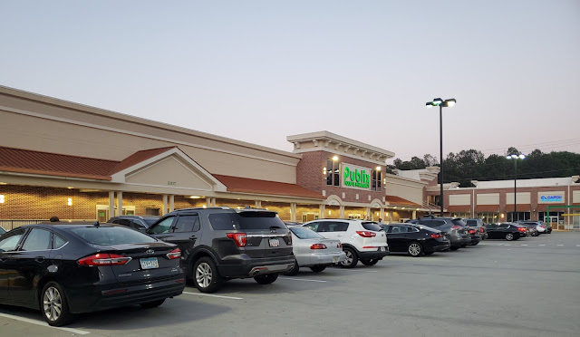
Publix #1363 opened on April 21, 2011, as the second largest ITP Atlanta store (behind 1996's #536). It still surprises me to see such a large supermarket built within Atlanta's I-285 perimeter; with that being said, this store was constructed on top of a parking garage to allow it to fit in a more condensed space. Another unique aspect I notice from the picture above is how the store has two exits. Typically, the modern 54M-2 will only have one entry and one exit, both centered on the store.
Walking inside, we see the typical cart storage area between the two sets of doors. This is one time when I was really saddened to not find any green beans!
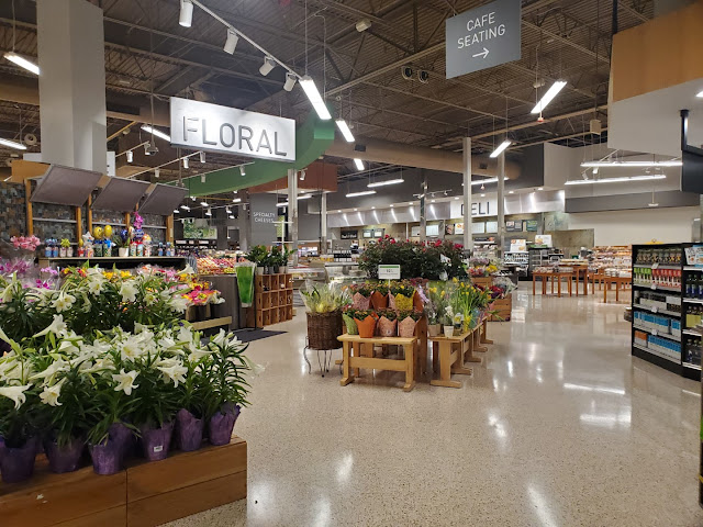
Much of this section of the store will look familiar to anybody who has been to a second-gen 54M. The primary exception I see is the café and accompanying seating area. Publix seems to only build cafés in more premium markets.
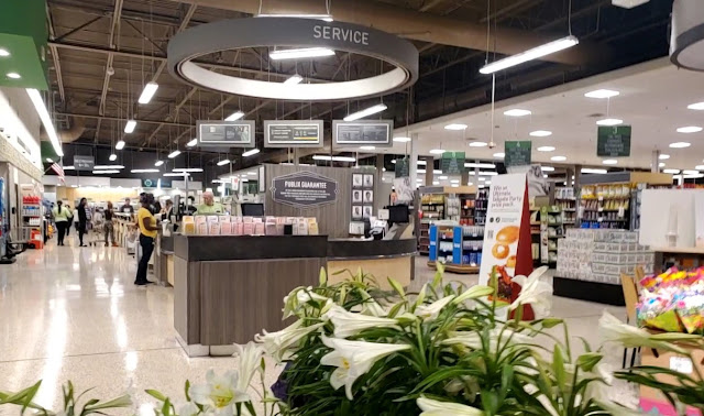
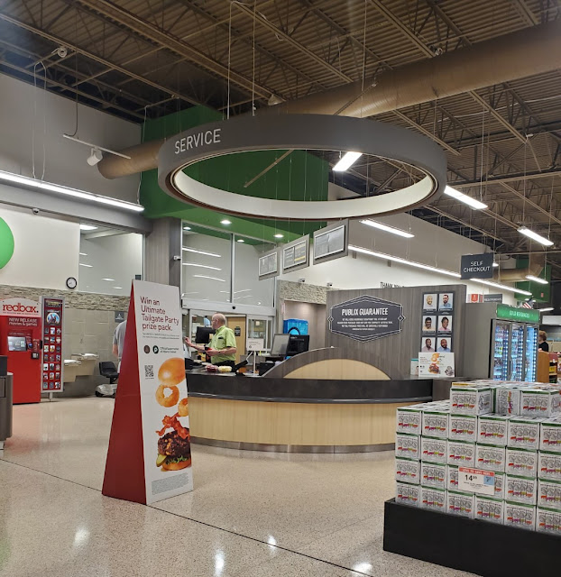
Taking a look back over the front end, nothing looks too out of place here. The main thing I noticed was the island containing various lottery forms. It seems like these are typically placed in a branded fixture against a wall, and not in a Publix-supplied cabinet. This store also managed to keep its original round customer service island. Both earlier CM 2.0 and later Invigorate / Sienna stores also have a section of dropped ceiling within the ring hanging from the ceiling, but this store's was just hollow.
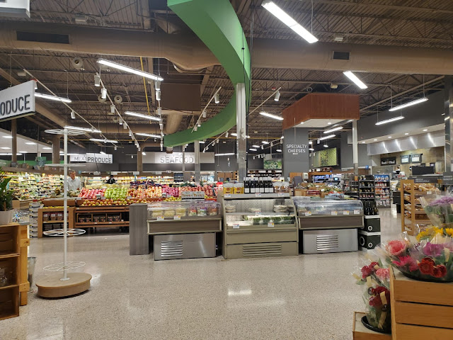
Stepping into the produce department, I see a few things that Publix decided to change in later stores. The first is the green arc. In newer stores, the orientation of this was flipped and shifted toward the coolers. Additionally, "Produce" signage would have been attached to this and not simply hung independently.
Is it just me, or does anybody else feel like the green on the arc clashes with the brown ceilings in this store?
Looking over toward the bakery in the front right corner, we see a sight that looks pretty familiar. We also can catch a glimpse of the edge of the café in this shot. I would like to point out how the bakery received mosaic tiles between the larger blue tiles; this is a pretty consistent sign of a store which was built before the 2016 (3rd-gen) Sienna refresh.
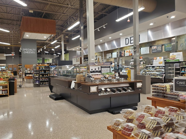
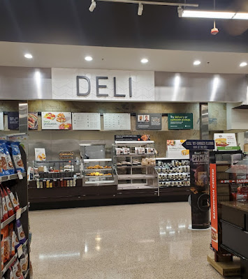
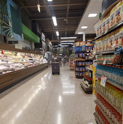
Next, we see the deli, hot food bar, and specialty cheese island. While this may look similar to other stores, there a few subtle differences. The first is that only premium stores receive a hot food bar or a specialty cheese island. Others would just have coolers in these locations with various cheeses or pre-made deli products. The other thing is how the sliced meats counter was swapped with the chicken and sandwich station in this store, compared to later builds of the 54M-2
I really wish I had seen this store before it was remodeled, because it previously featured a unique wood-grained deli department sign.
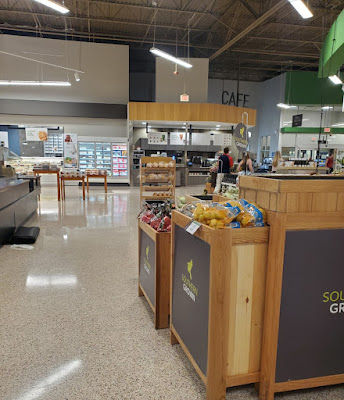
With a quick look back toward the front, we see the café and seating area which call the "multipurpose nook" to the right of the door home. Similar to the space in the front right corner of 42N & 49N stores, I have seen a number of different departments call this space home in the 54M-2.
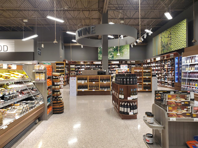
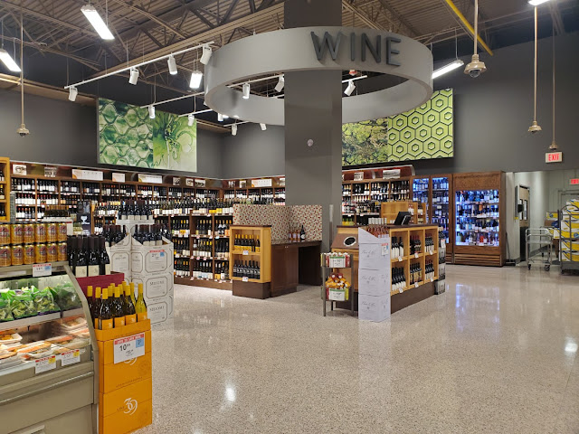
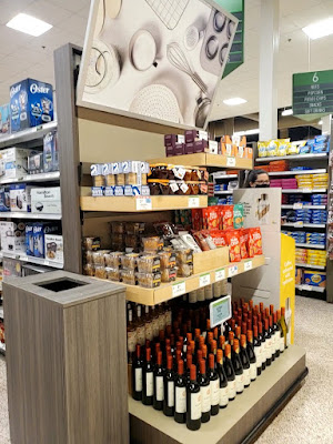
This store still placed wine in the back right corner, but it looks as if it received more premium wooden shelving and a sommelier desk. It also retained a painted version of its round Sienna department signage.
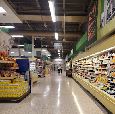
Let's take one last look at the grand aisle before we move on.
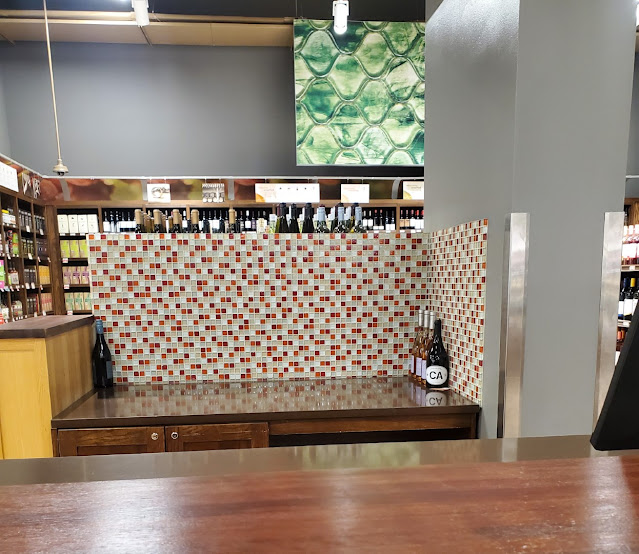
I wonder how often this store has a wine specialist on-site because this station looks fairly empty.
I did manage to take a picture of this tile pattern though; you won't see this one in any-ole Publix!
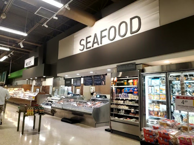
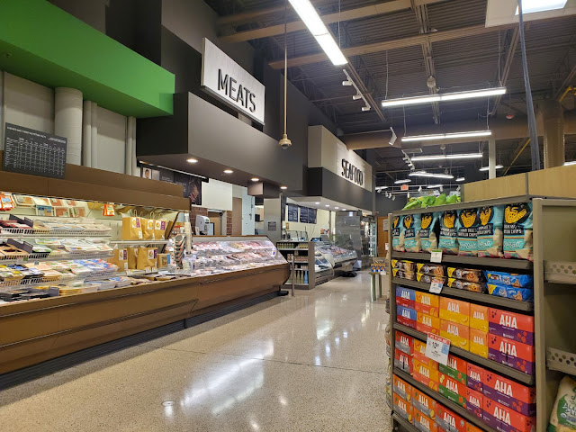
Next, we'll move onto the seafood department. This is another department which had unique signage back in its Sienna days because it looks like it featured lights with a wave pattern.
One of the easiest ways to identify an early Sienna remodel is this unique brown tile pattern behind the seafood counter. Publix eventually landed on this blue one, and it seems most of the prototypes, whether new builds or remodels, received that treatment.
This store also seems to have received seafood display cases which look more premium than the ones in a standard Publix.
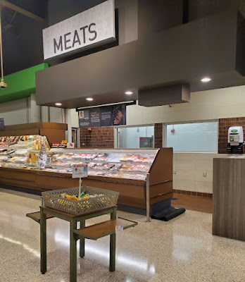
Here is another angle of the meat counter, and its striated muscle tile pattern.
Aisles 1 & 2 are recessed a bit from the main actionway and have a specials island in the extra space.
We'll take one more look at meat & seafood before we move on.
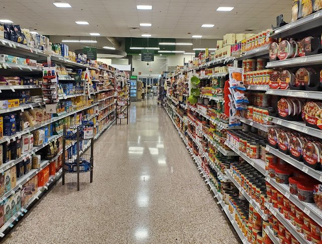
Aisle 4 is home to canned vegetables and pasta.
One big thing I noticed while wandering the grocery aisles of this store was the presence of these specialty endcaps every few aisles. Most of them seemed to feature gourmet or organic items, which would make sense with this store being a "Hybrid".
Returning to the back aisle, this view looks largely the same as any 54M-2. The one indicator of this store's status is the premium endcap on the edge of the frame.
Aisle 5 houses this store's selection of crackers, cookies, and office supplies . . .
in addition to candy!
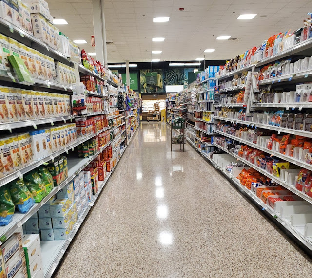
Aisle 7 has beer and snacks, while aisle 8 contains the first half of frozen. I've also noticed how some stores' Evergreen aisle signs look like this and feature green frames, while others have grey frames. I believe Publix recycled the green Sienna frames wherever they could but opted to purchase grey frames for most new-builds or non-Sienna remodeled stores.
I was hoping to channel more of my puns / sarcasm for this post, but nothing in these pictures seems to be calling my name. Anyway, between the brown-tinted terrazzo, brown coolers, and brown ceiling, I think this store's interior is more EverBrown than EverGreen.
Aisle 9 has the remainder of frozen food and some nice khaki colored refrigerators – not the color I would've picked!
The remaining grocery aisles seem to be laid out the same as most other modern Publix stores. I would like to point out how this store has two emergency exits in this corner of the store, compared to most typically only having one; maybe this relates to the store's slightly larger size as a 56M? We also can see another GreenWise display on the endcap.
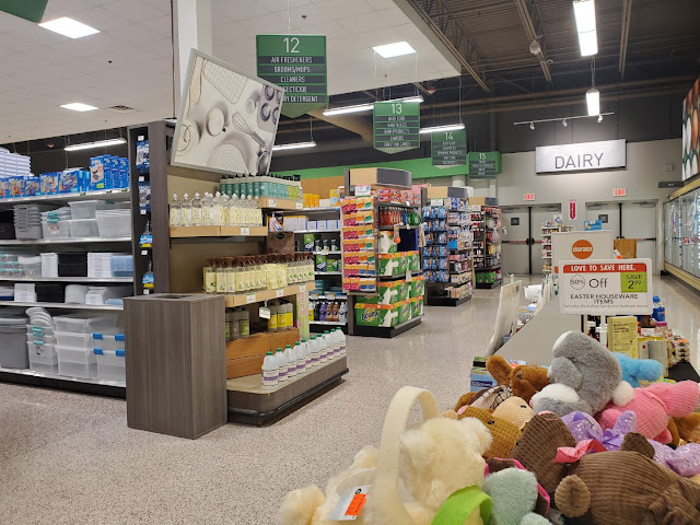
Aisle 14 features soap and cosmetics.
I'm not sure if you'll find this in a regular Publix (because I haven't really looked), but I noticed that this store had a random section of organic or specialty dental hygiene products next to the standard fare. I think the idea behind the "Hybrid Format" was to sprinkle sections like this throughout the store to provide a more upscale selection of products.
Meanwhile, aisle 15 is where you'll find yogurt, cheeses, and butter. I find it odd that water is also on this aisle, because the non-refrigerated space is typically reserved for bread, peanut butter, and jelly in other prototypes. Although the aisle signs list bread and jelly as being on this aisle, I don't see it in my pictures!
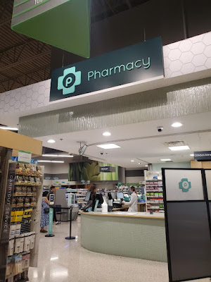
I do like the glass tiles Publix used for their pharmacy counters with Sienna.
Now we'll take a look at the "front speedway" as Publix calls it. If you didn't notice, this store also got more premium shelving for these pharmaceutical aisles in the front of the store.
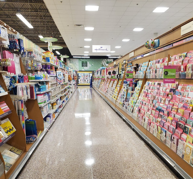
This store may not have as many cards as #1228 which we toured a few weeks ago, but it still looks like a lot when it takes up the entire side of an aisle. Greeting cards must have some high margins!
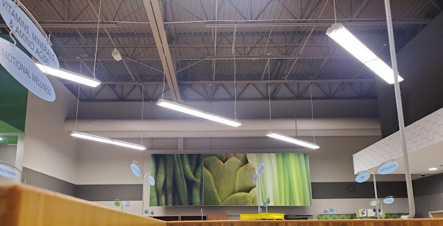
I've previously seen this collage in another Evergreen store, but I love how the designers in this package decided to leave a subtle gesture toward this store's Sienna past. The green beans may no longer be by the entrance and the artichoke may not be in the produce department, but they are still here!
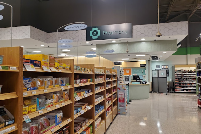
The honeycomb pattern also does look nice above the pharmacy.
In the edge of this picture, you can see this store's second set of exit doors, which feels really odd if you are used to seeing the very similar 54M-2. This seems to be a defining feature of 56M stores, or a 50,000 sq. ft. prototype I recently discovered in North Carolina. We can also see more of the wood shelving where customers can find various supplements and health products.
While these aisles of pharmaceuticals look rather standard, I did notice that the two "vitamins" category markers did not match. I'm not sure whether this was intentional, or if one was new and one was left over from Sienna (I've never paid much attention to how these vary between décors).
Adding to the premium feel, this store also received a goat soap display. As I've mentioned before, these seem to be reserved for higher-end locations.
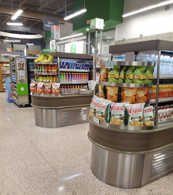
Something I had never previously seen in a Publix were these fancy drink/snack coolers by the registers
It looks like Publix even went through the effort to add the Evergreen-style grey wood grain to these as an update.
Since I always seem to catch Publix with some sort of holiday decorations, this particular trip found the store making preparations for Passover. However, I didn't notice much besides this sign acknowledging the religious celebration.
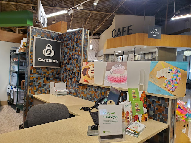
Another sign of this store's premium nature is the presence of an Apron's Catering counter.
Another fun tile pattern which you don't see every day!
We'll take one last look at the Café and entry door before we prepare the cabin for departure.
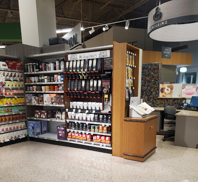
A final thing I wanted to point out is how this store still sold bulk coffee. I don't remember the last time I saw bulk coffee with the accompanying grinder in a Publix, but I used to love smelling the different beans and asking to buy some just so I could use the grinder!
Interestingly,
Publix didn't bother to change out the customer service island with the
newer style of desk. I also noticed how Publix simply painted over the
wood veneer on the "service" circle hanging from the ceiling because
the Sienna wood pattern could still be seen between the outer ring and
the inner light ring. Regardless, that is probably something only a devout retail blogger would pick up on!
And that will conclude our tour of Publix's second store to feature the modern 54M layout (in a 56M) and the Sienna interior package. While I'm sad that I didn't manage to visit this store while it still had Classy Market 3.0, it was still a cool experience. Until next time!
- The Sing Oil Blogger


