Publix #1058
270 E. Eau Gallie Boulevard, Indian Harbour Beach, FL – Indian Harbour Place
Publix opened this location in 2006 at the site of former Winn-Dixie #2291, an 80’s era Winn-Dixie that relocated down the street to the site of a former Albertsons in the late 90’s. This Publix replaced store #120 across the street at 223 E. Eau Gallie Boulevard, a space now split between a Ross Dress for Less and Office Depot. When Publix moved to this site, they did not reuse the Winn-Dixie building. This building was built new by Publix on top of the old Winn-Dixie and half of the next door former Walgreens. Also to note, Publix bought this entire shopping center back in June 2016.
@PlazaACME - This store tour is for you! (I remember you've mentioned this store a few times in the past). PlazaACME replied to this shout out as follows: "Thanks! This store was my first/only Publix experience so far. I really liked it."
In this My Florida Retail post we'll take a look at the Indian Harbour Beach Publix, a busy Publix located about a mile from the beach on the Eau Gallie Causeway, the main retail strip on the beachside. Given this store's location, this store caters to both the beachside locals as well as the many tourists who stay at the nearby hotels. This store is, for the most part, a typical mid-2000's style store in design and layout. However, this store was remodeled again in 2017 into a wannabe 54M prototype store (minus the deluxe elements like expanded prepared foods, specialty cheese counter, and such). I don't have any post remodel photos, as what you'll be seeing in this store tour is how this place looked with the Classy Market 2.5 decor (installed around 2012-ish).
To reflect on the fact that this Publix is located near the beach, a wave pattern was painted on the decorative awnings that span the front of the building.
Looking across the store's front walkway in this photo, where some promotional items have been placed. The entrance is located just ahead as well.
Welcome to Publix! Well, almost. Beginning with the next image we'll actually go through those doors and into the main part of the store, although you can get a sneak peek of the decor through the doors (which, for a refreshing change, is Classy Market 2.5). However, as I said before, that dingy, decrepit (he said facetiously), only 5-year-old decor was replaced in 2017 by the ever remodel happy Publix. Like I've said before, even though Classy Market 2.5 came out around 2011-ish, it's becoming harder to find these days as Publix continues their never-ending remodeling spree.
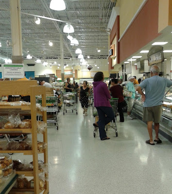
When first walking into the store, you are greeted by bins of sale items and the floral department. Beyond all of that is the bakery (seen here), located in the front right corner of the store.
Here's an interesting Publix relic I spotted in the floral department. This sign is an early 2000's Publix advertisement, probably hanging here since this store first opened in 2006 (although this sign was fairly outdated even in 2006). This sign features the old 90's style Publix Floral department logo, and a mix of Wavy Pastel decor font ("Full Service Floral Department") and Classy Market 1.0 font ("Publix offers a" and "Stop by and meet our designers"). Classy Market 1.0 is the decor package this store opened with. So over a span of 13 years now, this store has sported three different decor packages. Compare that to the many Winn-Dixie stores opened in the mid-1990's still have their original decor 25 years later!
A zoomed out photo of that old Floral sign. After doing the zoomed in crop of the sign, I wasn't sure if I wanted to keep this photo to post, but I figured I should just include it anyway. As styertowne commented, "It sorta resembles the Winn-Dixie 1990's Marketplace signage (at least with the diamond in the back)" This Publix department-specific logo dates back to the 90's as well, and the floral, bakery, and deli departments all had similar ones with slightly different colors. I don't know if it was designed with the Winn-Dixie diamond logo in mind, but it is similar. The pastel pinks also add to the Winn-Dixie Marketplace vibe.
Just beyond the bakery and further down the right side wall is the deli counter. Here you can see a decent lunch rush at the Publix deli, with a good number of those people probably waiting to order a famous Publix sub, aka the "Pub sub". Publix's subs have become so popular that those sandwiches have spawned an unofficial Facebook page, Twitter, Instagram and Tumblr accounts, along with #pubsub (the hashtag is actually endorsed by Publix)! I do have to say, Publix does make a good sandwich, and they're big sandwiches too. I really want a Chicken Tender sub now after writing all of this! :)
A straight on look at the deli counter.
Looking back into the front right corner of the store, back toward the bakery and floral departments.
The back right corner of the store is home to the produce department. The side wall opens into a small alcove to allow for more space for produce.
Looking from produce across the back wall of the store, with the meat department and the seafood counter lying just ahead.
Moving on from a look across the back of the store to a look across the front of the store now. Off in the distance you can see this store's pharmacy.
Looking up aisle 3 (international foods and kitchenware) toward the front of the store.
Looking at the meat department signage from the end of aisle 5. Behind the meat cases is the meat prep area, which is behind that row of windows.
Aisle 7, which is home to the cereal and coffee, among other things.
Publix's customer service desk is located in an island near the main entrance. Over the service desk is this large circular sign, which I like the look of. The stores built with the Classy Market 3.0 decor have other circular department signs like this to identify select other departments, and I think it looks nice. Retail Retell agreed in the comments, but Retail Retell doesn't think including that in this post is entirely necessary :P However, AFB disagreed, and decided to keep that sentiment here on the blog anyway.
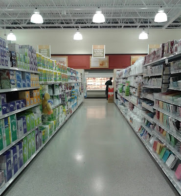
Aisle 8, which is home to paper goods and disposable dinnerware. As J. Mc. commented, "The lamps are interesting, a nice upgrade from strips of florescent bulbs." Publix has never been a fan of the long fluorescent strips. When they first started building these open ceiling style stores, these style lights are what they chose. Their more recent stores (as well as remodeled stores) get these flat square shaped lights. J. Mc. further added from his original comment: "[Those new lights are] probably LED, which would lower their energy costs significantly. MSP Airport replaced all the old fluorescent lamps in their parkades with flat LED lights a couple years ago. Not a cheap endeavor but the energy savings add up."
@Random Retail - Recently I've noticed Publix has begun carrying small Lego sets in their stores that have a small toy section. I thought you'd appreciate seeing this. Random Retail replied to this as follows: "Yes! I do. Thanks for the shoutout! Those sets are only $10 elsewhere and the Tire Escape is $7, so Publix marked them up."
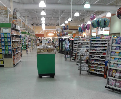
Since this store is located close to the beach and many beachside hotels, Publix dedicated half of this aisle to souvenirs and beach accessories.
The frozen foods aisles. That coffin case only runs through the back half of this aisle. Behind me were more upright cases.
Dairy department signage. Upon first seeing this sign, J. Mc. commented, "Ahh, it's cheese, I thought at first it was a giant goldfish..." However, on a more serious note, The NC Piedmont Database commented, "That dairy signage reminds me of Food Lion's 2004 decor package." That Food Lion decor in question is this one, and the resemblance to Publix's decor is pretty striking! Retail Retell agreed, saying "I can totally see the resemblance!" The NC Piedmont Database went on to add, "They have the same font - that font is Avenir, I think."
The beer and wine aisle, which is located in the next aisle over from frozen foods.
The pharmacy counter, which is located in the front left corner of the store. I took this photo from one of the small aisles of health & beauty products that ran perpendicular to the other grocery aisles in the store. As YonWooRetail2 commented, "It's neat how Publix has created their own Pharmacy slogan: "Feeling well, Living better"-That's very catchy. Its sort of like Walgreens' slogan: " At the corner of happy and healthy"."
The last aisle is aisle 19, which is home to a portion of the dairy department (mostly butter and cheeses), sodas, and cosmetics ("an interesting combination!" as Retail Retell commented). At the end of the aisle you can see the pharmacy box.
A look across the front end, with the bakery in the background.
Introduced during the days of Publix's Classy Market 2.0 decor and carried through into Classy Market 2.5 was this neat feature: along the front end (and sometimes in other parts of the store), Publix would put a collage of classic store photos and photos of other Publix memorabilia. Unfortunately, as many stores are getting remodeled, these photos are taken down and more than likely trashed. However, I like how Publix embraced their past by prominently featuring these photos in their stores.
And I will conclude our tour of the Indian Harbour Beach Publix with this overview of the entire exterior of the store. However, remember how I mentioned that there used to be a Walgreens in this plaza prior to Publix relocating here? Before we finish, let's take a look at what's left of that old Walgreens space:
Walgreens #????
260 E. Eau Gallie Boulevard, Indian Harbour Beach, FL - Indian Harbour Place
So to wrap up this post, here is a look at the space immediately next door to the Publix building. This Walgreens opened in 1983 with the rest of the plaza. I believe that Walgreens #4815 at 2200 N. Highway A1A (located about 2 miles away) served as the replacement for this store when it opened in 1999. This store sat empty until Publix announced their redevelopment of the next door former Winn-Dixie, at which point half of the old Walgreens space was torn down to make room for the new Publix. The half of the building that remained became home to Pet Supermarket in the late 2000's.
While I'm finished with the Publix, we're not done looking around Indian Harbour Place. In the next My Florida Retail post, we'll take a quick look at the plaza's other anchor, Florida's very own Bealls Department Store.
So until the next post,
AFB


Great. Now I can't stop seeing a goldfish in that dairy department sign XD
ReplyDeleteWas the Bealls side always rebuilt too? Because it seems really familiar to a location we went when I was a kid, prob around 97 or so.
ReplyDeleteI believe Bealls expanded their store sometime in the late 1990's or early 2000's, which is when it took on its current look.
Delete