Monday, July 20, 2020

When the 2020s Meet the Thrift Store


Goodwill #5239
1965 Viera Boulevard, Viera (Melbourne), FL

     If I were to ask most people to describe the stereotypical thrift store, I'd probably get a description of a very low-budget place located in a washed-up shopping center anchored by Big Lots, Save-A-Lot, and a pawn shop, cramped and messy on the inside, with mismatched fixtures and signage throughout. While the thrift stores described like that are usually the best ones to rummage through years worth of piled-up junk, sometimes it's interesting to see the other end of the spectrum - the sleek modern thrift store (yes, never would I have thought I'd use the words "sleek" and "modern" in the same sentence as "thrift store"!) The "sleek modern thrift store" will be the subject of this post, where we'll be taking a peek at Goodwill of Central Florida's fancy new look!

     If any kind of thrift store is going to make it in the upscale-leaning Brevard County community of Viera, it's going to be one that looks like this. The Viera Goodwill opened on May 28, 2020, in a brand new building constructed across the street from the former Earth Fare store (and future Winn-Dixie). The Viera Goodwill was the second store in Goodwill of Central Florida's fleet to feature their new look, following the opening of the Lady Lake Goodwill on May 14, 2020. For quite a while now, Goodwill of Central Florida (who operates all of the Goodwill stores in the greater Orlando area) had been using a colorful interior palate, which we saw a little bit of in my recent post about Kissimmee's Mill Creek Mall. These new stores opened in the last few months have switched to a completely new interior decor package, featuring a gray and blue color scheme. But before we move along inside, I just have to say this place has one fancy looking exterior for a thrift store too!


     Before stepping inside, here's a look across the store's front walkway. One thing there isn't a shortage of in this building is natural light, as there are windows wrapping around the front and sides of the building, which was a nice touch.


     You enter into the middle of the building here, stepping into racks of clothing. Clothing takes up 75% of Goodwill's sales floor, and like most thrift stores, is the majority of what is sold here. All of the non-clothing merchandise is located along the store's right side wall, visible in the distance here.


     Here's a better look at what you see when first walking through the store's front doors, looking straight into the racks of clothing. The new interior decor also comes off quite clear in this image. The walls are primarily gray, with little sayings and pictures describing Goodwill's mission around the store's perimeter. The support poles throughout the sales floor are painted blue to accent the gray throughout the rest of the store, and feature additional advertisements and posters for Goodwill.


     Heading over toward the non-clothing aisles, here's a look toward the back of the store, where we get a clearer view of the wall decor. The book section is located behind where I was standing to take this picture. Usually, Goodwill of Central Florida has really large book sections in their stores. The book selection here seemed a bit smaller than normal, but that could also be because this store didn't have the bookshelves broken into numerous small aisles like the older stores typically do. While I didn't get a close-up photo of the book department, you can see it in the background of the very first interior image of this store.


     Electronics and small appliances line the right side wall, above which are many of the windows installed to give this store an abundance of natural light. Opposite the wall are the store's many aisles of bric-a-brac, this and that, and et cetera. Speaking of bric-a-brac, this and that, and et cetera, here are some small retail relics I found amongst all of that as I browsed these aisles:


     A Richway price sticker on an old boardgame (Word Yahtzee to be precise)...


     ...and an old Zayre price tag on a foam cone, placed next to an I ❤️ Iowa water bottle that must have been donated immediately upon its former owner's move to Florida.


     Retail relics and people's love for corn country aside, we'll bring our attention back to the main sales floor of the new Viera Goodwill. Here's a look across the center of the clothes racks as seen from the et cetera aisles, showing off some of the store's decorated columns.


     Moving along to the back of the store, here's another look through the clothing.


     The back wall again, but this time as seen from the opposite side of the building.


     Turning the corner to the left side wall of the building, we don't only find more clothes, but also more windows.


     It's not just these brand new Goodwill stores that use lots of windows, but most of the buildings Goodwill of Central Florida has built from scratch over the last few years are quite generous with the natural light.


     The fitting rooms are located behind the jewelry counter in the front left corner of the building.


     Returning to the front of the store, here's another look across the building, as well as a sample of the store's department signs (which only exist for the clothing departments).


     The check lanes are located in a small queuing area at the front of the store, off to the side of the main entrance.


     Here's a better look at the front check lanes, complete with light up LED number poles - a bit of a fancy touch for a thrift store. Considering I've been to some thrift stores where the cashier has nothing more than a calculator and a notepad, this is quite the setup Goodwill has here!

     Goodwill of Central Florida will have a third location like the one we just saw opening in Lake Nona on July 23, 2020, but that's the last new store I know of out of them for right now. Goodwill of Central Florida has been relocating and upgrading their existing stores quite a bit over the last decade, so I wouldn't be surprised to see some existing locations remodel or upgrade to this new look as well. Compared to most thrift stores, there was plenty of organization and coordination of merchandise here, topped off with a decor package that's complete and matches everything else in the building. While it's fun to pick out old Kmart shelves bought at a liquidation sale and decor remnants from prior tenants when shopping at the thrift store, sometimes it's fun to see what happens when the 2020s meets the thrift store!

     Anyway, that's all I have for now. Pretty much all the other thrift store tours I have in my archives are to showcase remnants from a prior tenant, so we'll be back to the comforting confines of our stereotypical thrift store in the Save-A-Lot plaza before long. So until the next post,

AFB

Monday, July 13, 2020

Palm Trees, Beach Balls, and Pub Subs - Publix #1688 - Indialantic, FL


     A nice grand opening post is always refreshing, especially with all the turbulence in the retail industry right now. Last summer on MFR, we took a look at a brand new Publix store, so let's keep the tradition alive again this year with another tour of a shiny new Publix. Today we follow the giant inflatable grocery bag to the Brevard County beachside town of Indialantic, for a look at Publix's new small format store design...


Publix #1688
700 North Miramar Avenue, Indialantic, FL - Indialantic Center

     Even with a few rain showers getting in the way, the new Publix in Indialantic, FL opened bright and early on the morning of June 11, 2020. The opening of this new Publix store was a big deal for the small beachside town of Indialantic, marking the return of a grocery store to the city for the first time in 20 years. In 1999, Indialantic's longtime Winn-Dixie moved three miles to the north (and out of the city limits) to a recently vacated Albertsons store, forcing the citizens of Indialantic to drive up to Indian Harbour Beach for their grocery shopping, or cross the causeway to Melbourne on the mainland as their alternative option. All that has changed now, as the new Publix brings grocery shopping to Indialantic once again.


     Being located directly across the street from the beach, Publix chose to design this store with a "beach bungalow" architectural theme. While Publix's interior designs are pretty standard, it's nice to see some variations with the exterior designs to match the local area.


     Since there wasn't much room in Indialantic for a new grocery store (Publix had to demolish two smaller buildings and design a strangely shaped parking lot to fit this store on the land), the new Publix we'll be touring today features the smallest of Publix's six currently active store designs: the 28M. Coming in around 28,000 square feet, while small, Publix still finds a way to pack a decent amount of stuff into their smallest prototype. These small format stores feature the full selection of service departments and a decent selection of regular groceries as well. While Publix has been using the 28M design since the late 1990's, the floor plan of these stores was completely retooled with a new layout a few years ago, leading to what we'll be seeing here today.


     And speaking of that new layout, here it is! Publix included a map of the new store as part of their grand opening circular, so I'm including the map in this post so you all can better visualize the layout. The new 28M design is essentially a shrunken-down version of the larger 49M prototype that made its debut in late 2019. Introductions out of the way, let's head inside and see what this new store is all about:


     Even though Publix did debut a new decor package in late 2019 to coincide with the debut of the new 49M store design, the new decor (called Evergreen) is proving to be a bit elusive to me. Publix's tried and true Classy Market 3.0 is featured throughout the new Indialantic store, still looking just as good now as it did nearly a decade ago when it first made its debut.

     Anyway, pictured above is the store's main entrance, which brings shoppers straight into the produce department. Produce takes up the front right corner of the store, with the deli island and grab and go sections following immediately behind it.


     Like I said, even though this store is half the size of the average Publix, the fresh departments still feel full-size. The grocery aisles seem to be where Publix did most of the product trimming in these smaller stores, removing some of the non-grocery categories and cutting back on the selection of some products.


     For some reason I took a lot of photos of the produce department. Oh well, I guess I'd rather have too many photos than hardly any at all!


     After produce, we begin to transition into the deli and prepared foods department. Pictured here is the new Publix "Grab & Go" section, which features a variety of ready-to-eat and ready-to-heat foods. While 90% of what's featured in the Grab & Go section are products Publix has sold for years, these new sections take all those products and streamline them into one convenient cooler, rather than scattering these products in a few different coolers throughout the store.


     Panning to the right from the Grab & Go coolers, we find the deli island. The island in this store is essentially identical to the deli island in a 49M store, the only major difference being the small stores have the location of the produce department and the deli island reversed from the larger design.


     The front of the deli island is home to the Pub Sub counter, a great place to go for a snack on the beach or after the beach (or anytime really).


     While the Pub Sub station is located on the front of the island, the left side is home to the deli counter, the right side is hot foods, and the back is home to the gourmet cheese case.


     After produce, the right side wall becomes home to the meat coolers, with the service meat and seafood counter located in the back corner behind the deli island.


     Making our way into the back corner, here's a look toward the seafood portion of the service counter.


     Finishing up in the fresh departments, here's one last look toward the meat and seafood counters, followed by one last look at the Grab & Go aisle looking toward the front of the store:


     While it's not as large or fancy as a mezzanine level dining area, Publix did include a small seating area in this sunny nook located next to the store's main entrance. However, due to the pandemic, the seating area was blocked off, so this area has never officially been opened yet.


     Moving on to the grocery aisles, here's a look across the store's front end. Visible here is the back of the service desk, with the registers located just beyond that. While this store is about as wide as a typical Publix, it's not a very deep building. The grocery aisles are really short, which we'll see in the next photo:


      The short grocery aisles are where this store really begins to show off it's rather compact size. The older 28M store design (which I've yet to post on either blog) chose more normal length grocery aisles and more compact service departments over the modern design, which is essentially the opposite in concept. Since the fresh departments are getting a larger emphasis in grocery stores these days, it makes sense Publix would want to put more emphasis on those now compared to the older design, where all the service departments were essentially shoved into aisle 1.


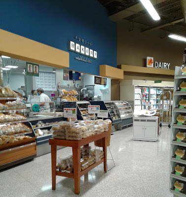
     The back wall of the store is home to the dairy department, with the bakery visible in the distance here.


     Some more center store action to come in the following photos, as we make our way toward the bakery in the back left corner of the store:


     For one of Publix's most prized departments, the bakery seems so lonely all by itself in the back left corner. Even the new 49M stores have the bakery back here, which seems weird to me, as the bakery would fit in much better in the "grand aisle" Publix was going for over by the deli island.


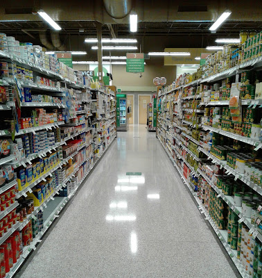
     Wine in aisle 9, followed by frozen foods in aisles 10 and 11, the last two aisles in the store.


     Here's a look down the first frozen foods aisle, but let's make a pit stop at the bakery before moving on to the second aisle of frozen foods...


     Emerging from aisle 10, the bakery department follows dairy along the back wall. While all by itself in this small store, the full selection of Publix bakery products could still be purchased here.


     There wasn't much room for table displays back here, so the bakery had to make use of some shelves along the wall to store all of the baked goods on.


     A fresh tray of Publix's chocolate chip cookies had just come out the oven as I passed by the bakery, and was set in this little display window where you could see the baker taking the cookies off the tray and packaging them in the plastic containers. I thought this window was a neat touch, as you got to see all the baked goods as they came straight from the oven (and after staring at this picture for too long writing about cookies, I want one now, and the presence of those donuts in the photo isn't helping me either!🍪🍩).


     The temptation of sweets aside, we'll leave the bakery behind us and move into the last aisle of the store, home to the remainder of frozen foods.


     Leaving frozen foods, we find the pharmacy located in the front left corner of the building. Due to the store's size, the pharmacy feels a bit cramped here, which is one of the only flaws in the new 28M design.


     Here's one last interior photo, looking across the front end (on grand opening morning - which explains the huge crowd!). However, it doesn't need to be a grand opening for a Publix to look like this. At most Publix stores, the sight you see here is called "Saturday afternoon". At Winn-Dixie, they call this sight a "mirage" 😁


     Stepping outside, here's one last look at the exterior of the new Indialantic Publix store, looking at the store's entire width. It's a nice little store, and a nice place for both locals and beach-goers alike to shop at.


     Looking at the left side of the building, this is probably my best photo at showing how this store isn't very deep at all. There aren't any satellite images available of the new Publix site yet, but it's rather impressive how they were able to shove this new store onto the tiny little lot they were given. Due to the strange shape of the lot, most of the store's parking is located on the side of the building, as the front of the new store comes really close to the main road out front.


     And speaking of the main road, here it is, with beach parking visible on the other side. With a Pub Sub and a beach umbrella in hand, you're all set for a typical day in Florida after you visit the new Indialantic Publix!

     While the Indialantic Publix is Breavrd's only new Publix in the works at the moment, later this year Brevard will be getting not one but two new Winn-Dixie stores, so the grand openings will keep on coming! It's refreshing to see some new stores on the horizon, especially with all the closure waves and bankruptcies that keep making the news.

Anyway, that's all I have for now. So until the next post,

AFB