Showing posts with label City: Sebastian. Show all posts

Saturday, June 18, 2022

Publix #287 - Riverwalk Shopping Center - Sebastian, FL


Publix #287
13435 US Highway 1, Sebastian, FL - Riverwalk Shopping Center

     I'm going to start today's post with a new edition of "Confessions of a Floridian Retail Blogger". Being a Floridian, you guys probably think I spend a lot of time shopping at Publix, the ubiquitous Floridian grocery chain. In a way I do find myself at Publix a lot, as I've been to 175 Publix stores (so far) in my travels, but (and here's where the confession part come in) I actually don't go to Publix very often for my regular grocery shopping. (Gasp! Call the National Enquirer on this one!) Most of my time going to Publix is while on road trips, really. Besides to grab a Pub Sub or something that happens to be on sale in any given week, I really don't shop at Publix much. I'm actually an Aldi guy, and anything I can't get at Aldi I'll end up getting at either Target or Winn-Dixie. (Gasp! Winn-Dixie! This is front page National Enquirer stuff now!) Winn-Dixie has really won me over recently with their renewed stores and rewards program, much to Publix's dismay (and I come from a family of Publix devotees too). However, I have nothing against Publix. Publix runs good stores and offers good quality product, and they know their niche, but they're just pricey, and I'm cheap. I live less than a mile away from a Publix, but I've found myself driving further out to other stores more often recently. So, what does all that have to do with today's post, you ask? Well, when I do find myself with the urge to do a decent Publix run, I have plenty of options locally to do just that. However, while I can be at a Publix in less than a mile, if I have the time, I'd rather make the 20 mile excursion to my favorite Publix to shop at - Publix #287 in Sebastian.


     Publix #287 is a quaint 1980's Publix store, which opened on November 21, 1985. Publix serves as the major anchor to this classic 1980's Publix community shopping center, with a Walgreens opening alongside it as the plaza's junior anchor. I have a soft spot for these classic 1980's Publix anchored shopping centers, as there's just something about the architecture and design of them that always struck me as interesting, probably stemming back to my time observing (the quite depressing now) St. Lucie Square in my younger days. While the facade details are different, both St. Lucie Square and Riverwalk Shopping Center share similar design features, although Riverwalk is much livelier and better cared for in the present. Since I like the aesthetic of this shopping center, and the aesthetic of older Publix stores in general, I don't mind making the journey down here for my Publix shopping needs when time allows (and the drive along the river on US 1 in far Southern Brevard County is quite scenic too).


     Besides the paint scheme, the exterior of the shopping center hasn't been changed since it opened in 1985. The interior has been updated through the years accordingly, but still retains a classic Publix feel. Publix #287 has never been expanded or heavily altered in any way during all the interior renovations it has received, so the departments are still in their original locations as well.


     Entering from the left side doors, here's a look across the store's entry vestibule. Having opened in 1985, I'm a bit torn about the vestibule being original or not. Publix #287 opened in the period when the company was transitioning from the classic concave style entryway to the single vestibule design like this, with many concave entryway stores later remodeled to include a similar vestibule. Sometimes there were quite obvious clues that the vestibule was a later addition, and other times the addition of the vestibule was practically seamless. The fact this store has an interior set of doors (which is not a common thing to see) seems to suggest the vestibule was a later addition, but I can't say for sure.


     Stepping inside, we turn to the right to be greeted by the usual display of weekly promotional items and BOGO tables. Greeting cards are tucked into a small aisle that runs along the building's front wall, with the service desk located straight ahead in the store's front right corner.


     Rounding the corner are more BOGO dump bins, and the "Publix Apple" sign comes into view. The apple sign is usually placed prominently along the front wall in front of the check lanes, but in these older stores, that decor piece just got stuffed wherever there was room, like we see here.


     As typical of a Publix from this era, dairy runs along the right side wall in aisle 1, with juices and other drinks on the opposite side.


     In the back right corner, we get a closer look at something the store's Sienna/Classy Market 3.0 paint scheme tries to unsuccessfully hide: some wall paneling from the decor package this store opened with in 1985! Throughout most of this store, that paneling can still be seen, just painted over in the browns and greens of the current decor. Since Publix can be pretty thorough with remodels, it's always fun when I pop into an older Publix store and see the painted over original paneling on the walls like this. For a general idea of what the interior of this store would have looked like shortly after it opened in 1985, this YouTube video gives some nice overviews of the 1980's Publix decor (that video filmed inside Publix #246 in Deerfield Beach, in case you were curious). It's amazing how different these stores look and feel now after a number of remodels!


     Looking across the back of the store from the back right corner, we find the deli department straight ahead.


     As usual in these 1980's build Publix stores, the deli is located along the back wall in a small alcove, under the distinctive lower ceiling. We'll return to the deli for a closer look in just a moment, but first, let's jump back up front for a moment:


     A bit of an abrupt transition here jumping from the back of the store to the front, but I didn't have any more graceful way to do so! While the previous photo looked across the entirety of the back wall, this one is of a similar perspective, just looking across the front of the store instead. From this perspective we can see the front lanes, along with a really interesting relic from decor packages past. Over the check lanes is a decorative metal structure that dates back to the Wavy Pastel days. In more deluxe Wavy Pastel builds, these metal structures were used to hang overhead check lane lights from. I'd imagine these structures held a similar purpose in remodeled stores, but I never encountered one of these metal structures myself until well after most of these stores would have remodeled away from Wavy Pastel. The structure could have been purely decorative in this store, but regardless, it's still a Wavy Pastel remnant! Sadly, even though the metal structure survived this store's early Sienna/Classy Market 3.0 remodel, it was later removed. The pictures in today's post were taken in 2017, and according to photos on Google, the structure was removed by early 2018. I must have captured this decor relic shortly before it was removed for good, so in a rare victory, timing worked in my favor on this one!
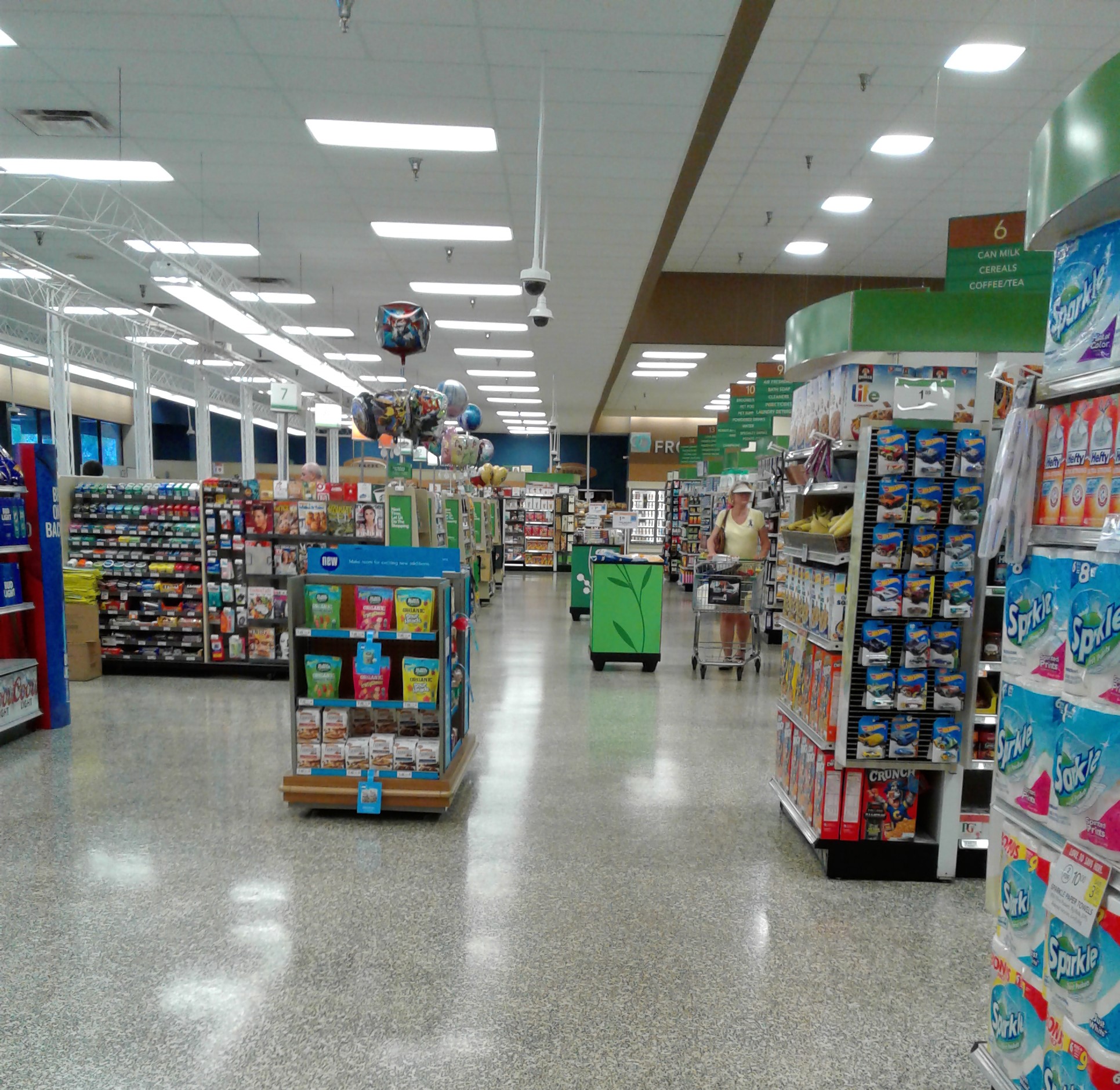

     I'm a bit surprised Publix bothered to remove the metal structure over the check lanes as a special project, and didn't wait until this store remodeled again. Not only is the structure big, it had electrical wiring running to it as well for the lights, so it seems like something that would be a bit complicated to remove.


     Leaving the front end, we'll turn down this aisle as we work our way back toward the deli department. Along the border of the ceiling transition we find more original (albeit painted over) 1980's paneling, which would have looked like this when the store first opened.


     Finding ourselves in the back of the store again, we return to the deli for a closer look:


     While most of Publix's stores from this era had a deli department of a similar design to this, there is one major oddity to the deli in this store. See it? If you don't, use this picture of the more common scene you'd encounter as a hint, or just jump ahead to the next paragraph for the answer.

     So what's the oddity about the deli here? Well, you just have to look up! The entire ceiling of the deli alcove is a giant paneled light fixture, which really brightens up the alcove. That design is most certainly original (as lights like this are very 1980's), and I can't help but wonder if most Publix stores from this era had similar light fixtures in their delis which were swapped out with modernized fixtures (like this) in later remodels. While I've been to a lot of Publix stores (especially older ones) in my travels, #287 is the only one I can remember having the paneled light fixture like this over the deli alcove.


     So the deli light is a rather neat relic from the past that Publix #287 happened to retain, and just adds to the retro charm of this store (even if most of that charm is masked behind some Sienna/Classy Market 3.0 era upgrades). Moving along, we find ourselves in aisle 4, home to baby items, stationary, and some health and beauty products. This store doesn't have a pharmacy, so the pharmacy-related products are housed in these early aisles (as Publix typically does in older stores that lack a pharmacy)


     Popping up front again, here's another look across the front end, with the bakery off in the distance.


     Publix always has the most perfectly faced cereal aisles.


     Beyond the deli alcove, the back wall transitions into the meat department, with the seafood counter off in the distance where the brown wall paint switches to green.


     The deli alcove again, as seen from meats.


     Getting closer to the left side of the store, we find chips and soda...


     ...as well as the classic combo of PB&J and wine. The next time I'm at one of Publix's fancy prototype stores, I'll have to ask the wine attendant for their recommendation on what wine pairs best with a PB&J sandwich. I've been getting a lot of weird looks from people at work when I break out the bottle of Merlot with my PB&J sandwich at lunch, so maybe I should be drinking a white wine with my PB&J sandwich instead.


     This store's last two aisles (numbers 13 and 14) are home to frozen foods, although a portion of aisle 13 is home to the beer coolers as well.


     Looking across the back wall from the back left corner, the Seafood service counter is to my left, with the produce alcove behind me.


     Turning around from the vantage point of that last photo, here's produce in all of its glory.


     While it's most common for Publix to arrange the produce displays perpendicular to the main aisles in stores from this same era, this store chose to arrange the tables parallel to the main aisles. I have no idea why this arrangement was chosen over the other, but it adds to this store's uniqueness and charm.


     Leaving produce, we take a look down aisle 14, the store's last aisle and home to the remainder of frozen foods.


     At the end of aisle 14, in the store's front left corner, is the bakery alcove. The bakery counter is located along the left wall, with ice cream freezers wrapping around the other two walls of the alcove.


     Intertwining the ice cream coolers with the bakery department is a very classic Publix thing, and something I've never seen another supermarket do. However, this arrangement makes a lot of sense, as cake and ice cream makes for a great pairing! (Not as good of a pairing as PB&J and wine, but it's close!)


     Here's another look toward the bakery counter as we begin to wrap up our tour of Publix #287.


     Here's one last look at the check lanes, with the exit doors straight ahead.


     "Thank you for shopping Publix" it says on that bulkhead over the doors. One nice thing about this store is all the windows along the front end, which let in a lot of natural light. The later split vestibule stores removed all the natural light provided by the original single vestibule design, but allowed the customer service desk to be placed in a more natural location in front of the check lanes, and not over in the corner like it is here.


     Here's one last look at Publix's facade, another classic example of a mid-late 1980's Publix design.


     While we're here, we'll take a quick look at the adjoining Riverwalk Shopping Center too, since the shopping center is another large portion of the main Publix store's overall aesthetic. The shopping center carries over the design of the main Publix store, zig-zagging is way toward the former Walgreens junior anchor:


     The former Walgreens is also of their classic 1980's shopping center design, standing out from the rest of the plaza with its tall facade.


     Walgreens moved to a freestanding location across the street from Riverwalk Shopping Center in 1998, with the former space now home to a Goodwill store. Goodwill combined the main Walgreens space with the space of their former attached liquor store next door, increasing the size of the salesfloor. It's always nice to stroll around the Goodwill store after popping into Publix, so let's head inside for a quick look around:


     Inside, Goodwill removed most traces from Walgreens, probably a result of the work done when combining the main store space with that of the former liquor store next door. This Goodwill store is operated by Gulfstream Goodwill, who is the Goodwill operator that runs out of West Palm Beach. Gulfstream Goodwill runs all the Goodwill stores in Palm Beach, Martin, St. Lucie, Indian River, and Okeechobee Counties, and this location in Sebastian happens to be their northernmost outpost, less than a mile from the Brevard County line (where Goodwill of Central Florida's territory begins).


     I only took two photos inside this particular Goodwill location, since there wasn't anything too exciting to see. The decor we see in here is the decor Gulfstream Goodwill used for years, only switching their decor recently to a new design. We'll be seeing more from Gulfstream Goodwill in the future, of stores with both the new and old decor designs. One nice thing about Gulfstream Goodwill is like Goodwill of Central Florida, these stores sell 95% donated goods like a normal thrift store, unlike their west coast counterparts that sell a disproportionate amount of new items in addition to the donated goods.


     We'll finish out this post with one final look toward the plaza's Publix store, a classic Publix in a classic Publix anchored community shopping center. As my favorite of all the Publix stores in the area, I hope this store pulls through and remodels to Evergreen instead of getting flattened, but the fact this location is tiny and lacks a pharmacy isn't helping its case any. Even though this isn't the most modern Publix out there, it's a nice step back into a simpler time in the company's history, and I don't mind driving out here from time to time to experience that. So even though there may be a scandalous picture of me in a Winn-Dixie on the cover of next week's National Enquirer, I'll always have a soft spot for these older Publix stores (and those addictive chicken tender Pub Subs). I like having a little supermarket variety in my life, even if some of that variety comes from a brand new Winn-Dixie and a really old Publix!

     Anyway, next time in "Confessions of a Floridian Retail Blogger" we'll talk more about my PB&J and wine problem, but until then, more adventures through the retail and supermarkets of Florida coming your way soon!

So until the next post,

AFB

Monday, December 10, 2018

Winn-Dixie #2354 - Sebastian, FL


Winn-Dixie #2354
995 Sebastian Boulevard, Sebastian, FL – Winn-Dixie Plaza

     Winn-Dixie opened this store in 1997 as a replacement for an older location (#2350) located about 5 miles away from here at the corner of US 1 and Roseland Road. In 2014, this Winn-Dixie was given a fairly nice remodel to “The Green Interior”, at which time a liquor store was also added in an empty storefront next door. The grand reopening after the remodel was held on November 10, 2014.

     Oh, the wonderful world of Winn-Dixie. When most people think of Winn-Dixie, an image of a store looking a lot like this will probably pop into one's mind. (Although you have to admit – there is a small charm to those funky pastel colors!). However, this time, we’ll be taking a tour of a Winn-Dixie that has actually gotten a fair amount of attention in this century, and looks pretty nice too! Welcome everyone to the Sebastian Winn-Dixie!

     This store was built as the stereotypical Marketplace style Winn-Dixie in the late 1990’s. While it still retains the classic Marketplace exterior and interior layout, this store received a very nice version of “The Green Interior” during a remodel in 2014. This particular remodel was surprisingly thorough for an SEG era remodel, and the results are actually quite appealing (compared to some other SEG era remodels).


     The “Food” and “Pharmacy” signs on the left side of the building are original to when this store opened in 1997, but are somewhat generic enough to not stick out too bad with the updated logo and repainted exterior.


     Here is a closer view of the entryway. This building design with the triangular awning and the triangular patterned tower (or 'Tudor revival' design, as coined by styertowne) is classic Winn-Dixie. You can find these 90’s style Winn-Dixie Marketplace stores all over the place in the Southeast, in various forms of use too considering how many of them have been shuttered over the years.


     Moving up to the walkway, we have a clear view of the entrance and exit doors (in the classic 90’s Marketplace arrangement still). The exit doors to my left still have the original Marketplace era “Thank you for Shopping at Winn-Dixie” emblem on the glass, a nice little artifact which doesn’t deter too much from the rest of the remodeled store (which, like I said before, was a fairly thorough remodel to remove most 90’s artifacts). A sampling of “The Green Interior” can be seen through the entryway as well.


     Walking through the entryway and looking to the left, we see the customer service desk, which was replaced during the 2014 remodel. During my visit to this store, there was something going on with the ceiling around the entryway (which is why some ceiling tiles are missing at the top left of this photo). Thankfully that wasn’t a sign of bad things to come, as I was overall quite impressed with this Winn-Dixie. This store was not as fancy as a Transformational store was, but definitely an improvement over any of Winn-Dixie’s half-hearted recent remodels.


     Behind the cart stall is this little alcove that was being used to store extra promotional items from the week’s circular. When this store was first built, this little area would have been home to the Winn-Dixie photo center. As Winn-Dixie’s financial troubles increased in the early 2000’s, along with film fading from popularity around the same time, all Winn-Dixie photo centers were removed from stores by the mid-2000s.

    Another thing to point out in this photo is the “local flare” piece on the wall, my main reason for taking this photo. While not specific to Sebastian, it’s still neat they mention Florida and that Winn-Dixie tried to do something to represent their home state. The only other state where I've seen photos of a Winn-Dixie with The Green Interior were in Georgia, and there was a corresponding sign representing Georgia too (which can be seen here). The same store in Georgia (which was a converted Harvey's Supermarket) also had a circular sign over the customer service counter, something that never appears in most other Winn-Dixies as the customer service desk is usually placed against the wall (like we just saw at this store).


     Across from the old photo center and next to the registers is the floral department. The store’s floral department had a large selection of flowers, in addition to a counter where you could place orders for custom bouquets and other floral arrangements. Even in older stores, floral is one department that Winn-Dixie seems to not skimp on (at least from my observation), so they must do well in this area.


    This is a look from the edge of produce back toward floral and the registers. Floral and the registers are located under that portion of the ceiling which drops lower, a classic 90’s Marketplace store trait. Back in the day, it would have been all cash registers under the lower ceiling, with floral located in the produce department.


     Moving on from the front of the store, here we have our first look into the produce department. This is looking into the store’s front right corner. With this store’s remodel to the Green Interior, all of the coolers in this part of the store were replaced with the new black ones you see here. Also visible here is the signage for the produce department. One interesting thing about the Green Interior is that not all of the departments have their names on the wall. Some, like produce, just have the picture circles to represent what department you are in. The wheat detailing on the walls (like can be seen in the corner here) was another nice touch to liven up what would have been blank space otherwise.


     Here’s an overview of the right side of the store, in a view prominently featuring the produce department. The deli is peeking out in the background, as well as the wine and beer section. Unlike in more recent remodels, Winn-Dixie actually took the time to redo the floors here. The produce and deli departments received brand new wood-grain style floors. The rest of the store also had some work done to the floors, but I don’t think the tile there was completely new. However, what they did to the floors here made the store feel much more modern than leaving the old pastel Marketplace flooring patterns to take away from the remodel. In reference to the decor and this store's remodel, this is what vintagefans had to say about it: "I always liked this look and thought Winn Dixie did a good job with the wood floors and crate displays with the green and gold wall colors. It's clean and looks modern and organic. I see this as kind of an update of the post-bankruptcy decor which was very similar, especially in the produce department."


     Here we have an overview of the entire produce department, including the produce department’s symbolic signage on the walls. As YonWooRetail2 put it, "The flooring and the general feel around this produce [department] is far better looking than a typical Publix (in my opinion). Wood flooring makes any grocery store look better!" Way to go Winn-Dixie - you found a way to look like Publix! (Just to kill off this decor after barely two years in the end).


     Nearly the entire right side wall was lined with these fancy modern coolers. Near the produce department, these coolers were filled with salads, salad dressings, chilled vegetables, and juices. Further down this wall these coolers transitioned into a home for chilled beer.


     A close-up shot of one of the newer style coolers, somewhat of a rarity in many Winn-Dixie stores. However, my intention with this photo was actually to capture an example of some of the local produce signage that has been popping up at Winn-Dixie lately. This particular sign highlights some famous Fort Pierce tomatoes (well, Fort Pierce isn’t all that famous for tomatoes, but I liked the way that sounded!), just one of many signs of this type throughout the produce department.


     Between produce and the deli department is the store’s wine and beer selection. This store had a rather extensive selection of wines for a Winn-Dixie, as well as a decent selection of craft beers.


    The signage for the wine and beer department was also entirely pictures, featuring four panels of wheat and barley plants (and surprisingly no grapes to represent the wine, although beer does take up the entire wall where the picture panels are located).


     As we move further toward the back of the store, we’ll take a quick look down one of the aisles in the wine department. The deli, just beyond the selection of wines, is quite visible in this photo as well.


    Now that we’ve seen the deli counter poking out in the background of a few photos, it’s finally time for a close-up shot of the deli counter itself. Like the rest of the store, the deli received all new cases. In addition to the usual selection of deli meats and salads, this store’s deli also has an expanded selection of store-made prepared foods (such as carved roasts and various hot side dishes) visible to the right end of the counter. Between the prepared foods and the deli cases is a sandwich station. While not quite as extensive of a selection of prepared foods as you’d find in a Transformational Winn-Dixie, what was offered here was close enough, and is certainly a selection not found in most Winn-Dixie stores! Looking closely at the department signage (specifically this deli sign), NW Retail made an interesting observation: "I'm actually getting a vague Albertsons feel from this interior. I think it's something about the font used, and the subtitles are kind of Albertsons-y too..." He's not too far off with that observation, especially when you compare this decor to the Florida Safeway's interior.


    Off to the side of the deli was this new chicken wing bar. I’ve seen this bar pop up at a few “less recently remodeled” Winn-Dixie stores of late, however this bar compliments this store’s expanded prepared foods selection quite well.


     You might have noticed this in the last few photos, but around the deli department are many signs that I found very reminiscent of the promotional signs used in Safeway’s Florida decor (such as the Chilled Drinks sign in this photo). I believe others have mentioned similar promotional signage popping up at other supermarkets too. Anyway, the use of these signs in addition to the look and feel of the rest of the green decor also tie back into NW Retail's observation.


     Moving away from the deli, we now head off into the grocery aisles, starting with none other than aisle 1. Aisle 1 is the aisle that bumps up against the produce and wine departments, and contains the store’s selection of waters (including the regular, sparkling, and enhanced kinds), seasonal merchandise, and apparently stills! (I guess for when you want to make your alcohol at home rather than buying that weak pre-made stuff at the grocery store!) I don’t think that’s what they were going for with the “still” placard at the top of the aisle sign, which I still can’t figure out the reasoning for up there. (The pun in that last sentence may or may not have been intended). After some observation, I believe NW Retail came up for the reasoning behind the 'still' placard: "It would make sense with an "and" in there -- "still and sparkling water". As is, it does seem rather odd!" Yes, that would have made much more sense with the 'and' placard in there, or just phrasing it as 'still water' on the placard to begin with!


     Here we have a view across the front end of this Winn-Dixie, as seen from the edge of the produce department.


     A look down aisle 2, which is home to the sodas and juices.


     Immediately to the left of the deli is the Seafood Counter, which is still full service and had entirely new cases installed during the remodel.


     Panning more to the left from the Seafood counter, we have this view across the store’s back wall. The meat cases take up most of the space along the back wall, with a tiny bit of dairy using the space back here near the far left side of the building.


     Canned foods and international foods can be found in Aisle 4.


     Here is another look across the store’s front end. I know I included a photo similar to this not too far back, but this one is a little bit different, taken from a vantage point a bit closer to the registers.


     Frozen foods are located in the center of the store, taking up all of aisles 6 and 7. The frozen foods coolers appear to be newer, or at the very least refurbished to match the new black cases installed throughout the rest of the store.


     Now moving along to the second frozen foods aisle, aisle 7, where we have a view toward the front of the store. This part of the frozen foods section was home to ice cream, and interestingly enough, fire logs, which can be partially seen on the endcap at the end of the coolers.


    Above some of the meat coolers along the back wall is this sign, featuring Winn-Dixie’s longtime slogan “The Beef People”. Winn-Dixie used that slogan from the 60’s all the way into the 90’s, although it would mostly fade out of attention after the end of the Marketplace era. In 2013 Winn-Dixie brought the slogan back to life, with this tagline appearing in The Green Interior, all the converted Sweetbay stores, and in the Down Down décor in some form, as well as in many printed advertisements. It’s nice to see Winn-Dixie re-embrace this part of their history, but with a modern spin.


     Another look across the back of the store, this time looking back toward the seafood and deli counters. The meat department doesn’t have its own sign with the department name on it, as “The Beef People” sign takes the place of one.


     Pet supplies and office supplies could be found in aisle 9 at this store.


     Even after Winn-Dixie purged many of their pharmacy departments from stores in the fall of 2016, this store’s pharmacy continues to operate. The pharmacy counter is located behind the customer service desk, on the left side of the store before the bakery. The pharmacy here had a decent crowd this day, actually.


     Here is a look across the front of the store, looking from the pharmacy counter back toward the registers and produce. Hopefully this photo gives you a better idea of the pharmacy’s location in the store.


     Laundry detergents, cleaning supplies, and hardware find their home in this store’s aisle 11.


     Another close-up of one of The Green Interior’s aisle signs, this one being for the infamous aisle 12, home to paper products and plastic storage bags. And unlike the last aisle marker I took a close-up photo of at this store (the one for aisle 1, which can be seen a few photos back), all the placards on this one make sense!


     Now that we've seen the sign for aisle 12, how about a look down aisle 12 itself? Like I said before, paper products and such are located in this aisle.


     Snack foods have their home in aisle 13. Off in the distance we can see the bakery, which is located in the front left corner of the store.


    Now for a look at the Winn-Dixie bakery itself. The bakery received signage similar to that of the deli, as well as some of the wheat stenciling we saw over by produce.


     Now for a look at the Winn-Dixie bakery itself. The bakery received signage similar to that of the deli, as well as some of the wheat stenciling we saw over by produce.


     Another view of the bakery. Winn-Dixie actually has a pretty decent bakery department (at least in the stores that have full service bakeries, that is - some older Winn-Dixie stores have practically non-existent bakeries that are quite disappointing). I like Winn-Dixie’s bakery breads personally, and their breads are usually priced much lower than similar ones you can find at Publix.


     Moving away from the bakery, we see this store’s last aisle – aisle 14. This aisle is home to prepackaged breads and buns, with the left side wall being home to dairy.


     The dairy department doesn’t have a sign stating the department’s name, instead including signage consisting of photo panels of farm scenes and some icons of dairy products further up the wall near the bakery. The wheat stenciling also makes an appearance in dairy, and even on the restrooms sign as well! And the compliments about this decor just keep pouring in! YonWooRetail2: "The combination of the black coolers and photo panels, this really feels like a fancy supermarket. I don't quite understand how a remodel to this green interior (which looks very nice) couldn't have been emplemented in more stores. It really just looks like a nice repaint. I'm getting wearied of the post bankruptcy decor. It looks dull now." vintagefans: "I do agree this decor looks nice. I kind of think of this as an update to the post-bankruptcy decor, as it has some elements of it, but looks more minimalist. There was another version of this decor that used more light gray/white colors instead and I think had a lighter colored wood flooring."


     The dairy aisle again, this time looking back toward the front of the store and the bakery department.


     As we make our way back to the front end, here’s a look across the store’s front aisle. In this photo we can see the pharmacy, as well as the registers off in the distance.


    As I prepare to wrap up this post, here we have an overview of the registers and the front end. As I said before, this store had a nice little crowd on this weekday afternoon. They had 4 registers going each with a line.


     Another look at the registers, this time from the perspective of the main front aisle.


     As I was standing in line waiting to pay for my few items, I started staring at the register light at the lane next to me. I was mostly trying to figure out how the things light up, since there is really no way you can put a light bulb in one of these the way they were designed. The numbers are printed on a rectangular piece of thick frosted glass, which was set into a metal clip with a string of mini LED lights going under it. The LED lights were strong enough to illuminate the entire piece of glass, making it seem like the glass is glowing when lit. I thought it was a neat idea, and definitely a modern one! This picture shows the light for register 3 (which is lit in the picture, although the effect really isn’t the same in the photo as it is in person).


     Our final interior photo of this store looks in the direction of the exit, with the customer service counter also visible to the right side of this photo.


     A new addition to this Winn-Dixie store during the 2014 remodel was this liquor store, which is actually considered Winn-Dixie #2394 (Winn-Dixie gives their liquor stores their own store number, and treats them as their own unique entity rather than an extension of the main store, like Publix, Walmart, and Albertsons do/did). The liquor store moved into a long empty storefront adjacent to the main Winn-Dixie store, a storefront that once housed a Movie Gallery. Next to the liquor store you can see a Little Caesar’s, the only non-Winn-Dixie owned business left in this little strip of storefronts.


     And that is Winn-Dixie #2354! I really liked this Winn-Dixie. The remodel was extensive enough to remove the dated feel that plagues so many of these Marketplace era stores, but was basic enough to not break the bank for SEG. The store was clean, presentable, and modern, and should serve as an example to what every Winn-Dixie store should look like today. I wish SEG didn’t kill off this remodel package so fast, in favor of the Down Down interior (with its many cheap remodels and questionable color choices). The Green Interior, at least to me, looks so much nicer than Down Down, especially in these older stores that didn’t get extensive renovations. With some of the troubles that 2018 has brought to Winn-Dixie and SEG as a whole, it will be interesting to see what happens with the company as we near 2019, and whether good new or bad news will prevail as SEG goes forward...

So until the next post,

AFB