


Target T-1106
Cobb Northeast
Marietta, GA 30062
Click here for the companion Sing Oil Blog post on the Sandy Plains Sing Store
This post was a bit of a last minute decision on my part, but upon discovering this store still had Target's P97 interior (which can only be found in at most 8 other stores), I knew I had to check it out! I figure that Independence Day is a time to celebrate with fireworks, so The Sing Oil Blog is going big this weekend. Not only do you get a post on the former Sandy Plains Sing Store, but you also get a tour of Georgia's oldest Publix, Georgia's only GreenWise Market, and a Target with a now-rare 1990's neon-filled interior. That's a lot (and why my post was delayed by two weeks). If you haven't done so already, make sure to check out this post's companion over on The Sing Oil Blog which explores those stores I mentioned above, and then come back here to see some neon! I typically don't like to photograph larger stores like Target because I end up taking 70-100 pictures of the place; this store was certainly the exception, but I still ended up with 67 pictures (compared to the 30 I normally end up with for a typical Publix). Oh well, hopefully I documented everything important!
Some History
The Cobb NE Target opened on October 8, 1997 and replaced Target T-382, which happened to share the title for Georgia's first Target (opening on April 26, 1989). Interestingly, Target came to the Peach State (and the greater Southeast) through its acquisition of 30 Gold Circle/Richway stores which the chain converted to the Target name. I believe there is only one remaining Target housed in a former Richway; the inside of this location looks like most other P17 stores, but the outside reveals the original Richway wedge skylights.
Although the old store isn't much to look at anymore, its replacement has achieved a shocking feat; it has not been remodeled during its entire 25-year life! This surprises me, because the Sandy Plains region of Marietta is obviously affluent enough for Publix's taste, so I would have thought this store would have been remodeled before now. Regardless, it hasn't been. This also isn't Georgia's only remaining P97 Target, but we'll have to wait to explore this store's sibling.
What tipped me off to this store's age was when I noticed how old the exterior sign looked. I was in the area to check out what had happened to the adjacent GreenWise after it closed and thought it may be interesting to see what this store looked like on the inside. I knew the store was not currently undergoing a remodel because the old exterior signage is typically one of the first things to be removed. Maybe it would make for an interesting detour.

I also found it interesting how the doors say "Entrance To Target" – as if I didn't know which store I was going to!
These older Targets always throw me off how they feature a set of automatic swinging doors on the outside, but manual doors in the middle (with a cart specific door between the exit and entry doors). I tried to use the manual doors while pushing a cart and was quickly surprised to have it slam back into the buggy. I was struggling!

I prayed, prayed, prayed
For a sign, sign, sign
Now there it is in the window
At about half-past five.
Once inside the vestibule, you can take a right to find yourself at the customer service desk. This happens to also be the only department with neon lettering in this store. I find it odd how the desk is in a separate room from the rest of the store, so maybe somebody else can shed some light on why it is like this.

To the left of the customer service desk (on your right as you enter the store) is the old "Food Avenue" snack bar. This was probably the space I was most excited to see on my visit, since the last one I saw made me feel like I was in a time capsule back to the 1990's. Unfortunately, it looks like it was closed at some point over the last few years and transformed into a wonderful pickup order staging area. What a shame! At least they could have thrown me a bone and left the signage up – it looked much cooler than a grey wall!

Although I missed out on the Food Avenue, I guess it does make sense for Target to obscure this area because it was probably the most dated-looking piece of this store. As we can see here, it was covered up by a half-hearted attempt at a red wall and drink center. If those drinks are to go, where are you supposed to pay for them?

Turning toward the store, we see the clothing department in front of us (as is typical with most Targets). One thing that I did find interesting is how this store still had a jewelry counter in its women's clothing section. I couldn't get a picture of it because a lady was following me (and I couldn't idly look at lingerie without seeming creepy), but the cases seemed mostly empty. That is a lot of unused floorspace!

It ain't all that bright, but even though it's subtle
That's right, although some of the neon may be burned out, they still are very subtle décor pieces to be leftovers from the 1990's. Actually, a lot more subtle than a "Golden Girls era" Winn-Dixie Marketplace! (Thanks, Anonymous in Houston for that line)
It is unfortunate that all of the hanging department signs in "Yellow World" have been taken down for some reason, but at least the old neon lights and price scanners are still in place. I do find this price scanner's location to be odd because I feel like they typically aren't floating in the middle of a clothing section. This corner signified the transition between the men's and women's clothing sections, with the dressing room acting as the dividing line in the corner.

Taking a look back over the ground we have covered, we see the bulk of the women's clothing section lining the right actionway of the store, with the doors off in the distance.

Turning the corner, we see a small section of the women's activewear department and the majority of the men's section along the rear actionway.

Here is a different angle of one of the burnt out strips of neon I showed earlier over the men's sock section. I did notice how the bars at the top of the racks are grey in this store, while it looks like yellow ones were used to match the department color in other P97 stores.

I don't know whether it was the old "French fry" carpet, the sparseness of this corner, or the neon lights, but this section of the store really put off some 1990's vibes in person.

Although some neon was burned out, I was glad to see that the lights in the majority of the store still worked just fine.

It's got me feeling alright, gonna make it a double
What's better than one shade of neon in a store? That would be two! (Or more) Here we see the transition between Yellow World and Red World, which takes place over the divider between luggage and pet supplies. The corner housing the luggage department felt really strange with regards to its placement; I guess since I don't typically consider luggage being placed next to clothing. This section also looked a bit sparse in its stocking.

At least we get to catch our first glimpse of some P97 aisle signs! Oddly enough, these indicate that this department should be a part of Red World instead of Yellow World. I also think that these signs are fairly rare to come across this day in time, as most stores had theirs swapped for a style we will see later on.

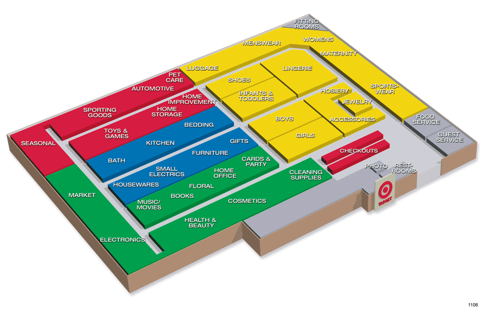
I decided to take a look at the map by the Pet Care price scanner to get my bearings. The main differences I see are how women's sportswear was moved to part of the lingerie section while that space was cleared for bathing suits; meanwhile, accessories made way for seasonal clothing items. I also noticed how the Home Improvement sign moved across the actionway, Automotive lost a sign, and the Floral department was seemingly dissolved. We'll see what else others pick up on.
Unfortunately, I did not think to check behind the current map to see if an old copy was hiding in the shadows.
 |
| Courtesy Target.com - Target T-1106 Map |
While I was researching this post, I took a gander through Retail Retell's Horn Lake, MS album and saw him mention an online database of digital Target maps. Well wouldn't you know they had a graphic for this store too! This graphic is much easier to read and looks like it only lacks the "Assistance Center" locations shown on the in-store version.

Welcome to Red World! Along the rear wall of the store, we can see the remaining pet supplies, some haphazardly-stocked air filters, and some outdoor toys and bikes off in the distance.

We'll now take a look at the "Assistance Center" where I photographed the map. This station looks very vintage, but I'd imagine the price scanner was added after this store's opening. One reason is because the font on the "Scanner & Service" sign above seems to match P01 more so than anything else in P97. I also thought the "Spill Station" sticker looked out of place.

We'll take a quick look over clothing, luggage, and shoes before we continue on.

Does everybody know what time it is?
TOOL TIME!
Although we won't find Tim or Al in this section, this sign does take me back to the 1990's sitcom of the same moniker. We can tell by this picture how this department is now located next to Pet Care, instead of being across the actionway as the map indicated.

I guess fans qualify as home improvement products?

Oddly located next to Home Improvement was the "team apparel" section. Wouldn't it have made more sense to swap this aisle with luggage?

What's even more strange (and I just not realized this as I was looking back through my pictures), is how the Home Improvement sign actually hung above automotive and most home improvement items are actually where the map indicated!

Turning around, we see the remainder of Red World, consisting of toys, sporting goods, and seasonal merchandise.

There's a neon light at the end of the tunnel, tunnel, tunnel.
I tried my best to create and interesting framing for this shot, and I think it turned out pretty neat! We see how the Lego man is attempting to climb over the Sporting Goods sign on the arch which frames the red squiggle on the back wall. I also didn't intend for Blake Shelton's Neon Light to narrate our tour, but it coincidentally worked out well!

Standing under the arch, we see a similar perspective for this shot where I attempted to do a better job of showing the red neon.

Next up is another price scanner station, which I used a lot during my visit to see how good the sales were in the outdoor department. All I ended up buying was a bag of dirt for my caladium.

If you need a bike, this Target does have a few options for you.

The coloring in this shot isn't quite right, but the light strip on the left looks a bit more accurate than the pink color I saw in most pictures. If you have never attempted it, photographing certain colors of neon is really difficult. I was trying my best to go through the myriad of settings on my phone's camera to get the red to not look magenta but ended up giving up in the end and resorting to post processing in Photoshop. Although it is a bit harder to color match a picture after leaving the store, I remembered that the red light was a similar shade to the red panels at the top of the shelving units.

Here you can see an unaltered picture of the red neon, and how my phone made the coloring look more magenta. In-person, the neon looked much more red and much
less pink. I wish my camera could've done a better job capturing it, but I ended up altering the hue/saturation for that spectrum of pink light in all of my other pictures. The post processing had a slight side effect of increasing the saturation of other red objects in the photo, but I think it turned out well overall. Nonetheless, that is why the lighting will look a bit more red in some shots when compared to others.

The remainder of Red World was dedicated to a seasonal school supplies section, with this shot being the color-corrected version of the one above.

Oddly enough, the original aisle signs for the seasonal section were swapped out for ones to match either P01 or P04 (I'm not that much of a Target expert).

Interestingly, the lighting for Red World continues into the space used for the Market. I would imagine that the food offerings in this store increased at some point from what they were originally, and Retail Retell's map of the Horn Lake Target I linked to earlier leads me to believe that this store had a department reset in the early 2000's.

We'll glance back over the seasonal corner before moving on.

Next up, is Blue World. As Retail Retell has mentioned previously, I don't believe many (if any) P97-built stores (with the exception of Super Targets, etc.) received blue neon since Blue World is always located in the center of the store. The blue "sprinkles" in Food Avenue would have been the extent of blue neon this store received. At least this section has retained the correct color of original aisle signs!

I think "portrait mode" on my phone did a good job of adding some bokeh to this shot, and it really makes me wish I could bring my DSLR along for a store photo shoot!

Across the actionway from the towels are the kitchen and small appliance sections. Based on the map, I believe kitchen was moved to its current home from across the actionway. At least the sign seems to match up here unlike Home Improvement!

Looking back toward Yellow World, we see Bath and Bedding to our left and furniture to our right. It is really strange walking into a modern target and not seeing a giant Magnolia Home section as opposed to those same products just being on shelves like in this store.

More bedding and lamps here, with boys' and girls' clothing just beyond.

Let's take one more look across Blue World from the center of the store.

The C9 aisle sign looks like it has seen better days, in addition to actually indicating the correct products in those days gone by! I wish I had taken note of the print date on those cards, but I think they may be older than the March 2016 signs I found later. I'm not sure how old the oldest category markers were, but I spotted some white ones with a date of 2018 and some black ones with a March 2016 date on them.

A nice cross-section of the Kitchen sign, with drapery just beyond.

And here is the transition from Green World to Red World. Judging by the map, it looks like the Market would have originally been encased by Green World but was since expanded into the red territory. Unfortunately, the Market sign was removed around the time when P17 secondary signage was added to the food aisles.

Here is a closer look at the transition, and some of the P17 category signs.

Finally, I was able to get a picture of what I believe to be an original assistance center! Notice how this kiosk doesn't have a price scanner, and also simply lists "Answer Phone" in a font similar to the rest of the P97 signage. It also shows the aisle sign for G23 in a red frame, indicating it should be a part of Red World, contrary to what the map below indicates.

In addition to the clothing department taking me back to the 1990's, the electronics area in Green World also felt pretty dated. It was shocking to see how many aisles were devoted to books, and these shelving units felt very dated and very inefficient for the number of books they were holding. It would have been nice to see how these were stocked back in 1997 when this store opened.

Even though this store felt like the 1990's, it still sold all of the modern amenities you would find at most other Targets, including computers, modems, and routers. No old VHS tapes here (cough cough, Kmart).

I failed to get a very good picture of the Electronics desk since somebody was standing just behind that shelf, but it looked like it has not changed in 25 years. This front end of the store reminded me a lot of my dark, dated, and depressing visit to the Carrollton, GA, Target a few years back. Unsurprisingly, it seems like P93 and P97 stores shared a lot of layout characteristics in common.

Neon, the light they always leave on
I did manage to get a picture of the front left corner of the store, in the midst of Green World.

Followed by the TV wall along the left side of the store.

We'll see a few more books

and some more books

and a couple more books

just a few more books

don't forget about DVDs

before we get to the vinyl records.

Across the front actionway from the physical media was this store's Health & Beauty section. This store did not receive a pharmacy, likely because an Eckerd-turned-Rite Aid was built just in front of this store.

As a parting shot, we see the H&BA products to our left (complete with some P09/P13 aisle markers) with electronics of in the distance.

Office supplies came between greeting cards and physical media on the rear side of the front actionway.

Now we'll take a nice overview of greeting cards and the rest of Green World with the front actionway to our left and the center actionway to our right. Again, I can picture myself back in the Carrollton Target looking at this section of the store, and only wish this location had the same aisle directory signs.

In these two pictures, I did my best to try and capture the accurate color of the signs in Green World, but I'm not quite sure either of them met the mark. At least this first picture shows us the black 2016 category signs while the second shows us the 2018 edition.


Maybe this red is close to the accurate color?

By this point, you should be able to tell how inconsistent the aisle signs in this store are!

Finally, we have made it to the checkout!

I'd guess that these lights are original since they match the shape of the department signage, but again, I'm not a Target expert.

To close out our tour, we'll take one last look at the old Food Avenue space (which looked similar to this) next to Guest Services.

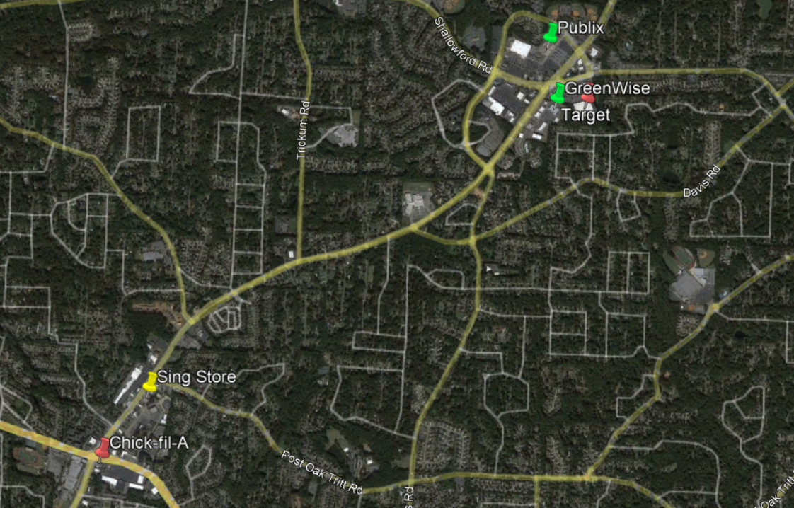
This shot shows how obscured this building is from Sandy Plains Road. If I had taken a picture to my right, I would have been looking directly at Publix #33. Also, we can see the edge of GreenWise Market #1689 on the right edge of this picture.

Remember this picture? I took this shot for my former GreenWise #1689 post, but it is part of what inspired me to tour this neon Target! We can see that this circa 2020 sign facing Sandy Plains Road boasts the new TARGET target logo, which is a stark contrast to the actual store. What juxtaposition!

In conclusion, I'll include a picture of a 1990's Chick-fil-A I saw about 2.5 miles south on Sandy Plains Road at the intersection with Piedmont Road. The old Sing Store used to be in the block just to the north and could have coexisted with this restaurant for a short time. This model of Chick-fil-A is becoming more-and-more rare to see, as many of the curvy ones have been torn down to make way for a modern restaurant. I'd also like to note how there is a more modern Chick-fil-A in the picture of the Target above. This is Atlanta after all!
 |
| Google Earth - December 2020 |
Although these businesses weren't all operating at the same time along this corridor, the Sing Store, Publix, and Chick-fil-A did coexist for several years before Amoco sold the convenience store in 1993. It looks to me like much of the retail in this area moved from the Piedmont Road intersection (where Kroger & Bruno's used to be located, in addition to the Sing and Chick-fil-A) to the Shallowford Rd intersection after Publix & Home Depot decided to build there in 1992. Target came next in 1997, relocating from their former store further south on Sandy Plains, followed by the GreenWise Market in 2020.
I know I certainly thought this section of Marietta was interesting to explore, so I hope you thought the same! Depending on how things go, I may take a short hiatus for the remainder of July, but don't worry, I'll be back with plenty of interesting stories both here and on The Sing Oil Blog in August. Also, don't forget to check out this post's companion if you haven't already.
Until next time,
- The Sing Oil Blogger

This has been a feature post from my series Sing Oil Blog: More Than Convenience, in conjunction with my post on Sandy Plains. To check out my other posts from this series or to learn more, click on the logo above.